If you’re working on improving a form, especially a government one, what advice do you need? In April 2019, I discussed a topic map that might help to answer that question in a webinar for Digital.GOV.
To find out more about where these ideas started, have a look at my March 2019 post Background to the work and testing the first draft curriculum
This update tells you more about:
- Testing with colleagues in March
- The webinar in early April 2019 that includes a new topic map and a request for help
- Suggestions and questions from people who listened to the webinar.
The topics are now in three groups:
- Get the questions, including user research with people who fill in and deal with forms
- Write good questions
- Put the questions onto pages, including usability testing.
Testing with colleagues showed that I needed to simplify
In March 2019, I did more testing of the ideas with colleagues. I learned that:
- the term ‘curriculum’ sounds too much like something delivered in a formal training context
- the five groups of topics that I thought of weren’t clearly defined
- I’d missed some crucial topics.
Thanks to everyone who came to the NHS Digital design huddle to try the ideas out with me.
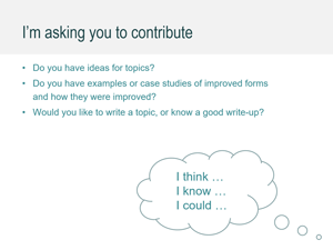
Digital.gov gave me the opportunity to ask for more help
Digital.gov is part of the U.S. Government, “providing people in the federal government with the tools, methods, practices and policy guidance they need to deliver effective and accessible digital services”. I was honoured that they allowed me a slot for a webinar to tell people about this work and ask for ideas.
During the webinar, I asked for suggestions for topics and for questions. I’ve added these, and my responses, at the end of this blog post.
I’d like to thank:
- the organisers of the webinars, especially Lauren Rabb, Benjamin Peterson and Andrew Maier, and
- Ginny Redish who listened to an earlier version of the webinar and gave me many great suggestions.
Watch the video of How to design a better form on the Digital.gov event page (click through to YouTube for a replay of the chat window and an automatically-generated transcript).
Discussing a Topic Map for How to Design a Better Form 2019 March from Caroline Jarrett
View the presentation as a PDF: CJ-How-to-design-a-form-USA-2019
If you’d like to comment on the topic map, add ideas, or might be willing to write up a topic, then we have an NHS Digital service manual Slack channel:
- Join the NHS Digital service manual Slack workspace
- Join the #forms channel
- Comment as you wish.
If you don’t want to use Slack, or you don’t want to comment in public, then choose one of these:
People who attended the webinar offered suggestions
Thanks to everyone who commented or made a suggestion. I gave some quick replies at the end of the webinar; here are some more replies.
Tara Gill commented “The question design is one of the most important things”. Me: Thanks Tara, I certainly agree with that.
Tait Chamberlain suggested “Designing the shortest/fastest/most intuitive question flow”. Me: Great suggestions. Sometimes the shortest flow isn’t the most intuitive. In the webinar, I mentioned the importance of asking only one question at a time (no double-barrelled questions). You can get a shorter form by asking questions that are more complex, but that rarely helps the people who are answering.
Tara Gill asked “Could you please provide an example of ‘good services are verbs not nouns'”. Me: This comes from a blog post by Lou Downe: “Good services are nouns, bad services are verbs“. There are some examples in the blog post. Another great example comes from the UK Ministry of Justice described in Helping people with court fees. They changed the name of the service from (noun) ‘Fee remission’ to the much clearer (verb) Get help with paying court and tribunal fees.
uly and Renee Maciejewsk asked for more explanation of why we recommend avoiding drop downs. Me: We’ve consistently discovered that people with low digital skills or with access needs can struggle with drop downs (also known as select boxes). To interact with a drop down, you must realise that you have to click on it or select it, then open it up, then scroll within the drop down itself to find the item you want, then understand that you have to click on or select that item. Sometimes drop downs are not implemented very well, and later use of the mouse or up/down arrow keys can change the selected item. For more detail, please watch Alice Bartlett’s video Burn your select tags.
GSA Privacy Office: We are interested in forms that help identify privacy risks in IT systems and identify mitigation activities to reduce risks to personally identifiable information being breached. Me: Thanks, that’s a fascinating suggestion. We all face the challenge of phishing attacks, spoofing, and other ways in which people of malign intent try to subvert government services. For example, those of us outside the U.S.A. have to be careful to use the offical .gov site for applying for an ESTA: the Electronic System for Travel Authorization which has a modest US $14 fee; from time to time spoof sites pop up that charge people far more than that merely for redirecting them to the .gov site. In the UK our National Cyber Security Centre (NCSC) offers security advice on personal data and advice about asking for and using passwords. The GOV.UK design system includes the topic Ask users for passwords which links to the NCSC policy. I could not find equivalent advice on the United States Web Design System; I’m sure that the US Government has advice somewhere.
Laura Ponce asked “Are there any different considerations for creating a brand new form that will be online only as opposed to digitizing a paper form? Or is it generally the same approach?” Me: I’ve almost never found a government form that is completely new. There is almost invariably something somewhere that people are currently doing that is going to be replaced by the new policy or approach. But if you do happen to work on something where there is definitely nothing that exists, then you won’t be able to observe people using the current forms or dealing with forms as they come in. I think that everything else that you need to do is the same.
Terri Walker suggested: “Not sure if this falls into usability testing or initial design, but Section 508/Accessibility requirements will also affect form design”. Me: Definitely. Designing for accessibility and inclusion is crucial for everyone, and especially so for government and the National Health Service where we cannot turn anyone away but must ensure that everyone can use what we create. Every government design system that I have seen includes accessibilty and inclusion as one of the principles. For example: “Accessibility is fundamental.” (US Web Design System). “Make it accessible” (Australian Digital Service Standard)
Tara Gill suggested “Define Audience, an addition to question design” and “What triggers the user to fill out the form? (addition to get the questions)”. Me: For sure. In my mind, both of these are included in the topic ‘Understand user needs and goals’, so this illustrates how important it is to provide a variety of ways into the topics so that people working on improving forms can find what they need without using a narrow set of terms.
David Kaufmann pointed out a case study: redesigned mortgage disclosure forms in the consumer finance.gov initiative Know before you owe
Tait Chamberlain mentioned “Designing UX: Forms by Jessica Enders is a great book you’re probably already familiar with”. Me: yes, it’s a book that I’m delighted to recommend. The book came out in 2017 when I was on medical leave, and I noticed just now that I haven’t provided a review of it on my website – something I must remedy. It’s a book that focuses mainly on the ‘develop/deliver’ phase stage of putting the questions on the page: Designing UX: Forms . If you want a book that covers more about what I’m now thinking of as the ‘discover/define’ stage of getting the questions, then I’d recommend having a look at the book by me and Gerry Gaffney: Forms that work
Syed Azeem asked about “How to merge two different data intake methods for a form? Paper which cannot be digitized easily but data can be extracted out later on and a digital native form providing structured data”. Me: What a great suggestion for a topic. One of the areas that I definitely need to get more ideas about is how this topic map fits in with other advice about service design overall, and if we are creating a digital form then what sort of digitization we are aiming for and how that relates to paper, telephone, face-to-face and possibly other methods of collecting data. I don’t know of much advice in this area, but I can recommend the discussion of different levels of digital forms in Ray Killam’s article What forms managers think about
#forms