How can we design at scale?
That’s the challenge that I’m working on with Tim Paul at the Government Digital Service.
When Tim first started working at GDS, the designers could fit into a room and sharing was easy. Now we’ve got hundreds of designers working on transforming government services in the UK, with the challenge of creating a consistent, easy experience for every person who uses a government service.
A conference is a chance to reflect
For the second year, Tim and I went to the Service Design in Government 2016 conference in London.
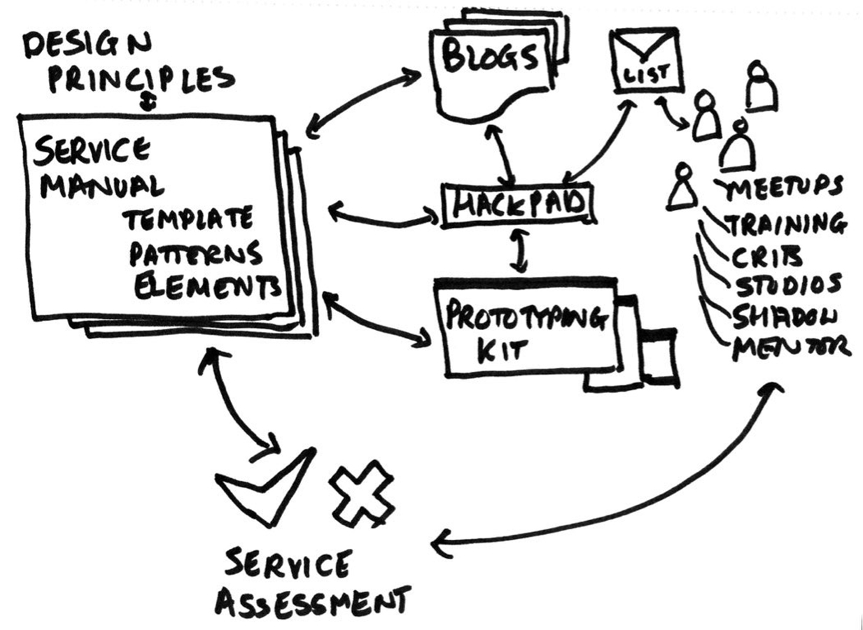
In our usual work, we have lots of opportunities to learn from and work with designers who are creating and improving UK government services. The sketch above shows some of the ways our design community exchanges ideas, such as the email list and cross-government design meetups. Tim and I also do research with designers – as described in our article for UXPA magazine.
This conference complemented those opportunities by giving us a chance to reflect on the year as a whole and look forward to next year.
We learned that we need to share internationally
One (welcome) surprise was that well over half the people who came to our session were from outside the UK. They are also working on delivering better government services for their own citizens, and we recognise that sometimes non-UK people use UK services (and vice versa). For example, Bernard Tyers at the Home Office wrote about launching a service in Kuwait.
Our designs must work for everyone
People don’t have much choice about government services. If you have to claim job seeker’s allowance, get a student loan, or renew your passport then you’ve either got to engage with government yourself or find someone to do it for you. So we talked a bit about the challenges that poses and how we no longer recommend three popular design patterns:
- No more accordions: my blog post for the gov.uk design notes blog
- Avoid complex progress indicators: see the advice published in the service manual at the end of this post
- Burn your select tags (no dropdowns): Formisimo’s roundup of the case against
Patterns are only helpful if designers use them
Our designers across government are busy, highly competent people: we need to make sure that our patterns save them effort and help them to deliver better designs faster. It’s no good having patterns if the designers can’t or won’t use them in their work.
We talked about four methods we use to make sure our design patterns are useful:
- Research: our users are designers so we do user research with them
- Co-creation: design colleagues join us in making and improving the patterns
- Enforcement: use of patterns is written into contracts and service agreements
- Design tools: for example, our prototype kit and the code for the GOV.UK elements
My notes from previous SDinGOV conferences
- Slides and reflections on the 2015 Service Design in Government conference
- Slides and reflections on the 2014 Service Design in Government conference
Advice published in the Government Service Design Manual: when to use a progress indicator
First, test your service without any progress indicators. Many services are simple enough that users don’t need them.
Try improving the order, type or number of questions before adding a progress indicator.
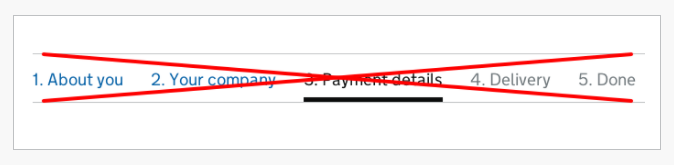
If people still have problems then try adding a simple step or question indicator, like this one:
This approach is compact and usually enough to give people the confidence to continue.
Only include the total number of questions if you can do so reliably. If the total number changes as the user continues through the service, make sure you update the indicator.
Examples to avoid
Don’t use this type of progress indicator:
These can be problematic because they:
- are often not noticed
- take up lots of space
- don’t scale well on small screens
- can distract and confuse some people
- make it hard to write good labels for the steps
- make it hard to handle conditional sections
This style of progress indicator has been removed from a number of services on GOV.UK without any negative effects.
Read a blog post about how the Carer’s Allowance team removed a 12-step progress indicator with no effect on completion rates or times.
#design #formsthatwork #forms