Guest post by Gerry Gaffney, co-author with Caroline Jarrett of Forms That Work: designing web forms for usability.

Technical communicators are familiar with the challenges of communicating with audiences who are reluctant to read. Clearly written, thoughtfully designed, well-formatted text is skimmed, scanned or skipped entirely.
The reluctance to read is rarely greater than when completing forms. Observe and listen to people filling in forms, and you are certain to hear “yada, yada” or “blah, blah” or the local equivalent, as respondents speed-read their way to a vague understanding of what they are required to write or type. Forms designers frequently lament that their careful injunctions and instructions are ignored entirely.
We know that there are various reasons why people read very little in general. They’re busy, they’ve encountered too much overblown text in the past, they don’t like reading online, and so on. With forms, there’s an added disincentive – people don’t like them, and just want to get it over and done with, as quickly as possible and with as little effort as possible.
Three layers
It’s useful to have a theoretical framework when we analyse any particular medium. Caroline Jarrett developed the three-layer model, and we wrote about it in our book “Forms That Work: Designing Web Forms for Usability”. The layers are:
- Relationship
- Conversation
- Appearance.
This three-layer model is a great way to think about forms design. In particular, the fact that it makes us focus on the all-important but often overlooked factor of relationship is very valuable.
First layer: Relationship
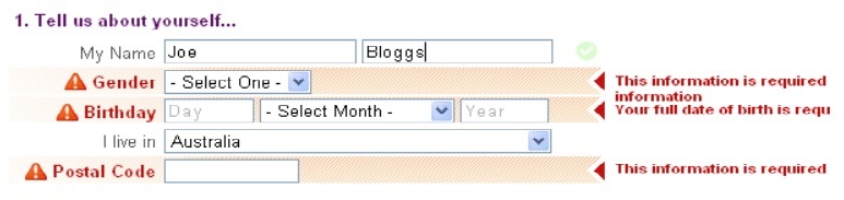
I have no doubt that everyone reading this article will have encountered a form that asked for too much information. The galling question may be your age, gender, date of birth, address, credit card details, medical history or colour preference. At other times, being asked for this information might be quite appropriate, but context is everything.
Frequently, companies or departments have a list of “nice-to-know” information. For example, the marketing department may think it’s nice to know about customers’ annual income, in order to better target campaigns and products. There must, however, be a balance between what you would like to know and what it’s appropriate to ask. The general rule is to ask only for necessary information. In particular, you should be reluctant to ask for information for which you have no current or immediate need.
The extent to which people will be willing to give you information depends on several factors:
- Do they trust you?
- Are you asking for appropriate information (from their perspective)?
- Will they benefit from filling in the form?
- Is the effort needed to complete the form commensurate with the benefit of doing so?
Maintaining a good relationship is about being a good person – treating your users with respect, valuing their time, providing them with appropriate assurances and taking care with their data.
Second layer: Conversation
A form is a medium for conversation. The form enables you to talk to the user and ask them questions, and enables them to reply to you.
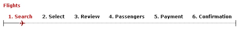
Good conversations have a flow. In a form, the flow is supported by some form of introduction (which may be as simple as a title, or may be a brief description of the purpose of the form), by progress indicators (for example, ‘Step 1 of 3’) and, in online forms, by validation (to ensure that the information provided can be parsed, or understood, by the recipient).
Good conversations also require that the questions you ask can be understood by the user, and that a response is possible. We will return to the topic of questions shortly.
Third layer: Appearance
The appearance of a form is, of course, of great importance. It’s largely responsible for the initial emotional response, helps the user understand the form’s components (sections, headings, questions, instruction, help, and so on), and reinforces branding.
Because the appearance layer is so apparent, it’s sometimes given attention to the exclusion of the other layers. Discussions over label alignment, whether to use colons, what font to use, and what colour the forms should be, can consume too high a proportion of the available time.
Certainly these matters are important, but it’s also true that if you make sensible decisions, and apply good visual design principles, it’s not likely to the appearance layer that causes most difficulty for your users. Instead, they will be tripping over problems with the relationship and conversation layers.
A good appearance is supported by the use of a clear grid. Without this, forms look messy and amateurish. Good contrast is important, as is a font that is conservative and not too small. These will help not only older and vision-impaired users, but all users.
Visual consistency is important. If you decide to use colons after field labels, use them everywhere. If you settle on Initial Capitals, Use Them Everywhere.
Having a good visual or graphic designer work on the form will help present users with something that looks crisp and professional. My own visual design skills are limited (to put it kindly), and I’m always delighted at how much a form can be improved in a short time by a good visual designer.
Writing
With the three-layer model established, let’s return to the conversation layer – because this is the layer where we need to deploy our writing skills.
Words in forms appear in various contexts, such as:
- Title
- Introduction (or preamble)
- Headings
- Questions
- Instructions
- Examples
- Help.
Some of these contexts are ‘traditional’ – there’s nothing really different about writing for them in forms (other than an enhanced push for brevity). However, two in particular – preamble and questions – are worthy of special attention.
Preamble
Many forms have a preamble. It will typically provide some context for the user. For example, it may describe the purpose of the form, the use to which the information gathered will be put, and any prerequisites.
However, preambles suffer from the very fact that they appear on a form – and users are in form-filling mode, which disinclines them to read any ‘optional’ text. There is a very strong tendency for people to jump straight into the first field or question.
When writing a preamble, then, there is one key fact to keep in mind:
- Some people will not read it.
This means that if there is any genuinely crucial information, the preamble is not the place to put it.
As an example, Privacy Victoria had a complaints form that was not to be used to report about breaches of medical confidentiality. Although the preamble stated this clearly, users weren’t reading it, and so were filling in the form even though it didn’t apply to them. The problem was fixed by recasting the instruction as a question. If the answer was ‘no’, the user could be redirected to another agency.
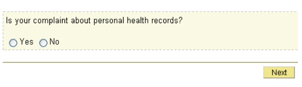
This recast of an instruction or advisory notice as a question is a handy trick, because it acknowledges the fact that users are in ‘form-filling mode’, disinclined to read instruction but prepared to attend to questions because, after all, that’s what forms are expected to contain.
However, the preamble can function effectively to provide context for the form, give reassurance, and set expectations – but it must be brief, and highly scannable. That is, users who glance at it should be able to pick up the key words and concepts.
To make the preamble easy to scan:
- Make it as brief as possible
- Use bullet points if appropriate
- Use very short sentences
- Place important words first, so that users who don’t read the entire length (and many won’t) can still gather meaning.
Questions
If users will frequently skip the preamble, they are at least likely to attend to the questions the form asks.
Before we consider how to write good questions, let’s think about how people answer questions in general.
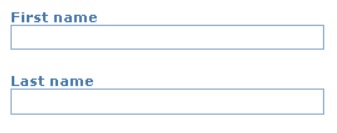
For some questions, we have ready-made, predefined answers (name, date of birth). For others we may need to look up the answers, but they’re simple and, hopefully, expected (credit card number, expiry date). In some cases, questions are more complex, and we will have to actively retrieve the information (your taxable income for the last financial year), or even create an answer (your attitude to a proposed product or service).
For simple, common, expected questions, a very brief prompt is appropriate.
Once questions become more complex, or open to misinterpretation, or in some way unusual, a more fleshed-out question, perhaps with explanatory text, may be appropriate.
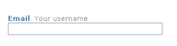
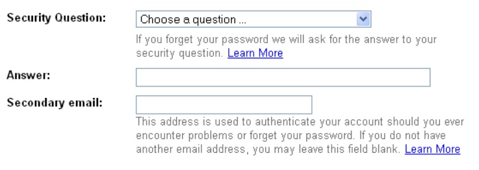
In the example below, for example, the user is asked for an email address, but since this will also be the ‘username’, an additional prompt is added to explain this usage.
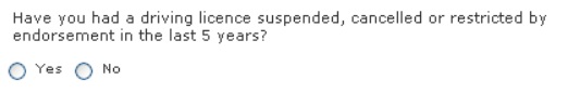
In this next example, the complexity of the information requested requires a more fully elaborated question.
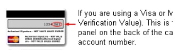
In this final example a graphic helps people find the Credit Card Verification number.
Jargon
Unnecessary jargon is the enemy of communication. Of course it’s a problem in any text, but in some cases there is enough context to figure out what it means.
In forms, unnecessary jargon can be particularly problematic because the jargon often exists in isolation.
Weeding out unnecessary jargon is often surprisingly tricky, but if you want users to be able to complete forms without undue effort, it’s worth the time.
Consistent language
Like jargon, inconsistent language can be insidious. It’s important to use only one term to describe any one item, and also to avoid overly similar terms which may cause confusion.
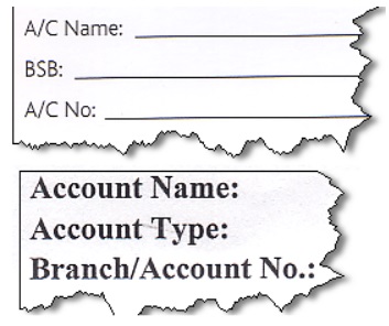
Be consistent not only within an individual form, but between the form and any other material. For example, one Australian bank uses the terms ‘BSB’ and ‘A/C Name’ on one form, but ‘Branch’ and ‘Account name’ (referring the same things) on another. People familiar with the banking industry may think “so what?” – but such apparently trivial differences are a great cause of confusion for many.
Ambiguity
Ambiguous terms and words are often surprisingly difficult to spot. Usability testing is the best way to uncover them.
When you’re writing questions or prompts, try to consider whether any of the words or terms you are using are dependent on context, or may have different meanings for different user groups. For example, an employment site had a field called ‘Employer search’ , but usability testing showed this was a poor choice, as it could mean ‘the search that employers use’ or ‘search for an employer’.
Information where it’s needed
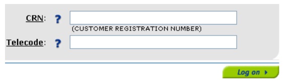
When writing any text for a form, place where it will actually be used or needed. Don’t expect anything approaching a ‘normal’ reading pattern. Users will typically focus only on the questions they need to answer. If there’s supplementary information about a question, try to place it next to that question. This is frequently a challenge, but a partial solution is to have an extremely brief description with a link to further detail, as shown in the example below.
A similar approach can also be used if you’re asking questions at which users might balk. Explaining, for example, that asking for a person’s age is a legal requirement, or pointing out that residential address is necessary to confirm credit card details, can help overcome reluctance to provide such information.
Usability testing
No matter how much effort you expend in designing a form, its problems will only become apparent when it’s being used. The best time to uncover problems is, of course, prior to release.
Usability testing involves having a representative user attempt to complete the form. Ideally, you should test with four to six users.
Usability testing of forms can be very simple – you can test paper versions, or make interactive mock-ups (for example, using a tool like Axure).
Usability testing is fundamental to good forms design. Consider it a non-negotiable requirement.
If you haven’t done usability testing before, working on a form may be the ideal introduction.
Conclusion
Keep in mind the three layers; relationship, conversation and appearance. This is a useful and practical model.
Write with great care, being ruthlessly brief, using the user’s language, assisting them to understand your questions, and avoiding ambiguity.
Conduct usability testing to uncover the problems that will simply not be apparent to you (and your colleagues).
This article originally appeared in June 2009 in Southern Communicator (the Australia and New Zealand Journal of Technical Communication), a joint publication of the Technical Communicators Association of New Zealand and the Australian Society for Technical Communication.