 Records are crucial for government. Neil MacGregor, in his radio series A history of the world in 100 objects chose a government record – a Mesopotamian clay tablet – to describe the origin of writing, and explained that writing was invented because good administration required good records.
Move forward 6,000 years and records have not gone away. It’s difficult to imagine how government could work without them: collecting revenue, distributing benefits, administering policy. But these days, we rely mostly on forms to collect the information.
January 2010 saw an event that attracted less media interest than the launch of McGregor’s series, but has considerably more importance for those of us who work in UK government. The LSE Public Policy Group and Oxford Internet Institute, supported by the Institute for Government, held a seminar to launch its guide and online toolkit for Improving Government Communication with their customers.
The new toolkit has been developed from their previous checklist Improving and reviewing Government forms: a practical guide, available on paper, that grew out of the 2003 report Difficult Forms: how government agencies interact with citizens.
What is in the forms assessment toolkit?
The online toolkit “allows rating paper and online forms as well as phone-based forms. It automatically calculates the difficulty score for a form and allows comparison with the difficulty scores of other forms”.
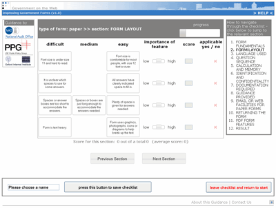
The idea is that you, as the owner of a government form, will work through the checklist [sic: sometimes it is a toolkit and other times it is a checklist] that: “allows comparison with the difficulty scores of other forms to identify whether your form is difficult or not – compared to other forms”. The toolkit is organised into 11 pages of questions of varying length, with a final page for the result. The pages are laid out in a consistent and tidy way, as shown in Figure 1.
Who might use this toolkit?
In line with best practice in assessing a form (Jarrett, C. and Gaffney, G, Forms that work: Designing web forms for Usability, Morgan Kaufmann/Elsevier), my first step was to think about a typical person who might use it and whether that person might have a different reaction from my own.
My envisaged user is Rachel, a busy web manager in a district council. She spent quite a lot of 2009 dealing with urgent matters that arose from the merger of her previous council into the current one. Now she’s been given the job of leading an initiative to ‘sort out that housing benefit form’. Their current form is only available on paper and everyone knows it isn’t the easiest form to fill in.
Rachel wants to know:
- Hints and tips for moving a paper-only form onto the web
- Whether there are any design standards for her to follow
- What other councils have done so that she can learn from them
- How best to go about tackling this problem.
Who else might want to use a forms assessment toolkit in local government? I thought of:
- Senior managers, who might want to know how their authority is performing compared to others, or how to set priorities for their teams’ work on forms
- Policy staff, who might want to know how to clarify and improve an individual form
- Managers of customer service staff, who might want to know how to save costs by reducing the requirement for helping customers with difficult forms.
The toolkit itself says that the toolkit is aimed at central government: “officials who have direct responsibility for reviewing how their organization seeks information from customers or citizens by means of paper forms, online applications or via call centres”. And also: “We hope that it may also be useful to other parts of the public sector, especially local authorities and NHS bodies”.
Users’ introduction to the toolkit is confusing
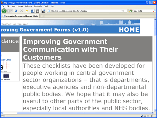
So, back to Rachel and her housing benefit application.Clicking on the toolkit brings her to the instruction page (Figure 2). Let’s hope that Rachel has a large monitor on her desk: at a standard 1024 x 768 monitor resolution, the text doesn’t fit on the page. The choice of light grey text on a white background is also unfortunate. Scrolling the page to the right, and using the ‘zoom’ a few times to increase the font size makes it more legible (Figure 3). That’s good practice.
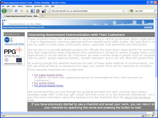
The first instruction page is 218 words: a little long for a preamble, but not excessively.
Rachel’s form is currently on paper, so the option ‘for paper-based forms’ seems appropriate. Disappointingly, this brings another 400 words of instruction. It appears that she needs to work through the whole toolkit twice:
Step one: to “determine for each question whether in its current form it would be difficult, intermediate (where this is applicable), or easy for your customers to answer.”
Step two: to “Use the Importance slide tool to assign a low, medium or high value for each feature depending on the form and the group of customers it is relevant for. Again, you may be able to draw on your own research and feedback processes on your customers’ requirements”.
At this stage, it is not clear whether ‘each question’ means each question on the 28 pages of the Housing Benefit form, or ‘each question’ in the toolkit. Surely customers would be answering questions on the Housing Benefit form? But Rachel is looking at questions on the toolkit.
The use of the ‘Importance’ tool is also confusing. It appears to be up to Rachel to decide whether a ‘feature’ (is that the same as a question on the toolkit? or something else?) has a ‘high value’ for ‘the group of customers it is relevant for’. Is that the relevance of Housing Benefit for people on low incomes? Or the relevance of the items on the toolkit to them? Or does ‘customers’ requirements mean that we are thinking about Rachel’s stakeholders?
Fortunately, in Step 3 the toolkit calculates a difficulty score for you for each section, and in Step 4 it puts them all together. It seems that high scores indicate difficulty; low scores do not.
The ‘Form Fundamentals’ section is inaccurate and unhelpful
We move on to the first toolkit page (Figure 4). Let’s ignore the problem that this page definitely does not fit on a 1024×768 monitor.
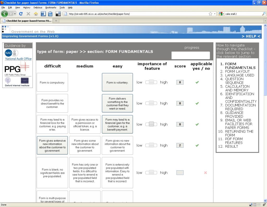
The page offers a series of questions about the overall purpose of the form and its impact on the customer: excellent idea.
The questions themselves and their difficulty scores: very odd indeed.
The customers for housing benefit are on low incomes and really need the money. How do we answer the first question, which offers a choice between “Form is compulsory” and “Form is voluntary”? If they want the money that they are entitled to, they have to tackle the form: there is no other way to get it. But there is no legal obligation to fill in the form, so how could it be described as ‘compulsory’? So it appears we have to answer ‘voluntary’, for the lowest difficulty score.
Similarly: the customer needs the money, and the form leads to a financial gain for the customer. So the next two questions count as ‘easy’ and our form so far has a zero difficulty score.
Living on a low income is no joke; housing benefit is no luxury. Yet this toolkit almost appears to think that a barrier between the citizen and the help to which they are entitled is defined to be ‘easy’.
And even if we simply change the answers to acknowledge the massive importance of this form to the claimant: what can Rachel do about it? The law is the law and she has no power to remove the requirement to fill in the form. So the start of this toolkit is both inaccurate and unhelpful.
Long forms can be daunting for users
‘Form fundamentals’ has 12 lines altogether. Why does it devote three of them to the same problem, length of the form? Bulky forms get that way because they have a large number of questions; guidance packs get that way because they need to explain a large number of questions.
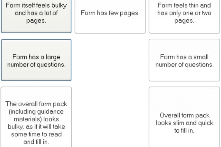
A typical housing benefit form might have 28 pages, of which 25 are the questions. How important is the sheer length to our person living on a low income? I think we have to say “high” – those forms are daunting. So we collect 9 difficulty points – but what is Rachel meant to do about that?
The ‘Help’ section is not very helpful
Perhaps at this point, Rachel also wonders what the toolkit will advise her to do – so she clicks ‘Help’.
Disappointingly, the top of the page that appears simply repeats the instructions that we have seen already. But beyond that, there are some ‘Further details’:
“When working through the checklists [sic], you will be asked to rate whether a feature of your current form could be seen by the customers completing it as ‘difficult’, ‘intermediate’ or ‘easy’. We have given some indicative reasons to help you make this rating. You should base your judgements on customer feedback. On some forms (including phone scripts and online forms) particular features cannot be avoided, and we are not saying that ‘difficult’ features should be cut if they are necessary. However, it is very important to keep the number of difficult features as low as is absolutely necessary, and to consider if any can be converted into easier to use features. Some of the features included in the questions can be more easily changed than others. It is fairly straightforward to alter the language used in questions, to ask questions in accessible ways and improve the kind of phone-based or web help that is available to customers.”
The authors’ claim that it is ‘fairly straightforward to alter the language used in questions’ is only half correct. Yes indeed, it is easy to change the wording of a question. Getting that new wording signed off by the policy or legal people: well, that’s another problem entirely. And what is Rachel meant to change the wording to? Where is her inspiration to come from?
The difficulty score needs to offer more guidance
The ‘Form Fundamentals’ section comprises 84 questions in all, and from many of them it is possible to infer appropriate advice, for example:
- Use a legible font size
- Write to the customer as ‘you’ (not ‘the applicant’)
- Deal with common circumstances before rare ones
- Include a prominent phone number for help.
The final output is a difficulty score for each section, and then an overall difficulty score. This gives you a broad indication of which of the 11 sections is giving you the most cause for concern. This summary would be much more useful if it contained a list of the points where your self-assessment has identified difficulties –and perhaps it might even be encouraging if it noted that some of the 84 items were successes.
Usability testing the form would be far more valuable
The most worrying part of the whole exercise, however, is the lack of emphasis on actual research. There are a couple of brief references in the help, for example: “You should base your judgements on customer feedback.”
That’s all. No advice about the merits of different sorts of feedback. Nothing to tell Rachel that a few hours of usability testing – watching claimants trying to fill in her form – will give her far more insights about what really gives customers difficulties with the form than this toolkit ever will. No suggestion to do some forms investigation: look at some filled-in forms as they are dealt with, to find out what errors customers are making.
The toolkit is a missed opportunity
As a forms specialist, I am always pleased to see anything that encourages forms owners, and especially the owners of government forms, to work on improving them. This toolkit, despite all its problems, at least has the merit of suggesting that forms owners think about how to make their forms easier to use. The disappointing part is that the advice is so poorly thought out, and relies so much on the form owner’s subjective judgement rather than actual research.
Photo of Shire Hall by Elliott Brown, creative commons licence
#forms #formsthatworl