 A concerned designer wrote to me: ‘Our forms are laid out in a single vertical column. A new project manager is pushing to get the forms for a new product to ‘look different from other products’ by requesting a two column layout. This means the user would go down, say 7 fields in a left-hand column, then back up to the top and down another 7 fields in a right-hand column. My instinct is to resist this but I can’t give any solid reasons why’.
Short answer: Your instinct is correct. Don’t do two-column forms.
Slightly longer (and mildly facetious answer): I’m assuming that we’re talking web forms here? If so, the answer is that it’s perfectly OK to use a two-column layout … if you don’t mind that users will frequently fail to notice the second column altogether with consequential confusion and annoyance.
And here are some reasons.
Two-column forms are confusing
If you have a one-column form (the usual type), then the reading order is straightforward: down the column.
If you have a two-column form, then think about what happens when you’ve dealt with the first question. Should you then move across the page horizontally, filling in questions row by row? Or should you work down the page vertically for the first column, and then go back up to tackle the second column? Can’t say without looking at your specific form. Sometimes, can’t say even when I do look at your specific form. It’s very easy for the user to be confused. And I think we agree that confusing our users is a Bad Idea.
Two-column forms are hard to do well on paper
These days, we’re all mostly looking at web forms. But I’d like you to think for a moment about paper forms.
It’s quite hard to do two-column layout in print, but at least in print people see the page as a whole. If you have an extremely clear gutter (space between the columns) then that sorts out some of the confusion: users can see that they are supposed to work down the left column, then go back up and work down the right column. Even so, it’s a high-risk strategy. Some people will miss the second column.
Two-column forms are best avoided on the web
On the web, users are much, much more likely to stick like glue to the single column and fail to notice the other column.
When testing, I’ve observed that participants frequently fail to notice anything in the right-hand column. Just the other day, one of them explained it to me: ‘Well, I just always blank the right column. I think of anything there as being an ad or not relevant.’
If you have a really good, clear gutter so that the reading order is clear (as on paper) then you actually increase the problem because the right column looks more distinctive.
But if you don’t have a good, clear gutter then you have a confused reading order. Some people will then notice the right column and go there first. Others won’t and will work straight down. It’s a mess.
Two-column forms can create accessibility problems
And finally (if you’re not yet completely convinced), two-column layouts can be especially tricky for accessibility. It’s not all that clear what happens when screen readers hit them. The screen reader doesn’t see any gutter… bingo, we have a confused reading order. And if you’re using a screen magnifier, you will definitely blank that right column. And if you have a reading difficulty, then two-column layouts just add to it.
And three-column forms?
So what do I think about three-column forms? Do you really need to ask? Go on, have a guess!
This article first appeared in Usability News, 1 March 2006
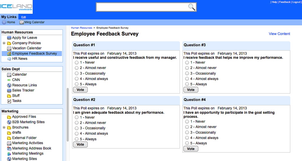
Picture of intranet survey by Noodle Vialect, creative commons
#forms #formsthatwork