 Which usability changes make the biggest difference? Invited by LoanBright to review their forms, we were surprised by some of the results. Among the changes we tested – layout, wording of questions, addition of extra pages – the only one to make a significant difference was re-working the introduction to the form. In this case study, first delivered to the Usability Professionals’ Association Conference in Minneapolis, US, LoanBright’s Christopher Minott and I describe the process and results.
Background
LoanBright is a web business that finds customers for mortgage providers and offers a range of tools to help mortgage providers manage their sales process.
The basic flow is:
- user arrives at a form by clicking on an advertisement (generally, low conversion) or sponsored link from a search engine (generally, much higher conversion)
- user provides a selection of information about the mortgage they want and some personal details
- when the form is submitted, the mortgage quote finder send the information to some appropriate mortgage providers
- the mortgage providers bid for the business
- the mortgage rate quote finder selects the best four providers and displays them to the user.
The business is funded by the fees paid by the mortgage providers for the leads that they receive.
The marketplace is especially competitive. Respectable web businesses are fighting it out with traditional financial institutions that are moving to the web, and there is also a nasty presence of spammers.
A key business measurement is the ‘conversion rate’: the percentage of users who complete a form (to the ‘submit’ or ‘send’ button) compared to those who arrive at it. It is the inverse of ‘drop out rate’.
The problem
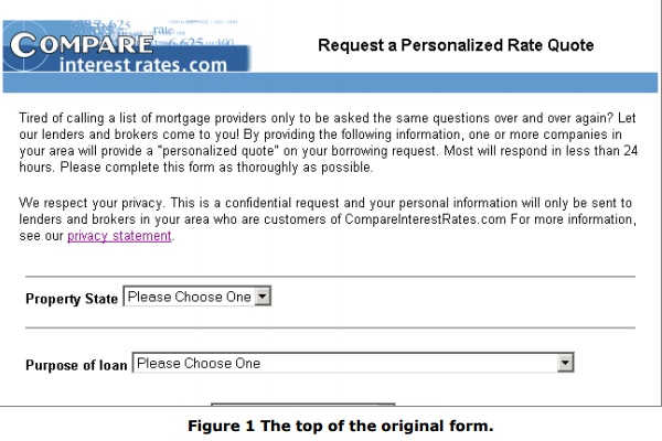
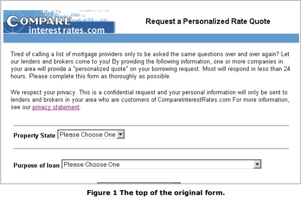
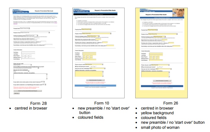
Loanbright’s form, shown in Figure 1 below, had done good service for several years but the feeling within Loanbright was that it was looking old-fashioned and might be inefficient. (They have a variety of forms with minor variations, but this one is representative).
Also, some competitors used photos of people and/or property and they wondered whether these might create a more attractive or engaging appearance, resulting in a higher conversion rate.
Method phase 1: expert inspection
Because there were some differences of opinion about which changes would have the greatest effect, Loanbright decided to start with an expert inspection from Caroline Jarrett of Effortmark Ltd.
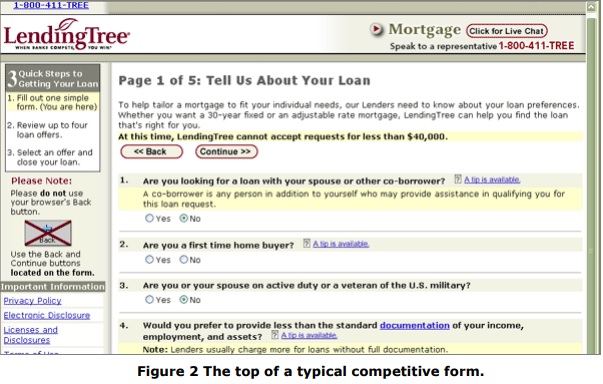
She reviewed their form, and those of seven competitors. This was feasible because all of these forms are fairly short, typically three or four screenfuls of questions. Figure 2 shows a typical competitor’s form.
This was an ordinary expert review, and is included here as background for the second phase.
Results phase 1: expert inspection
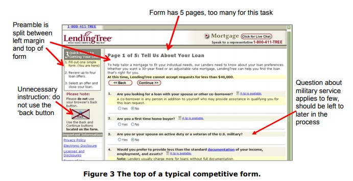
Expert inspection of the form and of competitive forms showed that the Loanbright form was one of the best available. Typical faults of competitor’s forms included:
- nothing to show how much work was required
- too many questions asked compared to purpose of the form
- questions with confusing wording
- questions asking for personal data without justifying why it was required
- excessively crowded screens.
For example, Figure 3 points out a few of the faults of one of the competitive forms.
The Loanbright form had many good points:
- a single-paged form, approximately three screenfuls at 800 x 600 resolution
- spacious layout with simple dividers between sections
- ‘sensible’ appearance without gimmicks
- most questions had clear and obvious wording
However, there were points where the Loanbright form could be improved:
1. ‘wall of words’ preamble: some of the words are unnecessary, and the presentation as a solid block of text is uninviting
2. nothing to indicate that the organisation behind the form is a respectable business (no ‘about us’ or ‘contact us’).
3. colour scheme might be seen as dull or unattractive
4. the question “have you ever had a bankruptcy?” (a question about credit history is a standard item on these forms) did not offer a choice for ‘never’ instead, the user had to pick ‘none / bankruptcy over 7 years ago’
5. some other minor changes to wording.
Loanbright decided to address point 4 immediately, so we have no data on whether they are significant changes or merely minor good ideas. Point 6 was left aside for the future.
Method phase 2: comparative testing
These forms are reached through advertising or after using a search engine, so they are spur of the moment, rather than a planned destination. Financial and organisational constraints meant that traditional usability testing with users was not practical. Fortunately, LoanBright was willing to try a selection of form
variants on the live service.
As we had complete control over how forms were served to users, we elected to create many different versions of the form with a variety of changes made in each version. These forms were served to a randomised, balanced stream of traffic so that each version was seen by directly comparable audiences.
There was no observation of users or indeed any contact with them other than their interaction with whatever form was served. We therefore have no qualitative data about why one variant worked better, or worse, than another variant.
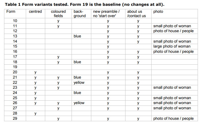
The forms we tested had combinations of these variations:
1. Centered in the browser window / left justified in the browser window
2. Coloured backgrounds in fields / plain (white) backgrounds in fields
3. Blue background behind form / yellow background behind form / plain (white) background
4. Reworked preamble / reworked preamble and links for “About us” and “contact us links” / original preamble
5. Small photo of woman / large photo of woman / photo of house and people / no photo
Figure 4 shows three of the variants tested.
We put together the variants and started testing, then we drew up Table 1 (below) showing all the variants tested. At that point, we noticed that it would have been better:
- to test more forms with the old preamble
- to test more than one variant with the new preamble but no ‘about us/contact us’ links
- to include some forms with a photo and the old preamble.
As the testing had already started, we decided to continue with the variants we had already prepared rather than adding any extra variants.
 Results
A preliminary test with a very poor stream of traffic (typical conversion rate around 1%) showed that the variants were comparable or better than the original form. LoanBright therefore decided to expose the variants to a better stream of traffic, this time with anticipated conversion rate around 5%.
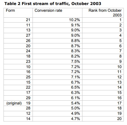
During the month of October 2003, the average conversion rate of all the variants was 7.3%, adding 2.5% to the conversion rates and therefore 33% better. This was encouraging and in itself justified the work of producing the variants.
However, as Table 2 shows, we had difficulty working out which changes gave the best results. Three of the new variants were actually slightly worse than the original. It was also hard to map rank in Table 2 to any of the groups of changes.
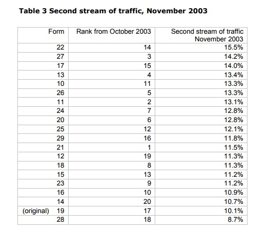
As the average improvement was good, LoanBright decided to try the variants on a better stream of traffic (typical conversion rates around 10%) during November to see whether the improvement was maintained.
We were pleased that the average conversion rate again improved by 2.5%. Table 3 was also difficult to interpret, as forms that had previously done well dropped in the rankings and others rose.
We decided that the next step needed to be some statistical analysis. We used Michael Hughes’s Usability Data Analyzer (1) to compare forms with a specific change to the others without that change.
New preamble is better
The first analysis was to compare variants with the original preamble (references 19 and 28) with variants with the new preamble (all the others). Again, in hindsight it was a pity that we only had two of one type and 18 of the others. Both tests, October and November, showed a significant difference (p= 0.047 October, p=0.006 November) between the conversion rates for the variants with the original preamble and with the new preamble.
No significant differences for any other changes
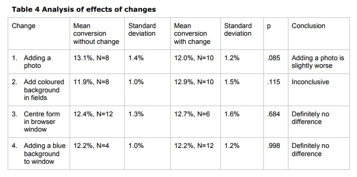
From this point, we assumed that the new preamble was definitely better so the remaining tests excluded the two forms with the old preamble. Table 4 gives our analysis of the effects of four changes:
1. Adding a photo (we did not distinguish between type of photo or size of photo, due to small sample sizes)
2. Adding coloured backgrounds to fields
3. Centering the form in the browser window
4. Adding a blue background to the window.
Conclusions and speculation
We conclude from this study that:
- a clear, short, neatly arranged statement of the purpose of the form in the preamble is better than similar but longer information presented as two blocks of text
- tinkering with a design that is reasonably tidy and organised in the first place is unlikely to make a major difference to the success of a form.
We also speculate that offering variants of the same form with minor visual changes may in itself increase conversion rates, simply because potential users are being presented with something a little different each time.
References
1. Michael Hughes “The Usability Data Analyzer” available for download at http://www.mindspring.com/~mikehughes.
#forms #formsthatwork