This presentation, co-authored with Whitney Quesenbery, Ian Roddis, Viki Stirling and Sarah Allen, was delivered at UPA 2008 – The Many Faces of User Experience June 16-20, 2008, Baltimore, Maryland, USA
Exploring the way search affects usability of a site
Some say “Search represents a failure of navigation”. This case-study challenges that idea: an intensive analysis of a large university website, comparing data from search logs, site traffic, comparative inspection of search algorithms, and usability testing (in-person, with eye-tracking, and remote). The result is a view of search as part of user experience, and how the site design can work with this reality.
Our goal was to understand how search – and user search behaviours – affects the usability of the site, and what we can do to factor search into the design.
The Open University’s website
The Open University is a large institution, dedicated solely to distance learning. Its website serves as its key marketing tool; as a source of materials and support for students; and as a show case and research home for its many academics.
We focused primarily on the parts of the site that provide general information about the University and detailed information about courses and programmes of study. These areas are used by general visitors and people considering higher education at the university (enquirers). They are also visited frequently by current students (over 200,000 of them), tutors, academic faculty, and staff.
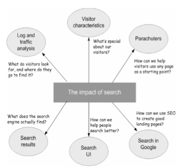
What we did
 We were able to draw on a substantial body of user research with both students and enquirers, including a set of personas.
Over a period of a year, several different usability and user research projects looked at how search contributed to the user experience. Our techniques included analytics, heuristic reviews, remote testing and in-person usability testing. Looking for insights into the impact of search, we combined information from several different sources, as we:
- analysed search logs from internal and external search, including logs from earlier years
- analysed several months’ site tracking data
- ran a review to compare search results from different search algorithms and search engine “tuning”
- performed usability tests: in-person with eye tracking; and remotely using a panel of participants with disabilities
- worked with the Search Engine Optimization (SEO) team to understand how the university pages look to external search engines.
Who are the visitors to the Open University website?
The majority of students are resident within the UK, with a substantial minority in Europe. A few courses are available worldwide. Also, distance learning attracts people who cannot attend a fixed location consistently, such as people with disabilities or caring responsibilities, people who travel a lot for work, members of the Armed Forces, and prisoners.
Completing an Open University degree is a long process. A big majority of students have full-time jobs; studying in their spare time, it typically takes six years to obtain a degree. And enquirers can take just as long to make up their minds to sign up, as they progress from a vague feeling that they might ‘do some studying some day’ through to making their specific choices from over 600 courses that can count towards over 200 qualifications.
What information do visitors search for?
As part of our standard opening interview for any user interview or usability test, we ask what information the participants want first in considering a university course. Despite their diversity as people, enquirers’ initial concerns are remarkably consistent:
- Can I study (my subject)?
- What does it cost?
- What qualification will I earn, and how will this help me in my job or career?
- Where do I go to take this course?
- Can I study part time, while working?
Students and enquirers who are close to signing up have an overlapping range of concerns. They know that the OU offers their subject by distance learning, but frequently revisit to recheck their decisions and future options, the cost, and the qualifications they can earn.
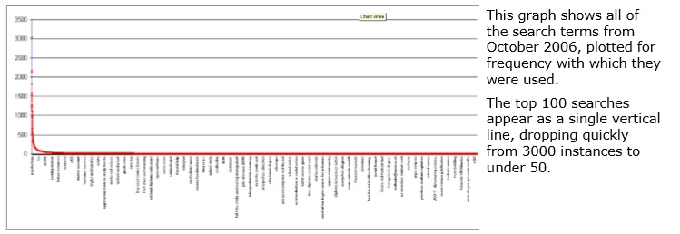
Sharp peak, long tail, persistent themes
If these questions are really ‘top of mind’, we expected to see them in browsing patterns and used to search. The search logs were an obvious choice for the next round of analysis.
And we found the same pattern of overlapping concerns. The queries on the internal search engine follow the classic pattern of ‘sharp peak, long tail, persistent themes’:
- A small number of terms are extremely popular;
- There is a very large number of infrequently used terms;
- Even in the tail, the themes of the top few terms persist.
This pattern is consistent across the whole set of data, over time, and within themes at greater levels of detail. The chart below shows the ‘sharp peak, long tail’ pattern.
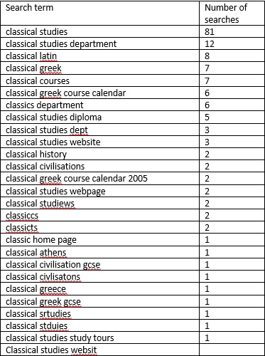
Looking in detail at just the terms starting with ‘classical’ illustrates some further points that hold true across all the terms that users search on:
- There are always occasional specialist searches that are highly targeted (“classics reading listhomer”), but
- The most popular search terms capture the main themes that users search for (the subject, the department, qualifications, course calendars, and the course website)
- Less-popular terms are mostly variations on those themes, frequently misspellings of them (“classicts”).
The implication is that it is worth working hard to deliver good results for the top few terms, as these affect searches throughout the list.
Search terms starting with ‘classical’ (and variations)
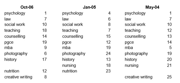
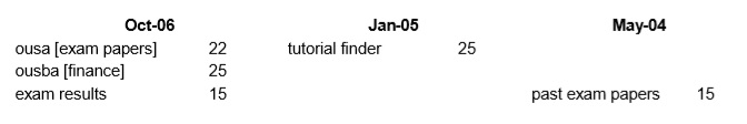
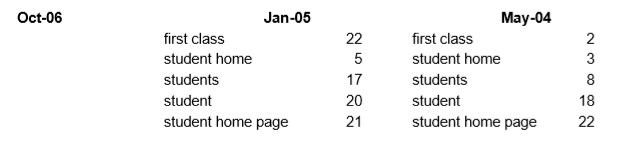
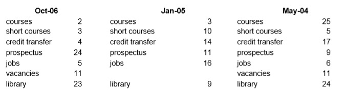
Top searches persist from month to month. Because the top few searches are so important, we investigated them in detail in May 2004 and then revisited that analysis in January 05 and October 06.
We found that the top 25 search terms are remarkably consistent from year to year and month to month. All terms are shown with their ranking for that particular month.
Top of the list we found a selection of subjects that appear consistently in the top 25, or hover close to it. Some misspellings of ‘psychology’ make the top 100.
Search terms also suggested seasonal topics tied to the academic year. October and May are exam months; in January, the majority of courses are gearing up for their February start. Links to this information could be placed on the home page when relevant.
Some highly rated search terms suggested places where the navigation and information architecture needed to be fixed. Access to the online course environment is a critical part of the study experience, but large numbers searches for “student home page” (and related terms) suggested that students had trouble finding the links to sign in to their personal pages. A more visible link (and ultimately moving the sign-in form to the home page) dropped these searches out of the top hits completely.
This analysis was helpful in understanding what people were looking for on the OU site. It also allowed us to use the data in several ways. For example, looking at other terms that appear frequently in the top 25 created some interesting design discussion. Should ‘jobs’ be promoted from its current location in the home page footer? Does it matter that some people search for ‘courses’ rather than clicking on ‘Study at the OU’? And are we catering appropriately for people searching for ‘credit transfer’, that is people who have completed some university study and now wish to transfer to or resume study with the OU?
Finally, with many queries containing just one or two words, it was difficult to tell which of many aspects of the topic they were interested in. For example, a visitor who enters ‘psychology’ might be looking for a course (at any level), a qualification, a faculty, research material, or careers advice.
This could not be resolved by the search engine alone, but by a combination of optimisation of the internal search engine and improvements to the information architecture.
What are “good search results”?
This led us to consider the question of how we should define a “good” search result. Until we answered this question, we could not make effective recommendations to improve the search.
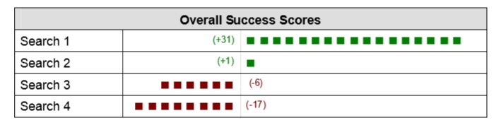
To explore this question, we ran a comparative heuristic review of four different search configurations (two different search engines, two different weightings for one engine, and a federated search approach). We used a set of the top 25 search terms. We wanted to understand the range of results they might return, and see how well they supported the goal: to provide information about the breadth of information available on the site, and place the most relevant results at the top of the list.
There was more variation in the results list than we expected. For example, when we searched for ‘jobs’, one engine just gave us a management course that talked about job design – as all of its top 10 results. Another engine found the overall jobs site, a variety of faculty-specific jobs sites, careers advice, and the same management course.
Some of these problems were caused by the web pages in the index (which included little metadata, some duplicated pages, and poor descriptions). We scored the results of each search on a scale from +3 to -3, and then totalled scores for each query.
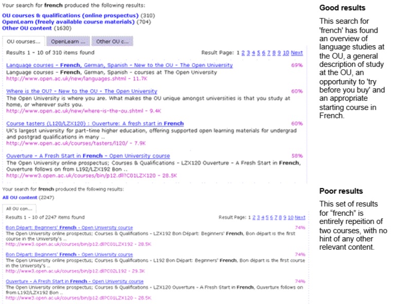
We gave positive marks for search results that had items from different areas of the university and included:
- A high-quality result appearing at the top of the list
- All of the links on the first page being appropriate results
- Links that address alternative meanings of the search term
- Links that reflected a variety of results, linking to more than one OU site (when appropriate)
- For subjects, at least one appropriate course appearing in the list and at least one appropriate qualification.
We marked results down for:
- Repetition of links, especially when there were an excessive number
- A link that required a sign-in (especially for the public collections)
- The inclusion of links that seemed to have no relevance
- Links with poor titles or descriptions.
One search engine did significantly better than the others.
How do visitors read the pages on the site?
We had access to traffic analysis, using a program called Site Intelligence. This program can identify repeat visitors, and is able to distinguish between general visitors and those who are signed in to the site (a clear identification of students, staff or faculty, though the reverse is not necessarily true). This data provided an aggregated view of site users, including differences between “single visit visitors” and “multi-visit visitors”, the number of pages they viewed, and dwell times.
One of the most striking differences between these university site visitors and the picture we see from more general web traffic is the dwell times: OU visitors stay on a page longer, and their visits are longer, than is typically reported on general websites.
As an example of our analysis: A typical task might be: “Decide on my program of study for the next three to six years”. We see this task broken into multiple repeat visits, and we see long visit times for each visit (a typical visit is between 10 minutes and 30 minutes).
There are two possible explanations of long visits:
- Flailing around the site, as users try to hunt down the content that they want (high levels of pages visited)
- Reading the pages, as users concentrate on single pages (relatively few pages for a long time each).
Site visit analysis shows that this site has typical page visit times of over a minute. If you allow three clicks to get to a content page, and a generous 10 seconds on each click, that gives you 3 minutes 30 seconds on the actual content: far in excess of a ‘skim and scan’ reading pattern.
This aligns with our observations in usability tests. When visitors get to content pages on this site, they stop and read intently.
A broad conclusion is that on this site, at least, people do read on the web. We’ve often heard a lot about people skimming and scanning their way through web pages. And we observe that behaviour on this site, too. But only on certain pages: those that Ginny Redish would characterise as ‘scan, select, and move on’.
This helped us decide that long pages were an appropriate solution for material such as course descriptions, as long has we had good signposting at the top of the page.
We also used this information as part of an analysis of the layout and content of the pages. By looking at the different search terms that led to a page, we could infer a task or question. This task could then be used to ensure that key information was easily visible at the top of the page, supporting users in quickly grabbing the details they needed, and in establishing that they were on the correct page, for further reading.
Where do visitors go?
We also had rich data on where visitors go, especially traffic to and from major sections of the site, and were able to use this analysis to show how well each part of the site is doing in helping visitors make connections between different information. We created analysis sheets showing the traffic to and from each of the primary portals.
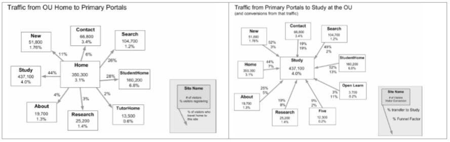
Much of this data was primarily useful in analysing the effectiveness of the site as a marketing tool. But it also revealed a number of interesting data “tidbits” that we could use to help shape the design. For example:
- Some sites were particularly effective in referring visitors to the course catalogue. We looked at their design to see if there were any aspects of their pages which could be generalised to other sites.
- Some sites were “islands” with few cross links. In some cases, this was expected, but where it was not, we wanted to know why.
We particularly noticed that there were poor connections between the course catalogue, the faculty or department websites, and some subject-specific sites, such as “course tasters”. We could see visitors entering the site from each of these locations, but rarely making connections between them. This was particularly worrying when we considered visitors looking for information about courses offered at the university, and creating better connective links became one goal for an update of the online prospectus.
What happens when visitors “parachute” in?
One of the surprising patterns is that much of the searching shows clear evidence of ‘jump search’ – using the search box as a convenient shortcut to known content; for example, about 10% of searches are looking for a course by its code number.
But is that pattern consistent across external search? External search is a major source of traffic to the Open University’s website. In October 2006, over 396,000 visitors arrived this way, using over 120,000 search terms that resulted in over 5.5 million clicks.
Visitors ‘jump search’ to the university’s site
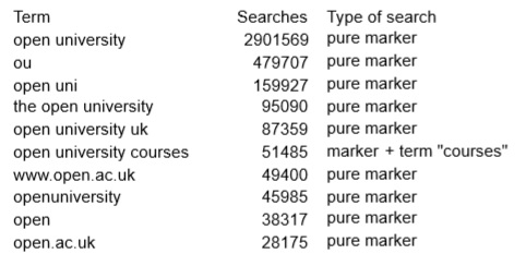
We analysed the logs of terms typed into Google that brought users to the University’s website. We found that many of these terms included something that showed users wished to arrive specifically at this site such as the name of the University. We call these ‘markers’, and characterise searches as ‘pure marker’, ‘pure term’ or a combination.
We found that 93% of terms used by external searchers include a marker, words or a short phrase indicating that the searcher was looking for the University, and an astonishing 87% are pure markers, including all but one of the top 10 searches.
Although searches without markers are only 7% of the traffic, they present the greatest opportunity of capturing new traffic: people who did not specify the University as their destination. We recommended special care of pages that are destinations for the most popular of these searches.
Visitors arrive at deep pages searches
Searches with terms are 14% of the external traffic (7% with markers, 7% without). These mostly deliver visitors to pages other than the home page: “deep pages”.
Previous usability work meant that we were confident that starting from the home page delivers a good user experience: would a user who arrived at a deep page do as well? To explore this, we chose typical tasks from a variety of types of sub-site, such as:
- a faculty site
- a site aimed at helping students improve their study skills
- a site aimed at people who might encounter the university through other media.
The university was also investing in search engine optimisation (SEO), identifying good search terms and appropriate pages for them to lead to. As part of this work, we wanted to find out whether those “SEO landing pages” were indeed good places to land. That is, did they help visitors find the information they needed, and answer their questions?
We found that good interlinking of sites does not happen by accident. Even if a site is intended to be tightly focused, it still needs to work well as a ‘corporate citizen’– and we have the eyetracking data to prove it. For example:
- Users were confused by one site which failed to offer ‘contact us’ links in the header or footer
- Faculty or department sites that focused on their internal organisation, rather than how their courses fit into university programs, caused problems for users interested in their subjects.
What helps visitors use the search results better?
As part of the usability research, we included search in the test task, or allowed participants to use the search feature if they wanted. We also tested different user interfaces for a new search feature that allows users to specify what kind of information they wanted.
Our results here were similar to those reported from other case studies:
- Good “headlines” are critical to effective scanning
- Most people select a link from the first few results found
- Advanced features are used only when a simpler approach fails
Conclusion
We started this work with the observation that search is now normal behaviour, and the question, “What do we do now?”
What we found is that this is not a simple problem that can be solved with a better search engine or by adding best bets. Instead, the answer is that support for searching has to be embedded into all aspects of the design. Our strategy for this includes:
Understand, and design for, popular searches. The sharp peak/ long tail / persistent themes pattern means that the results from the top few searches are critical.
Make search results more useful. Organise the results so that they are easier to scan, show both breadth and depth, and allow visitors to easily find areas of interest.
Use targeted metadata to support topical searches. Create a standard core of metadata terms for commonly used topics.
Improve the “searchability” of content pages. Structure content to support SEO for both internal and external searches.
Expose connections between related areas of the site. Identify destinations for popular searches that are good entry points, and provide ways to see different areas of the site related to these queries.