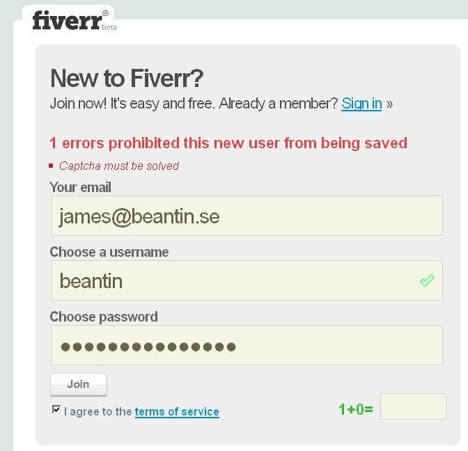
The sad thing about registration forms is that users hate them. Stick a form in front of them and they leave your site, they lie, or if they are really web-savvy they use a privacy protection service such as Bugmenot.
But organisations love them. ‘We’ll justify/protect/market/leverage this content by asking people to register for it.’
So the first line of argument is: try to avoid asking users to register at all. But I know that this is an unrealistic position. So how can we limit the damage and make the registration process as easy as possible?
Rule: explain why you’re asking
If you shove the questions at the users without any justification, they won’t be happy. Put in a very short sentence that says why you are asking them to register. Hint: the sentence ‘Click here to learn about the benefits of registering’ will NOT do, because it’s forcing yet another task between your users and their goal.
Rule: make sure you offer something that users want
The benefit that you offer for registering must be a benefit to the user, not to your organisation. Hint: ‘We’re asking you to register because our advertisers demand it’ will NOT do, because it’s no benefit to the users.
Suggestion: offer a pre-registration sample
One way of persuading users to register is to offer them some way of sampling the benefit they’ll get from registering. You could give them the top couple of paragraphs of an article, a couple of screen-shots from a demo, or a sample of the newsletter they’re subscribing to. It all helps to build trust and create a relationship.
Rule: fewer questions = better
Your users are busy people and you’re interrupting them. Be polite: keep your interruptions to a minimum. Can you restrict your process to a single question? Great, go for it. For example, if all you really need to do is assure yourself that you are dealing with adults for legal reasons, then just ask the single question: ‘Are you over 18?’.
Rule: less invasive questions = better
It’s even more important to be careful about asking invasive questions such as personal data. That’s both because users don’t like giving it to you, and because there are laws about it. Ask someone’s name and you’re into the world of privacy policies … a whole topic in itself.
Rule: ask once only
I was prompted to write about this topic because I was trying to track down an elusive news story about a tax forms designer who was suspended for putting jokes in the forms. Hmm, shall I keep it anonymous or shall I name and shame? What the heck, let’s go for naming. It turned out that the story was first published by the Middletown Journal. So off I went and I found that you can read parts of the paper online but other bits require registration. OK, I’m not thrilled about registering but tax form jokes are pretty thin on the ground and I was on a mission. And the registration form assured me that all I needed to do was register. I registered. I searched. I found an abstract of an article that looked like it might be the one I wanted. I tried to read it. Boom, another registration form. Not fair! And one that required payment – not a big payment, and I might even have shelled out if I’d been given an honest message on my first registration. But by now, I’d lost faith in the site. Another sad loss of custom caused by a bad registration form.
So my final rule is: don’t surprise people with multiple levels of registration. Be honest about what they’ll get access to – and what they won’t get access to.
This article first appeared in ‘Caroline’s Corner’, in the August 2005 edition of Usability News.
#forms #formsthatwork