This article first appeared as a chapter in Buie, E. and Murray, D., Usability in Government Systems: User Experience Design for Citizens and Public Servants, Morgan Kaufmann 2012.
“This form, this form in particular I am absolutely fine with and it is not a concern. Often I’ll actually give this form to a colleague and they will complete it. Not a problem. Other [government] forms, ohh, when they on the desk you are just thinking oh my goodness, nightmare.” Employer, interviewed in (Dowling, 2006)
Recording government transactions has a long history
If citizen and government never came into contact with each other, we would have no need to consider the user experience of transactions. But governments feel the urge to count, to make records, and to tax — and have done so for several thousand years.
Even when transactions were necessarily face to face, administrators found that it was worth recording them. One explanation of the origin of writing is that it was invented to make it easier to deal with administrative transactions; certainly, vast numbers of Mesopotamian clay tablets that still exist are administrative records.
“You’ve got a civil service here, starting to come into place in order to record what is going on. Here is very clearly the state paying some workers for some work that’s been done. They need to keep a track of the public finances, they need to know how much they have paid the workers and it needs to be fair.”
Gus O’Donnell, Cabinet Secretary and Head of the British Civil Service, comments on a clay tablet from around 3,000 BCE (BBC, 2010)
After the introduction of writing, the next crucial technological development in government transactions was the form. Instead of a free-format method of obtaining and recording information, the form offered a series of prescribed questions with specific requirements for the answers that helped to structure transactions into predictable sequences, with corresponding opportunities for increased efficiency. The exact origins of this approach are unclear, but a well-known example is the Domesday Book, compiled from a survey taken in 1086 (National Archives, 2010).
The invention of printing with moveable type offered the next technological step for transactions. Some of the earliest printed documents were forms: (Schwesinger, 2010) cites a papal indulgence printed by Gutenberg in 1445, and also includes a tax form printed in France in 1790. But the real period of growth for forms as part of government transactions was the 19th Century, and by the early 1900s forms had become the everyday artefacts with which we are familiar today — even if the format has changed somewhat.
In the 21st century, a face-to-face transaction is expensive. For example, a study found that the cost to a government agency of a face-to-face transaction was more than twice that of the same transaction conducted by phone, which was in turn more than nine times the cost of the same transaction on the web (Socitm Insight, 2011). And the cheapest of all: transferring data computer-to-computer, without involving people at all.
Government transactions can differ from other kinds of form
Much of the conventional advice about websites in general, and forms in particular, assumes that the transaction is:
- Discretionary:The user can choose whether to do it or not.
- Transitory:The length of engagement will be short.
- Competitive: The user can choose whether to do it on this website or some other website.
In contrast, a typical government transaction is:
- Compulsory: The law requires the user to engage with it.
- Lengthy: It may be complex in its own right; the transaction itself may be simple but be repeated over long periods, even lifetimes; or it may even be both of these.
- Lacking in competition: As a citizen or business person, you can choose to deal with it yourself, to pay someone else to deal with it for you, or to ignore the whole issue and risk retribution. But you cannot easily go to a different government.
There’s the old saying, “Nothing is certain but death and taxes” — and in many jurisdictions, even dying will not let you wriggle out of a tax bill.
In a business, the organisation’s size may determine who is ‘the user’
User experience is all about focusing on the person who is at the heart of the experience: the user. When we consider businesses, it is easy to be misled into thinking that you are dealing with “the business”. You are not: you are dealing with the person in that business who has to take responsibility for the transaction.
In her investigation of compulsory transactions that collect official statistics in the USA and UK, Dowling noted:
“This notion of a “forms person” is something that arose within other companies, particularly in the larger ones. When a new person starts (or is promoted / transferred) and they are directed to take over completion of a particular questionnaire, it often transpires that they end up completing all the others that come into their department. Perhaps unsurprisingly, it is a task from which people are keen to be relieved and thus is transferred to newer, often more junior, members of staff. However, this is not always the case as a few of the participants are senior managers in some of the larger companies.” (Dowling, 2006)
Bearing in mind that more than 90% of businesses are micro-businesses — i.e. have nine employees or fewer (U.S. Census Bureau, 2007) — the “forms person” nearly always has to do that work as an extra:
“And it is not my job is it? You [the government] are sending the forms and they have to be done, it is just on top of your job. And the boss certainly doesn’t see it as part of the job…forms to be filled I guess but other things are a priority in his book,” Person working in a small business (Dowling, 2006).
I was part of a team that investigated the ways in which people in micro-businesses deal with their tax responsibilities as employers. We too found that the “forms person” was struggling to find time in a busy working life to deal with these transactions, and to master the regulations and instructions that go with them. I particularly remember the woman who could keep up with the flood of materials only by reading them in bed at night.
But there is a benefit: in a micro-business, the person dealing with the forms usually has immediate access to the answers.
In contrast, in large businesses the problems are different but even more complex. Dealing with transactions is now a specific job function, but one on which whole departments work — or even share responsibility, across (for example) finance, human resources, and production.
The very largest, and most economically important, enterprises have a further challenge: how to determine where one business ends and another begins. If this large enterprise is a group, is the transaction about the group as a whole, a specific business within the group, the activities of that business that fall within this jurisdiction (particularly for international businesses), or some combination?
Medium-sized businesses may be connected in various ways with each other, or may be in business to provide services to other businesses (such as accountancy).
And that brings us back to the micro-businesses, where a number of businesses may be separate legally but in fact are operated by a common cast of individuals. This is illustrated by one of the families in “The Archers,” a long-running radio soap opera in the UK, where Tony and Pat run an organic farm with the assistance of their daughter, who sells their dairy products and vegetables in her shop, and their son, who has his own sausage business. Although their various responsibilities for the specific businesses are theoretically clear, in times of crisis they can get mixed and overlap.
The lessons here for e-government are:
- Do not assume that there is a single user.
- Allow for sharing one transaction between multiple users.
- Allow for protecting parts of a transaction from some users.
- Do not assume that all the answers are easily available.
- Provide save-and-resume features that allow information to be collected and entered into a form sporadically and in any order.
There are important considerations when government transactions involve individual citizens
When the transaction is with an individual citizen, is the picture any clearer? Possibly, but possibly not. Where private enterprise can choose to market to specific segments of the general public, government has no such choice. If the legislation requires a citizen to undertake a transaction, then some way of dealing with that citizen — or, rather, allowing that citizen to deal with government — must be found. We, or at least our parents, have to start our official lives at birth when they register that event — or possibly even before, should they be planning a home birth (Figure 2).
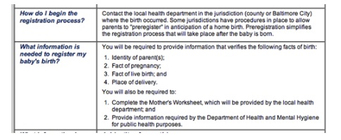
Figure 2: The transaction for registering a home birth may start before birth
An individual may be unable or unwilling to act for all sorts of reasons: too young, too old, too disabled, too disorganised, too frightened of officialdom — or too busy.
Conversely, government should not assume that an individual does prefer to have someone else act. In the UK, the Mental Capacity Act makes it very clear that simply making a foolish decision does not indicate lack of capacity.
The principles
(1) The following principles apply for the purposes of this Act.
(2) A person must be assumed to have capacity unless it is established that he lacks capacity.
(3) A person is not to be treated as unable to make a decision unless all practicable steps to help him to do so have been taken without success.
(4) A person is not to be treated as unable to make a decision merely because he makes an unwise decision.
(5) An act done, or decision made, under this Act for or on behalf of a person who lacks capacity must be done, or made, in his best interests.
(6) Before the act is done, or the decision is made, regard must be had to whether the purpose for which it is needed can be as effectively achieved in a way that is less restrictive of the person’s rights and freedom of action.
(Mental Capacity Act, 2005)
The lessons here for e-government are:
- Respect the right of the citizen to act without assistance.
- Equally, respect the right of the citizen to: ask another person to act for all or part of the transaction; have that person be informed about all of a transaction or about only specific parts of it.
- Allow for protecting parts of a transaction from some users.
- Provide mechanisms to allow information to be collected and entered into a form sporadically; do not assume that all the answers are easily available, or that the person undertaking the transaction knows the answers personally.
I’ve developed a four-part framework for thinking about any transaction
In this section, I will explain the four general considerations for transactions:
- Relationship: The combination of the government agency’s reasons for the transaction and the user’s.
- Conversation:The question-and-answer sequence that makes up the meat of a form, plus the route to finding the form and the information exchange that follows its completion.
- Appearance: The visual layout of the elements of the conversation.
- Implementation: Organising the different technological and human elements in the transaction so that they all work together, and on time.
The structure of the transaction: relationship
Every form issued by government is issued for some purpose. Similarly, citizens rarely engage with government without having some goal in mind, whether it is getting their trash collected or complying with legislation that requires them to complete a statistical survey on behalf of their business. In this section, I will discuss these key points about the structure of the transaction:
- Have you allocated the tasks appropriately?
- Are you supporting multiple channels?
- What level of online form is appropriate for this transaction?
- Are you expecting too much from your online forms project?
Have you allocated the tasks appropriately?
When the UK Inland Revenue was preparing for a major change to the personal tax system, I did a lot of observation of work in tax offices. One of the most depressing sights was watching tax officials typing tax returns into a computer – from printouts that had been printed by another computer. At that time (the early 1990s), there was no provision for online filing of tax returns. Fast-forward: by 2011, 78% of UK personal tax returns were filed online: computer to computer.
Can you organise the transaction so that people don’t have to be involved?
If people do have to be involved, they need to take six steps:
- Find the appropriate form(s).
- Work out which one(s) they have to use, and when.
- Fill out the form.
- Wait for a reply, acknowledgment or other receipt — possibly including notification of errors.
- Deal with the errors, queries, or follow-up question.
- Deal with any follow-up activity, such as paying tax due.
Notice that the form itself is only one step within the transaction, but a complex one, itself consisting of this detailed sequence:
- Understand the questions.
- Find the appropriate answers, including liaising with others.
- Perform any necessary calculations, for example to aggregate answers.
- Put the answers into the correct spaces on the form.
- If it is an electronic form, deal with any errors.
- Send the form on paper or transmit it electronically.
If people do have to be involved, you need to do these four things:
- Make it easy to understand the requirements of the transaction.
- Make it easy to find the relevant form(s) and identify the correct one.
- If calculations are involved, provide a way for a computer to do the calculation.
- Provide reassurance at the end of the transaction that it is all finished.
Are you supporting multiple channels?
Many government agencies are offering online transactions in the hope of obtaining cost savings for themselves, and possibly time or cost savings for the users.
But although access to the internet is growing rapidly everywhere, it is definitely not true that everyone has it. Even in South Korea, a country with wonderfully fast, almost universal broadband provision, 19% of its citizens did not have access to the internet in 2009 (World Bank, 2011). In the US, the ‘digital generation’ (18- to 29 year-olds) have grown up alongside the internet, yet 5% of them do not have access (PewInternet.org, 2011).
This lack of provision is unequally distributed: if you are poor, or unemployed, or disabled, or old, then you are far more likely to lack internet access (Helsper, 2008). But it is exactly those groups who have a disproportionately high level of interaction with government.
So if you cannot assume that everyone has internet access, you must assume that you will have to support multiple channels or find some other way of dealing with the inevitable exceptions. For example, Irish Tax and Customs mandates that all corporations and employers file returns and pay tax electronically, but also says:
[We] may exclude a person from the obligation to pay and file electronically, if [we] are satisfied that the person does not have the capacity to do so. In this context “capacity” is defined to mean access to the requisite technology, both hardware and software. (Irish Tax and Customs, 2011)
If you are offering an online transaction, you must also:
- Provide an offline alternative for people who do not have internet access
- Provide a way to switch between channels for those who find either online or offline difficult.
Are you allowing for rare exceptions?
One of the fascinations of government is the ‘Law of large numbers’.
This was explained to me by a project manager at a government agency. He was installing a complex system and had been assured by the vendor that the chance of a particular failure was “only one in a million”. As the project manager explained: “Of course, we had eight million users so it happened the first day”.
Let’s look at this from the point of transactions. Let’s take, for example, a compliance system: a government agency — let’s call it the Department of Oversight (DoO) — requires organisations to inform them about every instance of an activity. DoO officials will investigate some activities — those that it considers to be unusual — and will prosecute if they are revealed to be illegal. Most organisations comply with the law; unusual activity is rare, and the proportion of unusual activity that proves to be illegal is tiny. The challenge for the officials is to identify the unusual.
Organisations can choose to send in their returns of activity electronically, and most of them do: in fact, out of the annual 100 million returns, 99.9% are indeed sent electronically; leaving only 0.1% (1 in 1000) that must be sent on paper. This means that DoO receives 99,900,000 electronic submissions, and 100,000 paper submissions.
What do we know about these submissions? They are lots of electronic ones, and very few on paper. Almost we might say: “there might be something unusual about those paper submissions”. And indeed, when the officials start to investigate:
- They have to review about ten thousand electronic submissions to find an unusual one, but
- They only have to review about ten paper submissions to find an unusual one.
Table 1. Unusual activities by type of submission
| Type of submission | Number | Rate of unusual activity | Number of unusual activities reported |
| Electronic | 99,900,000 | 1 in 10,000 | 9,900 |
| Paper | 100,000 | 1 in 10 | 10,000 |
Clearly, if the officials invest at least as much time on the rare paper returns as on the vast number of electronic returns, they will reap large benefits.
What happens if DoO then decides to require organisations to send all returns electronically? Yes, it will achieve a small saving in processing time. But it now becomes much harder to identify the unusual cases.
This example illustrates a case where aiming for totally online transactions may be a step too far. Because of the Law of Large Numbers, it is far from atypical. Rare exceptions will always occur, whether for technological or practical reasons. The cost of pursuing them, and of programming systems to allow for them, may be disproportionate.
Lessons here for e-government transactions:
- Expect “rare” exceptions to happen every day
- Instead of forcing all exceptions to use an electronic route, consider offering an offline route instead.
What level of online form is appropriate for this transaction?
Online transactions can offer considerable benefits in terms of saved cost for the government agency, and increased convenience for the user. But what level of online form is appropriate for this transaction?
Ray Killam (2009) describes five levels of online forms:
- Print-on-Demand (POD). Essentially, paper forms that are made available electronically. The most familiar technology is Adobe’s PDF. Users print the form for filling in manually. The main user benefit is that the form is available immediately. The main organizational benefit is that the form does not have to be printed, stored, or sent out to the user. There is no obsolescence cost if it gets updated, and only the current version is available to the user. So POD forms save organizations a lot of money, but the user still has to print and send in the form. POD forms also have the disadvantage that the organization is likely to receive a lot of hand-written forms, which are harder to process. Despite their problems, POD forms can still be a good solution for getting forms to people who do not have their own computer but can get someone else to print out a form for them for completion later.
- Fill-and-print (F/P). These are an improvement on POD forms. The user fills the form online, then prints and sends in. There is usually a tab order, some field restrictions, some masking, and special fields such as check boxes and simple drop down selections. These forms provide the same advantages as POD, and are easier to fill out, more legible, and contain fewer errors. These forms are often a good solution where the organization requires a real signature, or the user has to attach another document that may not be electronic.
- Intelligent electronic forms (IEF). These have more intelligence such as calculations, conditional fields, logic choices, logon access, hidden fields, and help messages. They are truly online from the user’s perspective, but data collected is not integrated with enterprise applications. Many ordinary web forms fall into this category by accident: the organization has thought about how to collect the data, but not paid enough attention to what to do with it when it arrives within the organization. IEFs do work well, however, as a further improvement on F/P forms for forms with complex internal routing.
- Enterprise-enabled (EE). These employ email connections, database connections, secure access, intranet/Internet access, usage tracking, edition control, ecommerce connections, electronic signatures, and other enterprise features. They can eliminate or reduce paper from the process, improve productivity, improve customer service, and eliminate or reduce filing.
- Complete business applications (CBA). A full CBA typically employs multiple forms and sub-forms in an integrated business solution. It may have a mixture of IEF and EE forms, pulled together into a system that routes forms from the user to the different parts of the business as needed. CBAs require custom programming to build business rules and logic into the forms set. A CBA has the potential to save costs across a business, eliminating paper and duplicate keystrokes, and making sure that the data gets to the people who need it. (Killam, 2009)
Killam does not mention the drawbacks of EE (Enterprise-enabled) and CBA (Complete Business Applications) forms such as the high costs of implementation, and less resilience in the face of the inevitable cycles of change:
- Annual
- As legislation changes
- As agencies reorganise for internal or political reasons
Choosing the appropriate level of electronic form can be tricky. For example, the major benefits from CBA arise when work needs to flow around the agency, efficiently directing it in turn to each person who needs to deal with it. But one major UK government department cancelled a workflow project when we investigated and found that the work did not flow: the department was organised so efficiently that each worker dealt with his or her caseload in its entirety, apart from a tiny proportion of cases referred for technical investigation. No flow, no merit in CBA.
Lessons here for e-government transactions:
- Choose the level of online form that is appropriate to the transaction.
- Think about the costs of maintenance as well as the costs of implementation when considering the more complex types of online form.
The details of the transaction: Conversation
“I would say 70% of the form I can just fill out off the top of my head. Probably 20% I have to just work out some numbers and look things up and 10% I have to refer to other people.” Person working in a small business (Dowling, 2006).
Let’s make the assumption that you have followed the advice in the chapter on Plain Language and made sure that your questions are clear and written so that the users understand them in the same way that you do.
A government transaction is not a quiz, where users can reasonably expect to know every single one of the answers “off the top of their heads” — and if not, to give up on the transaction. Each question must be answered using one of these four strategies (Jarrett and Gaffney, 2008), presented in increasing order of burden:
Slot-in answers: The ‘top of the head’ information that most people will know without looking it up, such as their own name and address.
Gathered answers: Answers that have to be looked up and copied, or looked up and then manipulated, such as calculating total income from savings by looking up details on two of three bank accounts and adding them together .
Third-party answers: Answers that have to be referred to other people, such as obtaining a certified copy of a document to support an application.
Created answers: Answers where original thought is necessary, such as filling in a government job application that requires a statement of competency, or writing a justification for a planning application.
Burden is not necessarily a problem if the administrative benefit has been proven, but it must be understood.
Two specific areas can cause problems:
- The actual strategy that a user takes to find the answer does not match the official concept of the strategy. For example, the official form asks for a child’s name to be entered exactly as shown on a passport, but the mother writes down the child’s name according to the way she usually thinks of it. (Official strategy: gathered answer; actual strategy: slot-in answer).
- The strategies match, and the user gathers the answer or asks a third party, but does not have access to the source of the answer. For example, the official form expects the user to copy the answer from another document but the user has lost it, or has never had it in the first place.
 Lessons here for e-government transactions:
- Think about how the user will obtain the answer.
- Which strategy do you expect the person to use?
- Is there any risk that the strategy that you expect might differ from the one that will actually be used?
- Consider whether the burden of finding the answers is truly justified by the administrative benefit of having that answer.
- For third-party answers: could you ask the third party directly?
- For gathered answers: could you collect the data from the other document(s) directly and simply get the user to confirm the answers?
Making it look good: Appearance
In the early days of the web, users quickly learned that good design is expensive, and came to regard well-designed sites as more trustworthy.
“If a Web site strikes me as beautiful, I will gladly give away my credit card number – is that how it goes?
With our Swedish users, that is exactly what we experienced: users admitted to making intuitive, and rather emotional, on-the-spot decisions to trust a service provider when shopping online. A user comment included: “if it looks pleasant, I just trust it”. (Karvonen, 2000)
Since then, this research has been replicated; e.g. (Lindgaard, Dudek, Sen, Sumegi, & Noonan, 2011). If your site looks attractive and orderly, it will be perceived as easier to use — and therefore, users will approach it with a more positive attitude.
Exactly the same considerations apply to forms. An orderly form that looks airy and uncluttered will encourage your users. Crush it all together, add long paragraphs of complex notes, throw in plenty of convoluted language, and it will seem highly intimidating.
Lessons here for e-government transactions:
- Make sure that your form looks attractive.
- Avoid complex language and intimidating blocks of text.
Making it happen: Implementation
Implementing a typical, rather simple, government transaction will involve dozens of stakeholders:
- The web team
- The content people, often across different policy areas
- The staff who deal with paper forms
- The staff who deal with phone calls and face-to-face transactions
- Payment technologies and other specific services, often bought in or outsourced to a third-party service provider
- Marketing and publicity
- And maybe many more.
These different groups all have their own different points of view, responsibilities, and reporting lines. A successful transaction needs them all to work together to create a seamless and coordinated user experience.
If the groups do not coordinate, disaster can result. For example, I recall a UK tax transaction, where:
- the policy people responsible for forms decreed that incoming forms should be processed within 90 days;
- the policy people responsible for letters decreed that incoming letters should be processed within 30 days;
- the publicity people were running a major national campaign inviting the public to send in forms;
- and the staffing people had not yet got the planned level of staff in place.
The few staff available spent all their time answering letters from irate members of the public asking why their forms had not been dealt with — the letters had a shorter target than the actual forms.
Lessons here for e-government transactions:
- Consider all the different stakeholders who will be part of the implementation.
- Make sure they all have a common vision and coherent policies.
Case study: Find the form to pay a parking ticket
Although all of the different considerations are likely to apply to any particular transaction, I have chosen a case study to illustrate some selected aspects of the issues.
A small but frequent transaction: paying a parking ticket
Some people live in areas where parking tickets are irrelevant; others treat them as an everyday hazard, blithely park where they wish, and get their staff to deal with the consequences. Most of us are somewhere in the middle: we occasionally forget the time, misunderstand the rules of an unfamiliar area, or suffer some other misfortune that leads to the dreaded notice attached to our vehicle — and usually that means an encounter with an agency of local government.
For many local government agencies, parking tickets are an important source of revenue but also a contentious one as they try to balance the competing interests of residents, visitors, and businesses.
I attempted to pay a parking ticket using the websites of four UK local authorities, drawing on (Jarrett, 2011), and also found the websites relevant to parking tickets issued in Vancouver, Canada, Bethesda, Maryland, and San Francisco, California — chosen because I have visited those cities recently.
To make the transaction a little more challenging, I assumed that the parking ticket itself had been mislaid and therefore I no longer had the printed ticket.
Each site offered some good and bad experiences
It’s tempting to say that steps in a forms process are good, bad, or indifferent — but it’s a bit more complicated than that. A page might be a good page in that it is well written, has appropriate links, and an attractive design, but it might still fail because the user arrives at it with the expectation of a different page, or because the choices it offers are irrelevant to that task. A question on a form might be clearly written but still difficult to answer because the information required is not at hand, or because the choices on offer are not suitable.
This is illustrated by the steps on two websites: Montgomery County and Reading Borough Council.
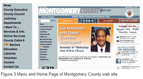 A quick search reveals that the appropriate authority for Bethesda is Montgomery County (Figure 3). Then it gets hard. The home page offers two routes to paying a parking fine: “I want to” and “Online Services”. Neither mentions parking; both are obvious if you work in government, but obscure if you do not. Maybe people in Montgomery County are meticulous about their parking; maybe Montgomery County’s parking policies mean that they rarely hand out tickets. But it still seems unlikely that “County Executive” is a more popular choice than paying a parking ticket.
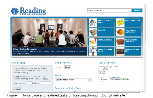
This was a bad start – but other steps on the Montgomery County site were better. In contrast, the first step on the Reading Borough Council in the UK was easy. The site features eight tasks prominently on its home page, including “Pay a Parking Ticket” (Figure 4). But other steps on this site were just as problematic as the first step on Montgomery County.
 As I worked through each of the seven websites, I noted whether the page worked well for me (+), posed a problem (–) or made no difference (o).
I could not find a way to pay a mislaid parking ticket online in any of the four UK authorities. I would have had to telephone to ask what to do.
All three North American authorities offered me the opportunity to enter my license plate number to find the ticket.
This might suggest that the user experience was poor in the UK, and successful outside it. But in fact every experience had its good and bad points, rearranged below to show how many of each I encountered.
| Authority | Paying for a parking ticket that has been mislaid | Number of good, no-difference and poor steps |
| Brighton and Hove City Council | Telephoned after 10 steps | +++++ooo– |
| City of Edinburgh Council | Telephoned after 6 steps | ++ooo- |
| Reading Borough Council | Telephoned after 5 steps | ++oo- |
| London Borough of Richmond on Thames | Telephoned after 11 steps | ++++oooo— |
| Montgomery County Government | Asked to enter license plate number after 5 steps | +oo– |
| City of Vancouver, British Columbia | Asked to enter license plate number after 4 steps | ++o- |
| City and County of San Francisco | Asked to enter license plate number after 6 steps | +ooo– |
One common problem: using unfamiliar terminology
One issue often tripped me up: the differences in terminology between the everyday phrase ‘parking ticket’ and the official phrases. For example, on just the UK sites I found all these variations, sometimes (but not always) used alongside the everyday phrase:
- Charge notice
- Fixed Penalty Notice (New Roads and Street Works Act 1991) (UK)
- Parking and Bus Lane Fines
- Parking or Bus Lane Penalty Charge Notice
- Parking penalty charge notice
- PCN (acronym used without expansion or explanation)
- Penalty charge notice
If you work in government, you’ll probably accept that they are all equivalent — but what if you’re not so familiar with official terminology? Each change creates a break in the smooth conversation between your site and the citizen.
Another common problem: visual discontinuity
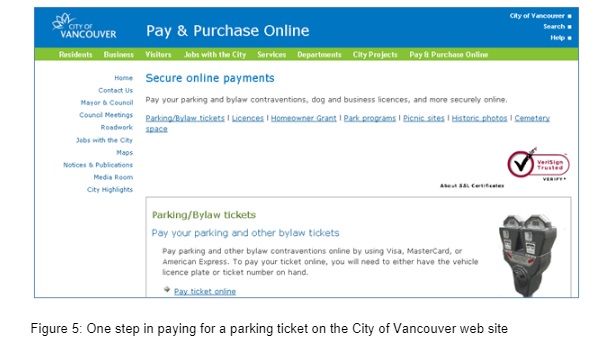 Another problem I encountered on several sites: an abrupt change in branding, part way through the journey. Figures 5 and 6 illustrate a typical example, from the City of Vancouver: the main site has a calm colour scheme of black text on a white background, enhanced with touches of blue and green (Figure 5).
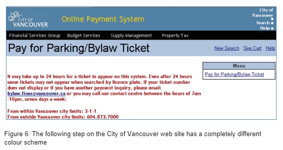 The payment system suddenly changes to red text with grey, black and yellow branding (Figure 6).
This visual break in the process is just as alarming as a change in terminology – particularly when it happens as the user enters a payment system, raising questions like: “Am I on the correct site? Is this new site really part of government? Is this new site secure?”.
Using a third-party system without specifying usability requirements
All of the UK sites failed to allow for the possibility of a lost parking ticket. I suspect that they are all using third-party payment systems, and that those payment systems all had the same defect.
Clearly, using a purchased module or service to handle your transactions can offer benefits such as lower programming and maintenance costs — but your users will experience that as part of your site, not as a separate matter. It is vital that you identify your usability requirements and ensure that they are specified in the contract.
This case study highlights many lessons
| Consideration | Lesson learned from this case study |
| Relationship | Make it easy to find the appropriate form |
| Conversation | Use the terminology that is familiar to your users, and use it consistently |
| Appearance | Use consistent branding across all the elements of the transaction |
| Implementation | Ensure that any third-party product is seamlessly embedded in the transaction. |
I’ve pulled together a summary of the lessons in this article
In this chapter, I first looked at who ‘the user’ is for government, and drew out these lessons:
- Do not assume that there is a single user.
- Allow for sharing one transaction between multiple users.
- Allow for protecting parts of a transaction from some users.
- Do not assume that all the answers are easily available.
- Provide save-and-resume features that allow information to be collected and entered into a form sporadically and in any order.
- Respect the right of the citizen to act without assistance.
- Equally, respect the right of the citizen to: ask another person to act for all or part of the transaction; have that person be informed about all of a transaction or about only specific parts of it.
- Allow for protecting parts of a transaction from some users.
- Provide mechanisms to allow information to be collected and entered into a form sporadically; do not assume that all the answers are easily available, or that the person undertaking the transaction knows the answers personally.
I suggested that ideally, a transaction will take data directly from one computer to another. I noted that that if people do have to be involved, you need to do these four things:
- Make it easy to understand the requirements of the transaction.
- Make it easy to find the relevant form(s) and identify the correct one.
- If calculations are involved, provide a way for a computer to do the calculation.
- Provide reassurance at the end of the transaction that it is all finished.
If you are offering an online transaction, you must also:
- Provide an offline alternative for people who do not have internet access.
- Provide a way to switch between channels for those who find either online or offline difficult.
But be warned that you must:
- Expect “rare” exceptions to happen every day.
- Instead of forcing all exceptions to use an electronic route, consider offering an offline route instead.
In the second part of the chapter, I discussed four major considerations for any form: relationship, conversation, appearance and implementation. The general lessons are:
- Choose the level of online form that is appropriate to the transaction.
- Think about the costs of maintenance as well as the costs of implementation when considering the more complex types of online form.
- Think about how the user will obtain the answer.
- Which strategy do you expect the person to use?
- Is there any risk that the strategy that you expect might differ from the one that will actually be used?
- Consider whether the burden of finding the answers is truly justified by the administrative benefit of having that answer.
- For third-party answers: could you ask the third party directly?
- For gathered answers: could you collect the data from the other document(s) directly and simply get the user to confirm the answers?
- Make sure that your form looks attractive.
- Avoid complex language and intimidating blocks of text.
- Consider all the different stakeholders who will be part of the implementation.
- Make sure they all have a common vision and coherent policies.
And in the final part, I looked at the specific example of trying to pay for a parking ticket where the ticket itself has been mislaid. The detailed lessons learned:
- Make it easy to find the appropriate form.
- Use the terminology that is familiar to your users, and use it consistently.
- Use consistent branding across all the elements of the transaction.
- It is not enough to co-ordinate purely inside the agency: Third-party vendors are key stakeholders in the implementation.
- Ensure that any third-party product is seamlessly embedded in the transaction.
In this chapter, we have looked at the broad brush of government transactions and dived into four main considerations.
Which considerations are the most important?
Given so much to think about, what matters most?
It’s tempting to claim: All of it. But my experience has been that in a typical government project, two considerations receive the most attention from the project team:
- information technology (IT) aspects of implementation
- detailed aspects of appearance, such as where to put the labels with respect to the fields on the form and whether or not to have a colon on the end of the label
For the users, the citizens and business people dealing with the transactions, IT considerations are also very important. Example: I did a small survey to investigate why some people continue to file their taxes on paper, and one of the top reasons they gave was a previous bad experience with the technology, such as the transaction crashing part-way through.
In contrast, few users care very much about the detailed aspects of appearance. In nearly 20 years of usability testing paper and online forms, I have yet to meet a user who notices whether the labels have colons, or expresses an opinion about it. Label placement is a little bit more important, but provided that the users can work out which label goes with which field fairly quickly, they’ll be able to deal with the form without difficulty. Most other detailed aspects of appearance fall into the same area: make some adequate decisions, implement them consistently, and you’ll be fine.
But if you do not pay enough attention to relationship and conversation, then your users really will be in difficulty. You will have to deal with their phone calls, letters and emails, leading to higher costs to you and burden for them. They may even give up altogether, failing to obtain benefits to which they are entitled, or failing to comply with the law.
Acknowledgements
I would like to thank Zoë Dowling and Ray Killam for permission to quote from their respective publications, and Ginny Redish for her perceptive comments on an early version of this chapter.
Reprinted from: Buie, E. and Murray, D. (2012), Usability in Government Systems: User Experience Design for Citizens and Public Servants, Morgan Kaufmann, ISBN: 9780123910639
Further reading
Jarrett, C. and Gaffney, G. (2009). Forms that work: Designing web forms for usability. Morgan Kaufmann.
References
BBC. (2010). Early writing tablet. A History of the World in 100 Objects Retrieved 12 September 2011, from http://www.bbc.co.uk/ahistoryoftheworld/objects/TnAQ0B8bQkSJzKZFWo6F-g
Dowling, Z. (2006). Web data collection for mandatory business surveys: an exploration of new technology and expectations. PhD Thesis, University of Surrey, Guildford, GU2 7XH.
Helsper, D. E. J. (2008). Digital Inclusion: An Analysis of Social Disadvantage and the Information Society: Oxford Internet Institute (OII).
Irish Tax and Customs. (2011). Mandatory Electronic Filing and Payment of Tax – Implementation of Phase 3. Retrieved 24 September 2011, from http://www.revenue.ie/en/practitioner/ebrief/2011/no-042011.html
Jarrett, C. (2011). A review of easy and hard forms. In Better Connected 2011, a snapshot of all local authority websites: Socitm Insight.
Karvonen, K. (2000). The beauty of simplicity. Paper presented at the Proceedings on the 2000 conference on Universal Usability.
Killam, R. (2009). Forms Management: What Forms Managers Think About. User Experience, the Magazine of the Usability Professionals’ Association, 8, 3.
Lindgaard, G., Dudek, C., Sen, D., Sumegi, L., & Noonan, P. (2011). An exploration of relations between visual appeal, trustworthiness and perceived usability of homepages. ACM Trans. Comput.-Hum. Interact., 18(1), 1-30.
Mental Capacity Act. (2005). Part 1, The Principles, Section 1. Retrieved 15 November 2011 from http://www.legislation.gov.uk/ukpga/2005/9/section/1
National Archives. (2010). Domesday Book: Research Guide. Retrieved 23 September 2011 from http://www.nationalarchives.gov.uk/records/research-guides/domesday.htm
PewInternet.org. (2011). Demographics of Internet users. Retrieved 1 October 2011 from http://pewinternet.org/Trend-Data/Whos-Online.aspx
Schwesinger, B. (2010). The form book : best practice in creating forms for printed and online use. London: Thames & Hudson.
Socitm Insight. (2011). Better connected 2011: a snapshot of all local authority websites. Society of Information Technology Management.
U.S. Census Bureau. (2007). Statistics about Business Size (including Small Business). Retrieved 1 October 2011, from http://www.census.gov/econ/smallbus.html
World Bank. (2011). Internet users (per 100 people). Retrieved 15 November 2011 from http://data.worldbank.org/indicator/IT.NET.USER.P2
#forms #formsthatwork