For this month’s post for my Surveys that Work blog on Rosenfeld Media I’m handing over to Gerry Gaffney – for a forensic examination of one customer survey he recently encountered. Apart from being co-author of my book, Forms that Work, Gerry is an expert in user experience research and design. His company is Information and Design.
Recently I stayed at a Radisson hotel in Sydney for a few nights.
After I left, I was invited by email to respond to a survey about my experience. As these things go, it wasn’t badly designed. I’ve listed a few specifics below, but it’s also worth making some general comments to consider when sending out this type of survey.
Respondents are self-selecting
Why did people respond to your survey? Did you over-sample those who were really happy, those who were really unhappy, or those who have time on their hands? I don’t know how to offset this, other than by trying to get as high a response rate as possible. Anything that reduces this response rate may militate against minimising the self-selection.
In this case, Radisson didn’t offer me any incentive to respond. Many busy people would automatically delete such invitations. As Caroline has pointed out previously on this blog (Do incentives help to improve response rate?), an incentive may help increase response. I confess that only my interest in forms design persuades me to respond to voluntary surveys from commercial organisations, but a $5 Amazon token would probably spark my acquisitiveness or loss-aversion bias.
Respondents are busy
Radisson promised that the survey would take “5 to 8 minutes” (a remarkable degree of precision, I thought, and wondered how it had been achieved).
Respondents don’t care as much as you do
This is a perennial problem that UX people spend so much time communicating. It’s often hard for teams to realise that in the real world “out there”, nobody cares very much about their product or service. This means that expecting deep thought and analysis from them is unrealistic.
Badly chosen labels can present an unbalanced scale
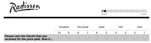
Radisson asks respondents to rate various elements on a 10-point sale. They’ve also added linguistic labels (“Excellent”, “Very Good” and so on).
Possibly the labels are to help people interpret the numeric scale. If this is the case, then the numeric scale is inadequate, and should be redesigned.
The labels unfortunately present an unbalanced scale. At least three of the labels (“Excellent”, “Very Good”, “Good”) are unambiguously positive, and only one (“Poor”) is unambiguously negative. The lack of balance presents a bias – respondents have at least 6 places to assign a positive response, and a maximum of 4 to assign a negative one.
The lack of precision in the previous paragraph is a result of the ambiguous “Fair”. Some people may interpret this as a positive rating, some as a negative. For example, Elizabeth Buie in a tweet on this topic said that she interprets fair as “slightly negative”. This more or less aligns with my personal interpretation, although in other contexts “fair” means “reasonable” or “appropriate”. In any case, the apparent attempt to clarify the purpose of the numeric score has resulted in a muddied solution.
Be wary of forcing people to make a choice
Many survey designers seem to find neutrality anathema. The 10-point scale used by Radisson, if it is balanced, does not allow the respondent to be neutral. I’ve often heard people say things like “we want them to make a choice”. In practice, when observing people filling in paper-based questionnaires, you will see people circle the two points on either side of the non-existent mid-point. If you demand that they make a single selection, they will choose one. However, what this achieves is to extract an incorrect response from someone who doesn’t believe that response is appropriate. It’s not exactly water-boarding, but it does amount to a forced confession whose value is tainted by the method of extraction.
Don’t know, don’t care, can’t remember, and not applicable
Radisson wanted to know whether I’d been asked to join some rewards program. I can’t remember, but there is no option to tell them so.
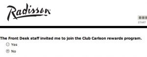
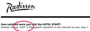
In some cases (see below) they did allow for “N/A” as an answer. However, “N/A” is required much more frequently than many people realise. If in doubt, include such an option. However, consider whether people really understand what “N/A” means. Remember that it’s jargon, and ambiguous (not applicable, not available, no answer…) .
Try not to exhaust your respondents
At some point respondents get tired of your survey. I would hazard a guess that this occurs at a point way, way earlier than most organisations realise. In the case of the Radisson survey, they have done two things to mitigate this:
- Provided an up-front estimate of time to complete (the “5 to 8 minutes”, remember?)
- Included a progress indicator at the top right.
Progress indicators are great; they can extract additional effort from the recalcitrant. However, their power is limited.
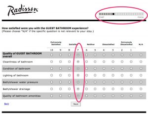
In this case, after several screens, Radisson will probably find that respondents are taking the path of least resistance, either abandoning the survey entirely or just clicking down a vertical line with very little attention to the individual questions they’re answering.
I wonder whether any respondent really wants to rate both water pressure and drainage on a 10-point scale?
The preventative for fatigue is brevity.
Look out for problems with interaction design
Radisson used check boxes instead of option (radio) buttons in one screen. Strangely, they went to the extra effort of creating an error state to trap when a respondent chose two options that were supposed to be mutually exclusive:
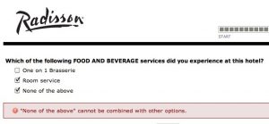
The message should have read “Sorry. Please imagine that the check boxes are radio buttons”.
Usability testing can reveal problems with wording
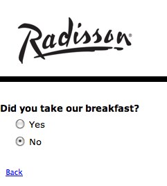
In usability testing, one of the first things you find out is when wording is confusing or, as in this example, unintentionally amusing. Radisson asks whether I “took” their breakfast. Not being a thief, of course I didn’t.
If you don’t want to know, don’t ask
Finally, Radisson asks me if I experienced a problem, but allows me a paltry 30 characters to respond (if I don’t choose one of their pre-defined options). Small, arbitrary limitations are rude and inconsiderate.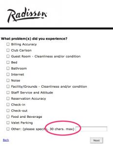
I’ve frequently had people justify such limits by saying “We don’t want them to send in ‘War and Peace’.” I’m not aware of any respondent who has actually attempted to do this, but it would certainly be reasonable to truncate anything after, say, two pages of text. But not 30 characters!
It’s reasonable to alert people that space is somewhat limited, but “words” rather than “characters” should be the measure. In English, a word is around 5 letters, so you can divide your total by this number, add a little fudge factor, and list that. For example, if your field is restricted to 1024 characters, you can list this as “200 words”. Only people like Caroline and me would ever count them and castigate you for it.
Usability testing will improve any form or survey
The Radisson survey is not an egregious example. It probably works quite well for the organisation. But a little more attention to detail, and a little usability testing, could make it better.
And that’s almost universally true.