 Here’s a question that I get asked quite often: “Should we put an ‘OK’ button to the left or the right of the ‘Cancel’ button?”
A common variant is to ask the same question with ‘Back’ or ‘Previous’ instead of ‘Cancel’, and to maybe include ‘Next’ in the mixture.
A simple question, a complex answer
I’d love to tell you: put OK on the left. Or on the right. Or something else that’s easy to say and easy to remember. Like so much in forms, the simple answer isn’t really appropriate. And yet, who needs another ‘it depends’? We’ve got far too many of them in usability. The truth, of course, is that ‘it depends’ is the right answer yet again. But we’ll avert our eyes from that and I’ll try to give a few rules here.
Rule 1: Look at other forms
The first point is to find out what other forms your users are working with and see where those other programs put their buttons. For example, years ago Jakob Nielsen pointed out that most users spend most of their time on websites other than yours. Or if you’re creating a program that will be used alongside Microsoft Office applications, then your users are likely to expect your program to follow their conventions. It does get a bit tricky if your users swap regularly between Mac and PC, because unfortunately the two operating systems have conflicting guidelines. Then you’ll have to think carefully about which one you’re going to follow – preferably, after doing some research on what your users do and which applications matter most to them.
Rule 2: Put buttons at the end of the conversation
The big deal with forms is that they ask users one or more questions, after which the user presses a button to say ‘I’m done with my turn in this conversation’. The conversational turn is handed over to the computer to do something. There needs to be a button. It’s usually called ‘OK’, ‘Send’, ‘Submit’ or ‘Next’. The crucial point is that it goes at the end. One common mistake I’ve seen: putting important instructions, or even whole questions, after that final button. A position that’s invisible to users. Don’t do it.
Rule 3: Decide whether the button is necessary
A while ago, I wrote a column: “The Piece of HTML created just for me: Reset”. My theme was that ‘Reset’ buttons are rather handy for the forms consultant who regularly hunts for forms on websites, fills them in and then wants to discard her entries. Sadly, the majority of them are at best useless and at worst deeply annoying for other users. Do you really need other buttons? Do your users want to discard all their work? If you don’t really need a button, then get rid of it.
Rule 4: Decide whether the button needs to look like a button
Sometimes you definitely need two or more possible actions at the end of the form: perhaps, indeed, ‘Send’ and ‘Throw away my work’ or ‘OK and ‘Cancel’. Luke Wroblewski calls the most important action the ‘primary action’ and anything else ‘secondary’. He and Etre did some testing on where to put ‘Submit’ and ‘Cancel’ on web forms, and whether to make ‘Cancel’ into a link or a less prominent button.
Surprisingly, they found that any option that put the two buttons close together worked equally well. The only one that failed was placing ‘Cancel’ right under all the forms fields and ‘Submit’ way off to the right. (An aside: I’d have expected ‘Submit’ right under the forms fields and ‘Cancel’ way off to the right to work just as well as the options where the buttons were all close together, but for some reason that option didn’t get tested).
In terms of time to complete the form, an option with two visually similar buttons worked best. It took users a tiny bit longer to deal with the versions where Cancel was less visually prominent or made into a link. Crucially, though, users preferred those options: “People responded well [to options with a less prominent Cancel] even if these designs slowed them down a little. This suggests that they were more concerned about avoiding losing their data, than they were about submitting it quickly”.
My take on this: accuracy and user comfort beats a tiny improvement in processing time in nearly all cases. So I’d reduce the visual impact of secondary actions and probably make really disastrous actions, like ‘Throw away all my data’, into links on web forms.
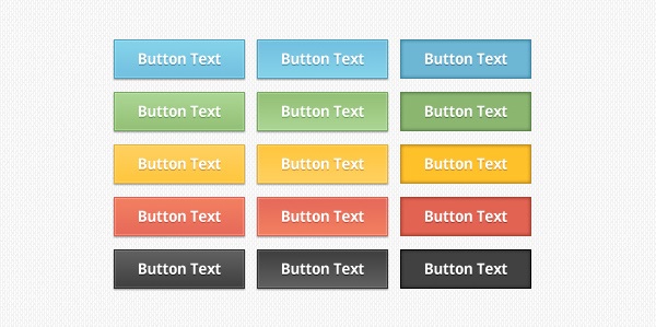
There’s a supplement to this rule: make sure the button looks like a button. There’s an online banking application that I have to use regularly and it confuses me every time because the buttons are simple rectangles of orange with text on them: none of the little shading tweaks that make buttons stand out and look like buttons. If you’re feeling short of inspiration, try an image search for ‘web button’ and a vast selection of everything from cool to remarkably ugly will appear. Or, more realistically, just have a look at how your favourite websites do them.
Rule 5: Label the button with what it does
The last step is to decide what label to put on the button. I’ve so often seen buttons labelled ‘OK’ and ‘Cancel’ when it’s not at all clear what those words mean. Think about those sadly too frequent Cancel boxes: you’ve asked a program to cancel something, and it then gives you a dialogue box with buttons labelled: ‘OK’ and ‘Cancel’. Does ‘Cancel’ here mean, yes, go ahead and cancel or does it mean, no, I don’t want to cancel after all? Note that there’s no rule saying ‘buttons have to have single-word labels’ and definitely no rule saying ‘there has to be an OK button and a Cancel button’.
This article first appeared in Usability News, 31 August 2008
Picture by With Associates, creative commons
#forms #formsthatwork