This post, written with Viki Stirling of the Open University, was first published in Tullis, T. and Albert, W. Measuring the User Experience: Collecting, Analyzing, and Presenting Usability Metrics, Morgan Kaufmann/Elsevier 2013.
The Open University is the UK’s largest university, with over 200,000 students, and the only one dedicated solely to distance learning. Its online prospectus receives approximately 6 million visitors each year. 90% of students register online, accounting for approximately £200 million (about US $300 million) of registrations each year.
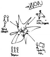 The team with overall responsibility for development of the Open University’s web presence is led by Ian Roddis, Head of Digital Engagement in the Communications team. He coordinates the efforts of stakeholder groups, including developers, user experience consultants, the academics, and many others. The team has been committed to user-centered design for many years now, by involving users directly in usability tests, participatory design sessions and other research, and indirectly through a variety of different data sets, including search logs and web tracking. But the real value comes from triangulation, using several different sets of data together – as illustrated in Figure 1, from (Jarrett and Roddis 2002).
Example 1: deciding on actions after usability testing
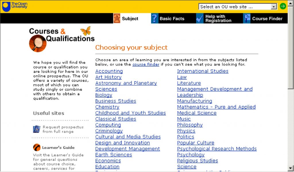
One of our earliest examples of triangulation started with a usability test. The prospectus home page consisted of a long list of subjects.
Most people who consider university study start by looking for the subject they are interested in. When we asked participants in a usability test to look for the subject they wanted, we observed that some of them struggled:
- When viewed on a typical screen at that time, some of the list was ‘below the fold’ and not visible to the user (Figure 2).
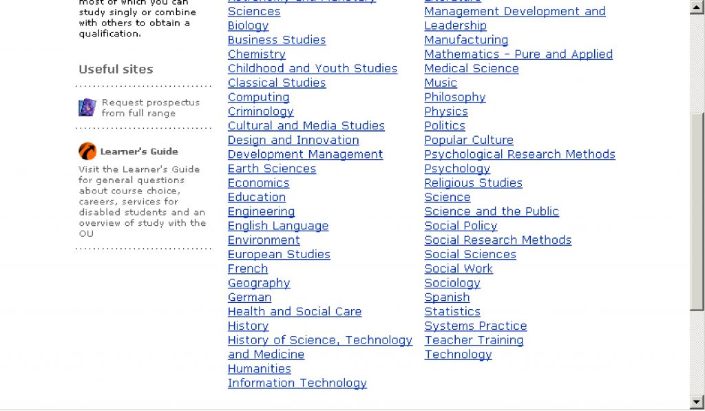
- The list was presented in alphabetical order, which meant that some related subjects (e.g. Computing and Information Technology) were separated from each other Figure 3).
We could have done more testing with more participants to measure exactly how much of a problem this was, but instead we decided to use web analytics to investigate the actual behaviour of site visitors.
Web analytics tools at the Open University
The Open University uses commercial web analytics tools, reviewing the choice of tools from time to time. Our current tracking tool is Digital Analytix from comScore. We tag each web page that we want to track, and we ask web visitors to give us permission to use cookies to track their visits. The tool then logs each page visit and the path taken by each visitor through the website.
We can also distinguish between visits by logged-in visitors (students and staff) and by other visitors. We distinguish between a single visit: the path someone takes through our site in one continuous experience, and the experience of a visitor: the aggregation of the multiple visits from a computer where someone has given us permission to use cookies.
It can be tricky to distinguish different types of visit and visitor, so we find that it’s best to try to focus on the big overall picture and not stress too much about finer details.
For example, we discovered that 37% of visits that involved Information Technology also involved Computing, but that only 27% of visits that involved Computing also involved Information Technology. In addition, we found that Computing was receiving 33% more visitors than Information Technology. This confirmed what we’d seen in usability testing: our participants were more likely to click on Computing (above the fold) than on Information Technology (below the fold).
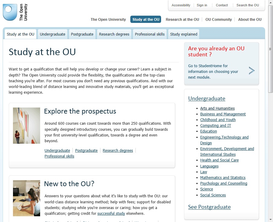
We looked at the content of these two subjects and discovered that prospective students should really think about both of them before choosing either. From this type of analysis, across the entire list of subjects, we recommended a new design with a much shorter list of subject areas based on actual user behaviour, and the clusters of subjects they tended to view together (see Figure 4).
The previous organisation of subject areas reflected the internal structure of the university at that time; for example, the Mathematics and Computing faculty taught Computing, but the Technology faculty taught Information Technology. The revised organisation aligns with visitor expectations and needs, and has performed well (with a few tweaks) ever since.
Example 2: site-tracking data
The usability test described in Example 1 was a major initiative that required a lot of data to persuade many different stakeholders – the type of thing you only want to do occasionally.
This second example is more typical of our everyday work. Some stakeholders came to Viki Stirling, who looks after analytics and optimisation, with a problem: they weren’t getting the expected level of conversion from part of their website.
Viki took the site tracking data and fed the appropriate tracking data into NodeXL, a visualisation tool.
Looking at the flows by visits, the problem immediately jumped out at her: A lot of visits arrive at a particular page, but few continue after that (highlighted in red in Figure 5). The big arrows from node to node should continue, getting only slightly smaller at each step. At the problematic page, we suddenly see that the larger arrow flows backwards up the chain, with only a small arrow moving on to the next step.
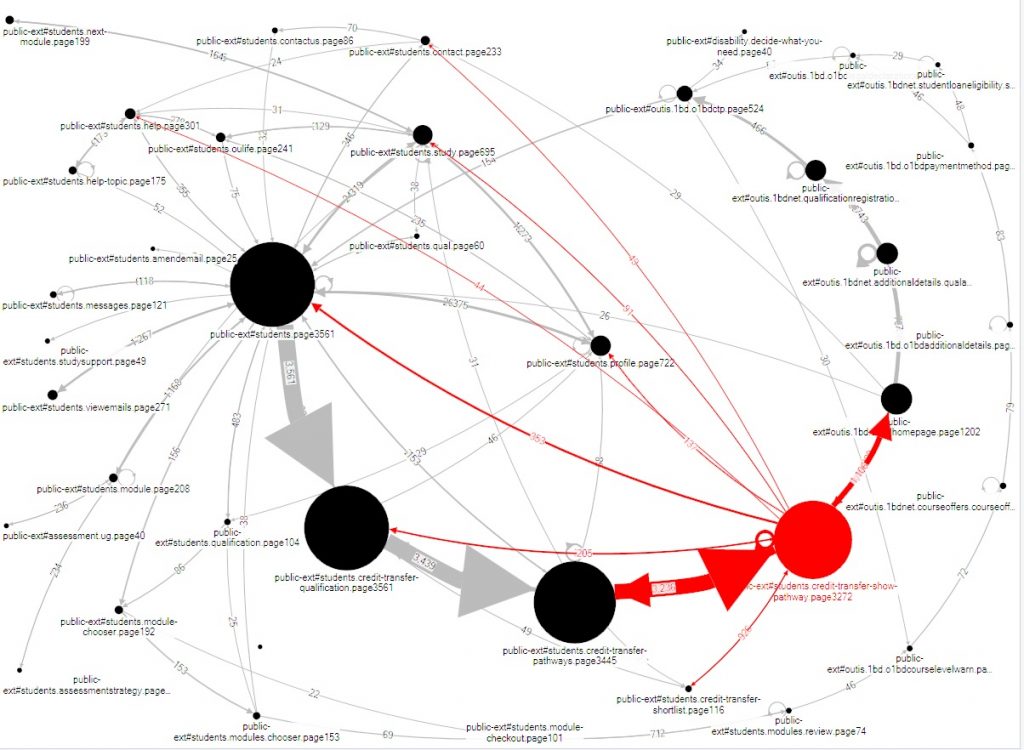
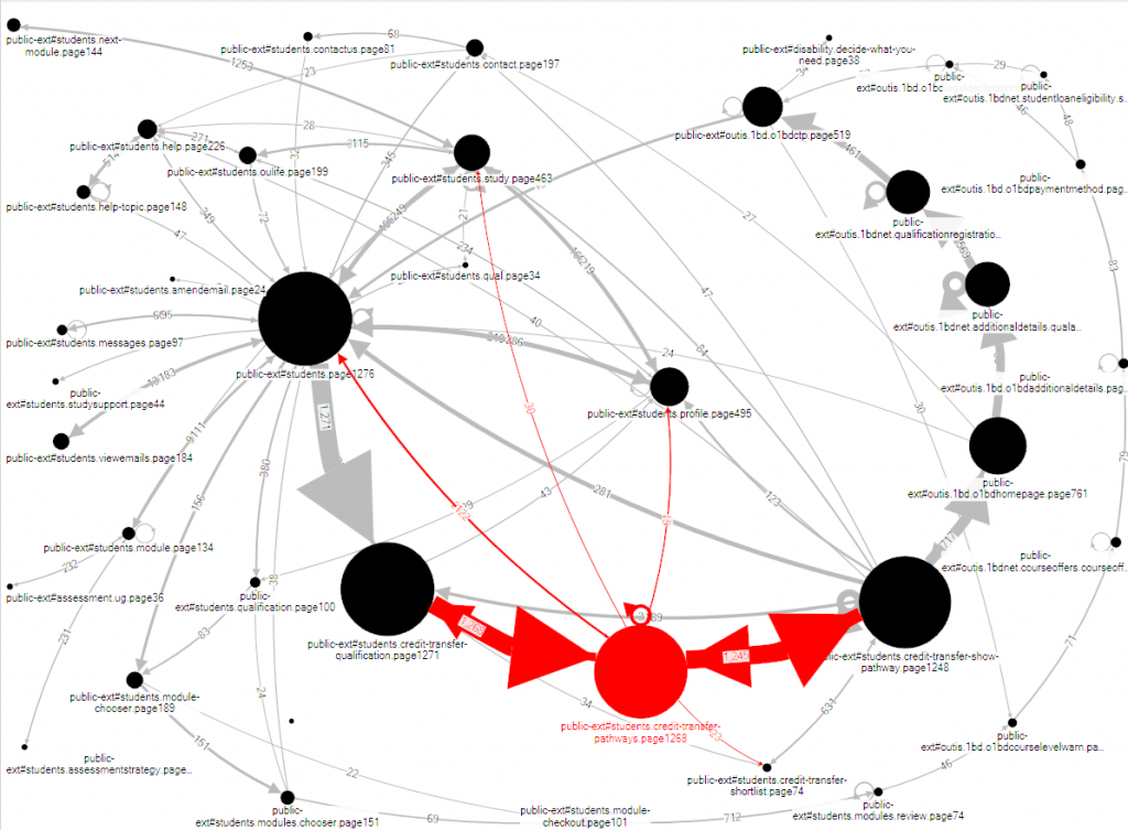
When she investigated the problematic page, it was obvious how to revise it. But Viki was suspicious: although this task isn’t common, it’s important for the relatively few visitors who attempt it. She investigated further, looking at the flows by visitor (see Figure 6). This reveals that the previous step in the process was also causing problems: visitors are moving backwards and forwards from that step, clearly trying to make progress but failing. Once again, a look at the relevant web page quickly revealed the necessary revision.
From the UX point of view, we might immediately ask: why didn’t the stakeholders do usability testing, which would probably have revealed these problems ahead of time? The answer is that of course, the Open University does lots of usability testing – but they face a challenge familiar to any organisation with a huge and complex website, which is one of prioritisation. In this example, the problematic task is rather unusual, and relevant only to a small number of users at a very specific point in their progression from enquirer to student.
Example 3: triangulation for iteration of personas
The two previous examples demonstrate use of measurement techniques for specific changes. Our third example illustrates the use of metrics for one of the UX tools we use all the time: personas.
We first started using personas after Caroline Jarrett learned about them from Whitney Quesenbery at the Society for Technical Communication Conference 2002. They were based on our experience of usability test participants over a few years – by that point we had been usability testing since 1998 – and Sarah Allen validated them against various internal data sources at the time. With Whitney’s help, we’ve been using, updating, and revalidating the personas ever since. Pruitt and Adlin (2006) includes a short overview of our experience with personas.
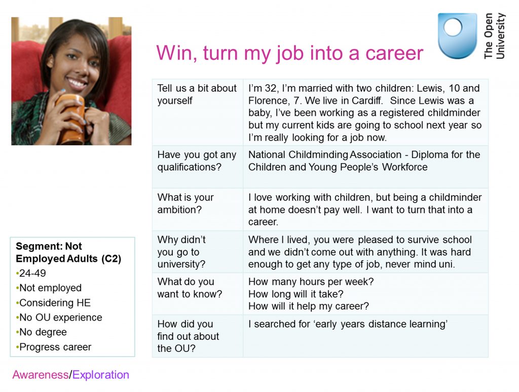
For example, the OU introduced Foundation Degrees, shorter degree programmes focused on training for particular jobs that are somewhat similar to the US ‘Associates Degree’. To help with our design activities around Foundation Degrees, we added in a persona, ‘Winston’, who was interested in the Foundation Degree in Materials Fabrication and Engineering. But we discovered that we weren’t meeting Winstons in usability tests. Viki Stirling had the idea of doing some visit tracking to see whether the routes through the site that we envisaged for the personas were actually sufficiently based in data. She discovered that most of them were, but Winston really wasn’t justified; the numbers just weren’t there. Winston became Win, interested in the Foundation Degree in Early Years (see Figure 7).
Lindsay’s reasons for studying are slightly different to Win’s, and she’s focusing slightly more on costs and fees – but overall, she’s close enough that we can be confident that a design intended for persona Win will also work for real aspiring students like Lindsay.
Summary
Most user experience techniques are valuable on their own, and we’re happy to use them individually – as illustrated by our everyday example, number 2 above.
We find that the real value comes from comparing what we learn from larger-scale quantitative techniques with what we learn from small-scale, qualitative techniques – and continuing to do that over many years.
Acknowledgments
We want to thank our colleagues at the Open University: Sarah Allen and Ian Roddis, and at Whitney Interactive Design: Whitney Quesenbery.
References
Jarrett, C. and I. Roddis (2002). How to Obtain Maximum Insight by Cross-Referring Site Statistics, Focus Groups and Usability Techniques. Web Based Surveys and Usability Testing. San Francisco, CA Institute for International Research
Pruitt, J. and T. Adlin (2006). The persona lifecycle : keeping people in mind throughout product design. San Francisco, CA Morgan Kaufmann.
#usability