
Gianpiero on social media asked: “What do you feel about progressive disclosure in forms? Valid or sneaky (considering you’re probably hiding a lot of fields)?” I’m a huge fan of progressive disclosure, provided it’s used in an honest way. LetContinue reading… Progressive disclosure: valid or sneaky?
Tag: forms that work
Designing paper forms
As the book Forms that Work: Designing web forms for usability is published, one of its’ authors, Caroline Jarrett, explains which of its chapters contain advice that can equally be useful when creating paper forms
Forms that Work: book by Caroline Jarrett and Gerry Gaffney
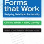
Forms that Work by Caroline Jarrett and Gerry Gaffney is published. The authors explain where to get the book and in 2025 update the post to explain why they won’t be doing a new edition.
Label placement in forms: what’s best?
Introduction Forms are ubiquitous and a major way in which websites can become interactive. But they tend to receive little design attention – and much of that is spent arguing about details. This talk looks at one of those details:Continue reading… Label placement in forms: what’s best?
Buttons on forms – where to put them, and what to call them
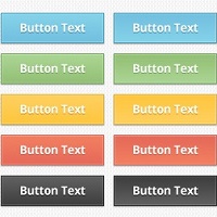
Here’s a question that I get asked quite often: “Should we put ‘OK’ button to the left or the right of the ‘Cancel’ button?” A common variant is to ask the same question with ‘Back’ or ‘Previous’ instead of ‘Cancel’,Continue reading… Buttons on forms – where to put them, and what to call them
Expert review helps to improve a complex form
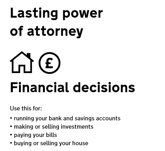
Applying for Lasting power of Attorney is often something people do at a time of challenge or stress. In this presentation to the Sixth International PLAIN Language Conference I describe a case study for the US Department of Constitutional Affairs where ourContinue reading… Expert review helps to improve a complex form
How to look at a form in a hurry, UPA 2006
Anyone who has heard or read more than one of my presentations will be familiar with my mantra: ‘test, test and test again’. It’s the only way to find our whether something really is usable, and yet we’re sometimes putContinue reading… How to look at a form in a hurry, UPA 2006
Colons at the end of labels?

This post dates from May 2006. I’ve updated it with my views in 2025. A month later in June 2006, I wrote another one: Colons at the end of labels – revisited, and in 2025 I updated that one too.Continue reading… Colons at the end of labels?
Two-column forms are best avoided
A concerned designer wrote to me: ‘Our forms are laid out in a single vertical column. A new project manager is pushing to get the forms for a new product to ‘look different from other products’ by requesting a twoContinue reading… Two-column forms are best avoided
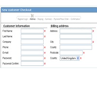
Registration Forms – what to do if you can’t avoid them
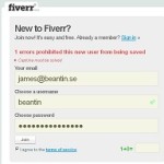
The sad thing about registration forms is that users hate them. Stick a form in front of them and they leave your site, they lie, or if they are really web-savvy they use a privacy protection service such as Bugmenot.Continue reading… Registration Forms – what to do if you can’t avoid them