“Could you make sure my older presentations are fully accessible?” Caroline’s request seemed an easy enough task: we’re both keen to ensure that we reach the widest possible audience.
Armed with an early version of Whitney Quesenbery’s tips on accessible presentations, I settled down to what I expected to be a few hours’ enjoyable work. How hard could it be to add ‘alt text’ to a few pictures?
It turned out to be harder than I expected, so I’ve pulled together some lessons learned.
Whitney incorporated some of my suggestions in her checklist for UXPA magazine: Make your presentation accessible. The slides she used for her illustrations are from our presentation Surveys that work: An introduction to using survey methods.
Fancy fonts cause problems
Whitney starts with ‘Make Text Easy to See’. That was fairly easy: Caroline had chosen a decent-sized basic font throughout.
But she’d also picked a tricky accent: Turkeyface font which SlideShare doesn’t recognise and therefore turns into a hideous cursive script. The only way to preserve the font is by turning each Turkeyface title into an image – and then explaining what it says in alt text. (I tried to persuade her to opt for a font that SlideShare does recognise, but haven’t had any luck so far).
Alt text is about a great deal more than describing images
I knew that adding alt text to the images would be a big chunk of the work. It turns out that there’s an art to doing this well, as I discovered in Whitney’s presentation on writing great alt text.
Not only did I need to explain what the picture shows but why it appears in the presentation in the first place: what is its added value? (And if there is none, why use it at all?)
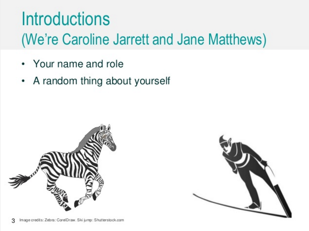
For example, in our surveys course we begin by inviting everyone to share something unusual about themselves. Caroline chose an image of a zebra; I chose an image of a ski jumper. How much to say about them?
I decided to write: “Zebra, because Caroline’s random fact was about baking zebra cakes” and “Ski jumper, because my random fact was about the hilariously bad British ski jumper Eddie the Eagle”. If you want to find out more, you’ll have to come to one of our courses!
It’s a balance: how much to make the presentation meaningful for someone viewing it through a screenreader, how much to replicate the experience of viewing it without being there. How much to explain, how much to intrigue.
Animations create extra work and are confusing
Animations proved another pitfall. Clever transitions between slides, and animations that build a concept, can make a message easier to understand when you’re doing a presentation face-to-face.
However, we found we needed enough words for a short essay when we tried to explain what is happening on screen in alt text for someone who is viewing the presentation later. We decided to rework any transitions or builds into a series of individual slides – and to think harder about whether builds are really necessary in future presentations.
You need to put the components of each slide into an order that makes sense
Alt text is only one of many elements to creating accessible presentations – and not the first obstacle anyone who has difficulty reading a screen will encounter. A quick look at the make-up of each slide (click from ‘home’ to ‘arrange’ and then ‘selection pane’) showed the elements – title, text, figures, images, image captions, page numbers – appear in the order they’ve been added to the slide. Confusingly, PowerPoint presents them in the reverse of the order that a screenreader will hear – starting at the bottom and reading up.
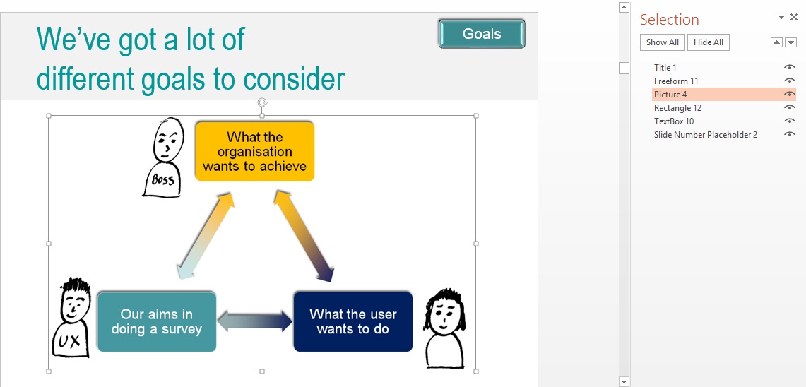
Combine bitty images into one stronger one
In the slide above, we built up an image from three boxes, three arrows, and three cartoons – but really, it’s one illustration. I didn’t want to have to describe the nine components separately, so I combined them into one, which also makes it easier to describe in alt text. For a complex diagram like that one, I’ll sometimes just put a brief summary into the alt text with ‘see notes’ and a longer explanation in the notes, with the benefit that the notes are available for anyone who views the presentation.
Build accessibility into your presentation from the start
If you think about accessibility as you make the presentation, it’s not that hard to do. We’ve made a few changes:
- we think hard about whether a build or animation is really necessary
- we choose a simpler image over a more complicated one with several parts to describe
- and I’ve noticed that Caroline is more selective about using her favourite fancy font.
It’s never too late to retrofit accessibility
From now on, everything we upload to Caroline’s presentations on SlideShare ought to be accessible, so please contact us if you find any problems.
Alongside that, I’m gradually making my way through our backlog of older presentations. Here are some of the resources I use:
- Whitney Quesenbery’s guide: Make your presentations accessible.
- WebAIM’s guide to PowerPoint Accessibility includes tips for older versions of PowerPoint
- EBU (voice of blind and partially sighted people in Europe) guidance on Making information accessible for all
- (update: September 2021) An alt-text checker for PowerPoint presentations, created for Effortmark.
#designtoread
featured image by Karin Dalziel, creative commons licence