 Today, search is not a design failure, but part of the user experience, one of many ways that people find information on the web. This paper – co-authored with Whitney Quesenbery, Ian Roddis, Sarah Allen and Viki Stirling – looks at how search has changed as part of the user experience, and the role that good content design plays in making information easy to find. Examples from the Open University website illustrate ideas for how the design of the content works with the design of the website to make information easier to find, easier to understand, and easier to use to meet a goal (or answer a question). This paper was delivered at the 55th Annual Conference of the Society for Technical Communication Philadelphia, Pennsylvania, US.
We’ve been Googlified
Like it or not, search is here to stay. Google is not only a top brand, but a verb (“Let’s google that”). There’s even a term to describe how Google has influenced web behavior: Googlification (Lebson 2007, Klinkenberg 2008).
“There is no need to know Because we can find” http://www.googlification.com/
Search: good experience or design failure?
Back in the dark ages (up to the mid 1990s, for example), search was a specialist function. Librarians, scientists and researchers used search, but most people didn’t. More importantly, researchers in human-computer interaction focused on search as its own expert task, rather than part of a broader view of information seeking. But even then, it was already clear that making it possible for people to find information in the growing collection of online information would require finding common ground between experts in information retrieval and everyday users. As Ben Shneiderman (1997) put it, “the future of the World Wide Web as a universally acceptable tool may depend on our ability to reduce the frustration and confusion of the masses of users, while enabling them to reliably find what they need.”
As the web grew, two schools of thought about search emerged, exemplified by the positions of usability commentators Jakob Nielsen and Jared Spool.
Does search put users in charge of their own destiny?
Nielsen was an early enthusiastic supporter of search. As early as 1997, his usability research showed that “more than half of all users are search dominant” preferring to “go straight for the search box when they enter a website: they are not interested in looking around the site; they are task-focused and want to find specific information as fast as possible.” (Nielsen, 1997).
By 2001, he advocated that website designs should included a search box on every page. He suggested that search plays two roles: First, as a way to allow users to “control their own destiny” and make their own way to the information they are searching for. Second, as an “escape hatch when they are stuck in navigation.” (Nielsen, 2001) In other words, whether through choice or necessity, search provides an alternative to the navigation and information architecture provided by the site itself.
By 2005, Google was firmly established as the leading search engine. That year, Nielsen (2005) wrote that “Users now have precise expectations for the behavior of search…Search is such a prominent part of the Web user experience that users have developed a firm mental model for how it’s supposed to work.” He defended his 2001 guidelines as “even more important with the new mental model. The dominant search engines comply with all the main usability guidelines, which is obviously a major reason that they’re on top. Today, the guidelines don’t just describe good search; they describe expected search” (Nielsen 2005).
Or does search reduce the chance of success?
Jared Spool’s opinion of search parallels Nielsen’s. He also reported that about half the people in his usability testing used the search engine, but that “Using an on-site search engine actually reduced the chances of success, and the difference was significant” (Spool, 1997).
He maintained that one cause of this pattern of failure is that users only try one or two searches, and abandon the site if they are not successful, and concluded that “These results indicate that designers get one, possibly two chances to help users find their content with Search. If most of the users don’t find what they want in the first try, it doesn’t seem likely they will ever find it” (Spool 2001).
Like Nielsen, Spool’s thinking about search hasn’t changed much, and he continues to publish articles and podcasts that suggest that Nielsen’s second use of search is the more appropriate view: that it use indicates a failure of the design and navigation on a site.
New models for understanding search
There are two models for understanding search that we found useful in thinking about how to design for search.
The ‘berrypicking’ model
Marcia Bates’ (1999) work on how non-experts search for information led to the concept she called “berrypicking.” The idea was that searching is not a single iterative task, but a process that takes place over time. During that process, people collect pieces of information, which they collect from different sources, much as you might wander from bush to bush putting berries in a basket.
When we think about real-life goals, this model makes a lot of sense. At The Open University, it would be tempting to think about the task of selecting a course as a search task that would take place in a single logical process. But in the real world, students collect information from many different sources, gathering many different kinds of facts, details and insights until they have enough information in their “basket” to make a decision.
Search and the long tail
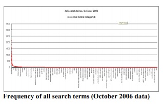
One of the more interesting models for how people search was the result of analysis that Richard Wiggins (2002) did at the University of Michigan. He analysed the search logs and found a standard pattern in which a very few terms made up the bulk of the searches. When graphed, the pattern shows a distinctive distribution curve with a small number of items making up a large percentage of the total.
We found a similar pattern of a sharp peak, long tail and persistent themes in the Open University search logs.
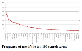
This pattern holds true even when we looked at just the top 100 search terms.
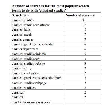
It still holds true when we look at just the terms within one very small subject area, classical studies.
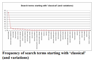
To get a better sense of the data, here’s the actual search terms starting with ‘classical’ (and spelling variations). You can see how few terms are used more than five times in a month. You can also see how the extra terms introduce little real variation: most of them are minor modifications of more popular terms.
Both internal searches (using the OU’s own search engine) and external searches (users arriving from external search engines) show the same pattern:
Sharp peak: a very small number of extremely popular search terms
Long tail: a very large number of terms used only once or twice in a month
Persistent themes: the topics seen in the most popular terms recur throughout the tail (with minor variations and misspellings).
These patterns are consistent:
- Across audiences (staff, student or enquirer)
- When narrowed by theme: for example, within a particular subject
- Over time: themes persist from month to month.
Wiggins’ (2002) observed that “Ultimately, my argument is simple: If you help a lot of people find content that they frequently seek, you improve the overall efficiency of the organization.” Wiggins’ observation, combined with the strong pattern that we found, suggests that we can achieve the most if we focus our efforts to improve search results on the small number of very frequently used search terms.
Search is now normal behaviour
In earlier work, Whitney (Quesenbery 2003a, 2003b) identified two patterns in how people used search as part of their web experience.
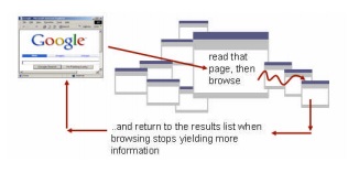
Search is the new home page
People used search as a launching point for a session, returning to that search page as they tried different sites in the list. In effect, they created a home page on the fly with the 10 “best bets” from across the whole web.
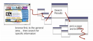
 People alternate between searching and browsing
They used search within a site to jump quickly to a specific area of the site. They then browse for a while, and then search again – either by using the site search, or by returning to their favourite search engine and trying
again.
In both of these patterns, search is embedded into the web experience, not seen as a separate activity.
People use search wherever they find it
In our usability testing for The Open University, we found that participants used search at many points in their
time on the site:
- They turned to search when they did not see a probable link quickly, even if they had to return to a home page (where there was a search form) or do to a search page.
- They looked for a search feature on any site they perceived as a large body of material. (There are many large sites contained within the overall OU site.)
- More experienced participants tried to use advanced search features, but this did not usually improve their
success.
A good search design improves the user experience
Pay attention to pages that get unexpectedly high search ranks
In our analysis of search logs from external search engines, we discovered that there were a small number of “golden terms”. These are searches that are capturing users who may have had no plans at all to visit the OU. They attract those visitors to a small group of “golden pages” that offer special opportunities to capture visitors.
These terms (and the pages they point to) are important because they are the unusual ones that break the “long tail” pattern.
Some of them represent the hidden branding for your site, search terms for which people make a strong association. The search term “study from home” generated not only new visitors, but visitors who requested a prospectus.
Others may be pages that have achieved a high rank in Google just because enough people find them useful. This means that people are visiting your site not for your primary business goals, but because there is a hidden specialty. For example, The Open University has a group of courses on writing: creative writing, writing essays and so on. The faculty website includes some resource pages that are very helpful to anyone interesting in writing. Those pages turned out to have a very high rate of registrations: people who found these resources often signed up for a complete course.
This was all good news, but we also found that many of these pages were on isolated parts of the overall site. They did not have the universal navigation bar, and sometimes were not even branded as being part of the university. Even generic navigation increased the likelihood that visitors would explore more of the site; specific links to the relevant courses or departments further increased the chance that the visitor would take the next step to explore studying at the OU.
Design search results for easy scanning
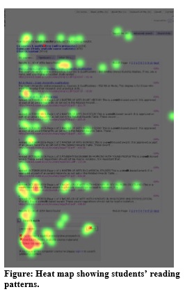
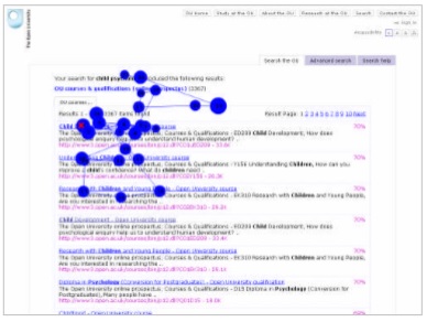
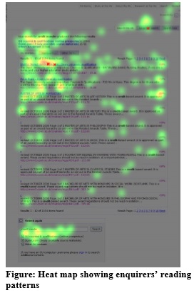
At The Open University, we used eyetracking to get a better understanding of how people read the search results pages. The eyetracking data confirms the observation that participants don’t look further than the first three or four hits, if they find one that seems good in that set.
For example, the eyetrack below follows a student who was looking for a course about psychology of children. She glanced around the top of the page. The first fixation is on the first link. Her eyes then darted around the top of the page confirming the query “child psychology”, checking a few of the lower links, and then returning to click on the first link. There are no fixations lower on the page than the third link.
We also saw differences in how students and enquirers scanned results pages when looking for information.
The students were purposeful, as we might expect from frequent users of the site. They looked at all of the search results, but their eyes did not tend to wander. More than one tried the search options at the bottom of the page, and one used a link at the top to narrow their search.
The enquirers’ scanning pattern was more diffuse. They looked all over the page, including the top navigation, top search options and bottom search options, but without strong direction. Some clicked on the top link, possibly hoping that it would have the information they wanted, even though the title and abstract did not indicate this.
Designing information to be searched
Many aspects of search are controlled by the search engine.The effectiveness of the search algorithms is one of the more important elements in determining how good the user experience is. A search engine, however, is only as good as the information in its index. Poorly written page titles, missing keywords or short descriptions, and the inclusion of inappropriate pages in the index can all undermine even the best search engine. Garbage in, garbage out.
With the growing importance of search as a normal way to find information, it’s time to pay more attention to the content itself.
Titles and descriptions have to stand on their own
In a search results list, people read the page titles as “headlines” (Quesenbery 2003, 2003a), scanning through them first. Only if a title is interesting do they read the rest of the description. Those titles really have to work.
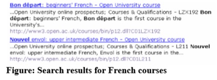
For example, searching for French courses, the most important thing is that they are clearly identified: courses separate from diplomas or degrees ,and the level of the course identified.
Without the information that “Bon départ” is the beginners’ French course, and “Nouvel envol” the upper intermediate course, think how much harder these two search results would be to read.
This is not just search engine optimisation. Better titles help make any list, menu and even on general information pages.
What do you “feed” your search engine?
Finally, you must also decide what to index. This is especially important if your servers house RSS feeds, blogs, discussion forum archives, or photo galleries in addition to more traditional web pages. The whole panoply of Web 2.0 features introduces new complexities for search engines.
At The Open University, a popular section of the website introduced RSS feeds for each of their main navigational topics. Because these files lived on the same server, the search results were overwhelmed with links to XMLbased pages.
Other examples require careful thought about the purpose and audience for a website. Let’s imagine that one of the staff is an expert in a particular technology. She publishes a blog with hints and tips that others find useful. There is no proprietary information on the blog, so it is open to the public. But do you want that blog to appear in your site search results? The answer could be yes if the blog will function as a “golden page.” But you might not want this information to supersede other information about your company’s capabilities.
Conclusion
The days when search can be treated like an isolated feature of a site are over. Search is normal behaviour, and all aspects of the search experience—the results page, how search is integrated into the site, what is indexed for search, and the content used by the search results—all need to be carefully designed.
References
Bates “The Design of Browsing and Berrypicking Techniques for the Online Search Interface”, retrieved online, 1999
Klinkenberg, Paul “Googlification” Retrieved from http://www.googlification.com/, May7, 2008
Lebson, Cory (2007) “The “Googlefication” of Site Search: Adapting to Google’s Influence on User Behavior” UPA2007
Nielsen (2005) “Mental Models for Search are Getting Firmer” Alertbox on www.useit.com, May 9, 2005
Nielsen (2001)“Search: Visible and Simple” Alertboxon www.useit.com,May13,2001
Nielsen (1997) “Search and You May Find” Alertbox on www.useit.com July 15, 1997
Quesenbery, Whitney (2003a) Designing a Search People Can Really Use. STC Intercom, December 2003, p 18-21
Quesenbery, Whitney (2003b) “Designing the Right Search for Your Site” presentation at NYC UPA Chapter, Feb 11, 2003
Quesenbery, Whitney, Jarrett Caroline, et al (2008) “Search is now normal behavior. What do we do about that?’ UPA 2008, Baltimore, Maryland
Shneiderman, et al (1997) Clarifying Search: A User Interface Framework for Text Searches. http://www.dlib.org/dlib/january97/retrieval/01shneiderma n.html
Spool, Jared (1997) “Why On-Site Searching Stinks” http://www.uie.com/articles/search_stinks/
Spool, Jared (2001) “People Search Once, Maybe Twice” http://www.uie.com/articles/users_search_once/
Wiggins, Richard (2002) “Beyond the Spider: The Accidental Thesaurus”, Info Today, October 2002 http://infotoday.com/searcher/oct02/wiggins.htm
featured image: Search! by Jeffrey Beall, creative commons licence