

These slides are from the first part of a workshop I ran for EBI on user experience surveys. They cover two key topics: how to improve the questions in surveys, and how to assess UX using a survey. Better UXContinue reading… How to ask better questions and how to assess UX using surveys
Category: All
UX of Transactions
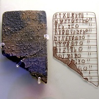
This article first appeared as a chapter in Buie, E. and Murray, D., Usability in Government Systems: User Experience Design for Citizens and Public Servants, Morgan Kaufmann 2012. “This form, this form in particular I am absolutely fine with andContinue reading… UX of Transactions
To sign or not to sign? Signatures and signing ceremonies
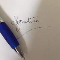
Each year more and more business, leisure and personal transactions move online. Yet the handwritten signature continues to have an almost mystical power in the minds of lawyers, organisations – and many of us who are asked to sign forms. This article challengesContinue reading… To sign or not to sign? Signatures and signing ceremonies
More investigation of why usability problems go unfixed – why the lightbulb still has to want to change
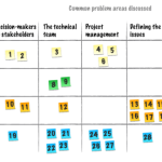
Not enough time, not enough resources, not enough clout to make it happen… Earlier in the year, Steve Krug and I reported on a survey in our talk ‘Because the lightbulb has to want to change. We asked UX professionalsContinue reading… More investigation of why usability problems go unfixed – why the lightbulb still has to want to change
Write clearly: how to take your writing for the web to the next level

These slides form part of a workshop on writing and editing for the web, delivered for EMBL-EBI in June 2012. Write clearly: take your web writing to the next level from Caroline Jarrett View the slides as aContinue reading… Write clearly: how to take your writing for the web to the next level
Because the light bulb has to want to change: Why usability problems go unfixed

Sometime in 2011, Steve Krug and I were chatting about a puzzling challenge in usability: the agreed but unfixed problem: ‘Agreed problems’ are ones that clients are fully aware of and agree need to be fixed. ‘Unfixed problems’ are onesContinue reading… Because the light bulb has to want to change: Why usability problems go unfixed
How to improve a complex form
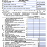
If you have a long, complicated form then here are some things that you can do to help users through it: Find out which parts of it are truly necessary. Can you simplify it at all, or perhaps delay someContinue reading… How to improve a complex form
Ten tips for a better UX survey, Las Vegas 2012

I was delighted to be invited to talk to the User Experience Professionals Association Conference in Las Vegas in June. This presentation offers tips on writing better questions, using rating scales well, improving the whole survey process, and testing, testing,Continue reading… Ten tips for a better UX survey, Las Vegas 2012
Basic best practices for buttons

Buttons on websites? Nothing special: just an ordinary everyday element of interaction design. Despite this, it’s rather too easy to find buttons that don’t conform to some basic best practices. Here are my basic best practices for buttons: Make buttons look likeContinue reading… Basic best practices for buttons
Buttons on forms and surveys: a look at some research
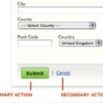
Where to put the buttons on forms? There seem to be endless discussions: Does ‘submit’ or ‘send’ or ‘OK’ go to the left or right of ‘cancel’? Does ‘next’ go to the left or right of ‘previous’? My views are:Continue reading… Buttons on forms and surveys: a look at some research