 Government forms are usually complex, asking a huge number of questions.What is the best way to group questions to make completing them as easy as possible for people?
This blog post for Government Digital Service considers what we’ve learned about form structure from recent user research.
We recently published a new guide on form structure, our term for choosing how to group questions in a form. Tim Paul announced it in his post One thing per page. It’s part of our advice on design patterns in the GDS Service Manual.
The old guide had three topics: asking questions, structuring forms, and a long section that compared the merits of four different types of structure: single page of questions, one question per page, accordion forms and hybrids.
The new guide has a three-step process:
- Know why you’re asking every question
- Design for the most common scenarios first
- Start with one thing per page
The biggest change is: “no more accordions”. We used to give them as an option to consider. Now we don’t.
In this post, I’ll explain:
- How we created the new form structure guide
- Why we’ve rejected accordion forms as an option
We do research with people who use our design patterns
Our design patterns draw on two types of research:
- The user research that our colleagues across government do as they create user services
- Our own research on the design patterns, which we do with designers, developers, and product managers
When we’re in the research studio with – let’s say, a designer – it’s a lot of fun. Our participants have nearly all observed a lot of user research but have rarely been ‘the user’, so that’s a new experience for them. Some are deeply familiar with our Service Manual and are looking out for changes and diving into details. Others are new to it and want to get an overview of what’s in there and how they might draw on it.
We saw people skip over some crucial advice
Our old guide started with this sentence:
Choose a structure for your forms that most naturally fits the way people need to use them.
It then listed 3 further topics that were covered in the remainder of the page:
- Asking questions
- Structuring forms
- Example structures
The ‘example structures’ section was the longest, with discussions of the merits and problems of each structure and included eye-catching illustrations, such as this one.
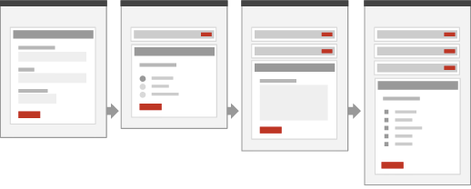
Now that you’ve had a look at the image, do you recall that opening sentence?
Don’t recall it? Well, scroll back to have a quick look.
Back with me? Excellent. If you played along with my little experiment, then you’ll have exactly replicated what we saw in user research. The designers and developers saw the sentence as it flew by when they first joined the page, but quickly looked past it to focus on the images.
So let’s have another look at it.
Choose a structure for your forms that most naturally fits the way people need to use them.
In practice, discovering ‘the way people need to use a form’ is hard. It needs concentrated work that may take several weeks of tough negotiations with stakeholders, observation of staff, and multiple rounds of usability testing. Also, because the imperative ‘Choose’ starts the sentence, it’s easy to get the impression that you do the choosing part before the “understanding the users needs” part.
We decided to change the balance of the page so that it emphatically puts the first task first:
We noticed that participants focused on two types of structure
Our old guide presented arguments for and against four types of form structure:
- Single page of questions
- One question per page
- Accordion form
- Hybrid form – a combination of the other types.
All of our research participants were working on forms that are too complex to work as a single page of questions. This aligns with what we’ve found in most government service forms – there are simply too many questions to be practical as a single page. Our participants mostly focused on the discussion of ‘The good’ and ‘The bad’ for two types of structures: one question per page, and accordions.
We no longer recommend accordion forms
In the previous guide, we mentioned that accordion forms are harder to implement and harder to use than one-question-per-page forms.
We said that an accordion form could handle branching and dependencies between sections. We’ve learned from our colleagues’ research with users that it can be very tricky to get these things right in an accordion form. If the accordion includes a branching question, then it can suddenly appear to ‘grow’ a new section – or lose one. That’s often very disconcerting for users. It’s even worse when an answer hidden within one section of the accordion removes or adds a completely different section.
We now know that ‘one question per page’ works well as a starting point
We took a good, hard look at what we were saying about ‘one question per page’ and accordion forms, and asked ourselves whether we still agreed with it based on what we’d learned about successful and unsuccessful forms in the last 18 months.
We’ve consistently found that very simple one-question-per page designs work better for our users than anything more complicated – at least as a starting point.
| What we used to say about one-question-per-page | What we now know |
| “harder to show progress” | Users rarely or never look at the progress indicators. The team working on Carer’s Allowance – an important form, and a long one – removed the progress indicators from their form and it made no difference at all to the completion rates. (Ben Holliday talks about this in his post Do less – problems as shared spaces). We no longer worry about showing progress. |
| “users have to click more to progress through the questions” | What we now know: users show little concern about how many pages of questions they have to click through, PROVIDED all those questions are easy to answer and clearly relate to the overall purpose of the form. |
| “you lose the context of neighbouring questions” | This is far less important than we believed originally. Users can sometimes need to know the context of a neighbouring question, and we find those exceptions quickly and easily in the first few rounds of user research. |
| “you need to build a separate page to review and edit questions” | What we now know: we used to list this as a negative; we’ve seen that users like these pages, they work well, and they are a positive benefit. So now it’s a plus point. |
| “doesn’t naturally handle non-linear processes like looping, adding and removing” | This was also listed as a negative; we now consider that it’s actually a lot easier to deal with non-linear processes in one-question-per-page forms. |
“At least as a starting point” is important
We recognise that some forms will have dozens – possibly even hundreds – of questions. We definitely expect that user research will quickly show you that some questions will be best grouped into a longer page. But we’re continually surprised by how questions that naturally ‘go together’ from the point of view of designers, or of government stakeholders, don’t need to be on the same page to work for users.
The turning point for me was when colleagues on the GOV.UK Verify team tried testing ‘create a username’ on one page and ‘create a password’ on the next. I’d always thought that those two topics needed to be on the same page. I was wrong: users didn’t even notice that we’d split them apart. As it happened, after a couple more rounds of testing we put them back together on the same page – some of our users have very little experience of computers, didn’t understand the concept ‘username’ or ‘password’, and it turned out to be easier to explain both concepts together. But if we’d never tried them as one-question-per-page, we’d have never learned exactly what we needed to explain and why.
Read the original blog No more accordions: how to choose a form structure
#forms #formsthatwork