Introduction and definitions
What is a form? BFMA has its own definition, but for this tutorial I am going to propose one that looks at a form from the point of view of the person who fills it in – the form user.
Forms ask questions and expect answers. They can gather information, when the form asks the questions and the user answers, or they can provide information, where they aim to offer answers to the user’s questions.
We’ll concentrate on information-gathering forms, as that does line up with BFMA’s slogan “we capture the information that makes business run™”. When you offer a page to your user with questions and spaces for them to fill in the answer, you’re gathering information. You’ve changed the underlying direction of information flow from outwards, your organisation to the user, to inwards, user to your organisation. That requires some commitment from the user.
What do we mean by ‘on the web’? There are lots of technologies for electronic forms and web forms available today, and it seems that new ones appear every week. So I’m not going to look at differences between technologies or their benefits. Instead, I’m going to pay close attention to the user. People change more slowly than technology, so the principles here should last longer than guidelines based on specific technologies.
The three-layer model
So, what are the elements of a form from the user’s point of view? First of all, there is the appearance. We know a form when we see one because it looks like a form.
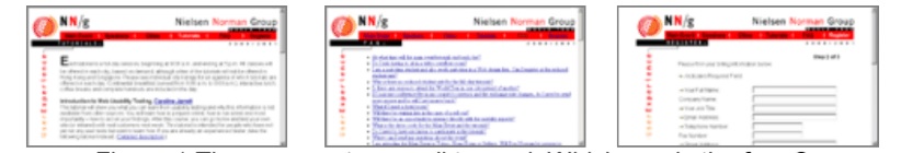
Look at Figure 1. There are three screenshots, deliberately made too small to read. But most of us will immediately identify the one on the right as the form. Users start behaving differently the moment a page looks like a form. They’re sucked into the response areas, and forget about reading the rest of the page. If a form looks ‘designed’ and easy to read, users are more likely to trust it and to answer truthfully.
The next layer in a form is the conversation. All those questions and answers create a conversation between the form and the user. As the user fills in the form, he or she has to understand the question, find the answer, put the answer on the page and move on to the next question or next topic -possibly dealing with any validation problems. If users understand the questions and can find the answers easily, they are more likely to trust the form and answer truthfully.
The third layer is the relationship. Why should users take time to give you information? What causes that information exchange, and where does the power lie in it? On the web, users will impatiently click away from your site if you offer them a form at a point where they think it is inappropriate. Or they will provide false or partly misleading information if they consider your question is impertinent. A colleague investigated one database and found that the client had over 1000 entries for “x@x.net” alone – leaving aside all the Mickey Mice and so on.
We’re going to look at the layers separately but it’s important to remember that the user experiences all of them at the same time. You can’t separate the conversation from its context, the relationship, or have that conversation without it having some sort of appearance. They all influence each other.
Relationship
The relationship between your users and your organisation determines their reactions to your form. That relationship changes between encounters with your form, and with each question.
Users are more likely to trust your form if:
- they know your organisation
- they have dealt with you in the past, and were satisfied with the outcome
- they feel positive about your organisation.
Then there’s the route they took to get to your form, and the circumstances when they are completing it. So:
- How did they get to the form? If they expected it, such as asking for delivery address to fulfill an order, then that is good. If they didn’t expect it, such as popping up a registration form out of the blue, then that is bad.
- How much time have they got available to devote to your form? A busy executive booking a hotel will be more impatient than a young person applying to college for the first time.
- What else is happening? Is this form being filled in by staff on the telephone to an impatient customer?
- Do they have a choice about whether they complete the form? We all hate our tax forms, but mostly we try really, really hard to complete them correctly. No choice there. And internal staff will tolerate rather bad forms because that’s part of their job. No reason why an external user will feel the same way.
You also need to understand their goals. If filling in the form will help move them along to a current goal, they are more likely to do it and respond accurately:
- What do they expect to achieve by completing your form? Buying car insurance to avoid major bills in case of an accident is more compelling than filling in a pop-up survey on a site you’re not much interested in for the chance of winning a few dollars.
- What information do they expect to give you? We’re likely to offer inside leg measurement when buying trousers, but not when buying car insurance. Users are especially choosy about when they’ll divulge private information such as email address or social security number.
- What do they think will happen next? If they get a direct result from filling in the form, such as a confirmation that they’ve successfully booked a place at Symposium, then they’re more likely to get to the end and more likely to be accurate.
Appearance
Websites that look good are more trustworthy (Karvonen, K. 2000. “The Beauty of Simplicity” Proceedings of the conference on universal usability, 2000 ACM). If your form looks nicely designed and orderly, then the user will be more positive about it. And it helps considerably if they can read it easily, and clearly identify where the answers have to go. There are many ingredients of a good appearance for forms, but here I am highlighting just two points: using layout conventions and designing to a grid.
Use the layout conventions
There are some straightforward conventions for layout of web forms, and you stray from them at your peril:
- Boxes are ‘cut out’ of the background form
- The inside of the box is white, or a paler colour than the background
- Buttons are ‘raised up’ from the background.
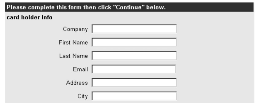
Generally, most HTML forms on the web at the moment stick closely to convention. The few Flash forms I have seen have been pointed out to me as particularly confusing. They have all suffered from the same problem: willfully ignoring these conventions. For example, see Figure 3 on the next page.
The boxes should be put in a consistent place relative to the prompts (the labels or questions that prompt the user to reply). This coffee site has got the labels all over the place.
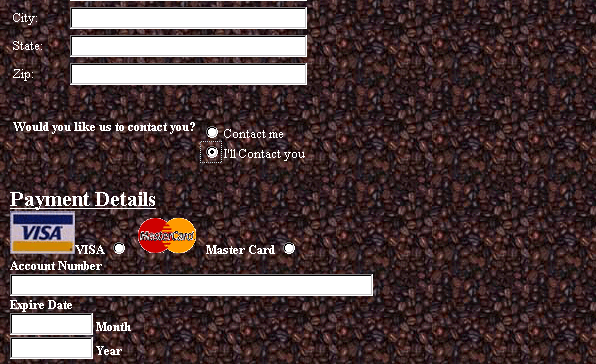
It would be easy for a user to click the VISA radio button when intending to pay by MasterCard, because of the ambiguity in the layout.
Arranging radio button choices vertically, as the coffee site has done with ‘Contact me’ and ‘I’ll contact you’ has these advantages:
- no ambiguity. The answer clearly aligns with the appropriate choice;
- allows for variable length choices, while still lining up neatly to the left.
But it has a major disadvantage: if you have lots of choices, your form will appear to be long. And pure length is definitely off-putting. If you want a reasonably short form and you can arrange your prompts so that they are about the same length, then putting them before the box and right-justifying gives a neat result.
But it can look oddly ragged if the prompts are variable lengths, so if that applies to you then left-justify your prompts.
If you need to translate your form, then you need to allow for theexpansion that you get when translating from English to most other languages. One solution that works well is to put the prompt above the box so it can expand as much as needed while still looking tidy. But if you do this it is essential to increase the line spacing so that the prompts are clearly associated with the box below not the box above.

Design to a grid
You may have heard a rumour that graphics detract from usability. Do not believe it. If your form looks good, it is more likely to be filled in. A few well-chosen graphics can help, and a clear and orderly design will help even more. So if you are not a graphic designer yourself, consider getting one to help you. Meanwhile, there is an important designer’s trick that will help your form to look more ‘designed’ and orderly: designing to a grid.
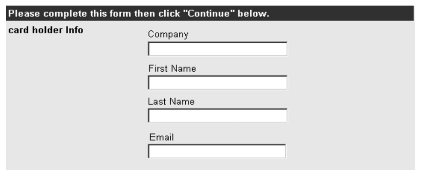
Figure 8 is an example of a form that looks neat and attractive. (The questions are another matter).
If we then block out the main areas of the form, as in Figure 9, we can see that the instructions, prompts and boxes themselves make graphic shapes on the page.
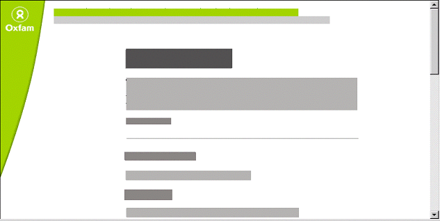
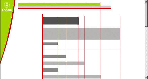
This page looks tidy because these blocks line up neatly at the left-hand side -and, where possible, at the right-hand side as well (but without using ‘justified’ text, which is harder to read). Figure 10 shows the strong and weak lines in the grid.
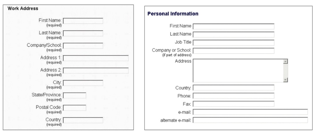
The next two figures are ‘before’ and ‘after’ a quick tidy up. Before, we have confused prompts, and boxes that are all sorts of different lengths. After the tidy up, the prompts stand out much more clearly and we have simplified the lengths of the boxes. Not much work required, but it looks much less messy.
Conversation
Sharp-eyed people will notice that in Figure 11, we changed some of the questions as well as the layout. And that brings us to the question-and-answer sequence that is always so important in forms: the conversation. Working through the form, we have to:
- understand the question
- locate the answer
- put the answer on the form, and
- move to the next question.
Understand the question: the rule of consistency
Of course, plain language is crucial in forms and gives your user a much better chance of understanding the question. I would like to highlight another very common problem in use of language: using similar words for different things or different words for the same thing.
In one early draft of a UK tax form, we had nine different variations on the phrase ‘tax code’. That was in a one-page form. This caused no difficulty at all to the tax specialists who were working on the form, but would have been highly confusing if we had failed to catch it before issue. You need to use exactly the same phrase or word every single time. Keep the ‘elegant variations’ for your creative writing classes.
It is equally important to differentiate between similar things. For example, on a recent form the user had to choose between ‘working’ and ‘not working’. During testing, the users found it hard to remember which was which. So they suggested changing the terms to ‘working’ and ‘new’. Now they are clearly different and so much easier to distinguish.
The rule is: “same word = same thing, different word = different thing”.
Locate the answer
Even though I have worked on UK tax forms for over 10 years, I still dread filling mine in. Why? Not because I do not understand the questions, but because I hate the process of hunting through my paperwork for the answers. Have you checked the amount of work that users will have to do to find the answers to your questions? They can reasonably be expected to remember their own names and addresses, if they’re willing to give them to you, but what about reference numbers from literature you have sent out separately?
Put the answer on the form
Having got an answer (either because it was easy, or after hunting around for it), the user has to put it on the form. There are a variety of different input methods available for web forms, and Sarah Miller and I put together a paper on how to choose between them: “Should I use a drop-down?”
What I’d like to consider here is the problem of inappropriate categorisation. Many times, we ask users to choose between categories where none or too many seem to fit. For example, I was testing a university web site where the user had to choose between categorising himself as a ‘new student’ or a ‘continuing student’. His problem? He was returning to study after a gap. So in his mind, he was neither continuing nor new -just stymied by that question.
On a paper form, these categorisation problems are much less important because the user can simply write in the missing category. But on a web form, we often ‘helpfully’ force users into making a choice because we are checking that their input is ‘correct’. I have lost count of the number of times I have moved Leighton Buzzard from its usual location in Bedfordshire, United Kingdom to Arkansas because a validation has forced me to enter a US state in my address. (I have even learned that the two-letter abbreviation for Arkansas is AR).
One easy way around this problem is to make plentiful use of that convenient category “other”, particularly for early versions of the form. If you find that it is rarely used: well done, your categories are working correctly. But if it is being used, do not worry that you will get huge amounts of variation in it. Nearly always, there will be a very small number of answers that come up frequently – and that you can then add to your categories, retaining the ‘other’ choice as a courtesy to the (much fewer) people who have genuinely unusual circumstances or answers.
Thoughtful validation
One of the advantages of many types of web form technology is that you can help your users by pointing out their mistakes, known as ‘validation’. Yes, users do make genuine mistakes and they may be grateful if you catch them. But before deciding what error message to display, think about why the error happens. As well as the category errors mentioned above, there are:
Typing errors People sometimes hit the wrong key. Unless the person has a real typing problem, these errors are likely to be confined to the occasional field.
Transcription errors These happen when a person is copying information from one place to another, for example reading a number from a credit card and typing it on-screen. Transcription errors are frequently swaps (the user types 4311 instead of 3411)
Send errors These happen when the person presses the ‘send’ or ‘submit’ button either deliberately or inadvertently when only part-way through the form. Your server gets a page with many blank entries.
Privacy errors These happen when the person considers that the question you have asked is inappropriate in context. They leave the field blank but you want it to be completed.
Two of these types of errors (category errors and privacy errors) are your fault, not the user’s. So it is particularly important to avoid accusing language in error messages. “You must correct your mistake” is annoying to a user when in fact they are struggling with a category or privacy error made by the organisation that is asking the questions.
Instead, politely ask the user to try again – preferably explaining why giving you the data you requested will help the user to achieve his or her goals.
Secondly, respect the effort that the user has put in to your form so far if you possibly can and keep their input. I have known forms that took two or three attempts because I hit slightly different category or privacy errors each time round, and when I did so the form discarded all my previous entries. Many people who are less persistent that me would have abandoned the transaction as soon as they saw that their work had been discarded.
Conclusion
This paper has presented the three layer model for thinking about forms, and then shown some of the ways that helps to make web forms easier to fill in. I’m always interested to hear about your results from making and testing forms, and will try to answer questions if I can. So please contact me with your comments.
#forms #formsthatwork