This article, by Cathy, was originally part of a collection of personal stories published on the Design to Read website.
I suffer from glaucoma (Primary, Open-Angle Glaucoma) and have first-hand experience of visual field defects. Most damage has occurred in one eye only, but I use both eyes when reading. Layout and screen resolution make a big difference to the comfort of reading, but note that this is partly due to the effects of glaucoma surgery and not just visual field damage.
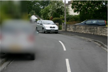
To date, I haven’t found any articles that consider how people with visual field loss see text on a page or computer screen. Most examples of sight loss relate to scenes, and the images don’t match the pattern of field loss caused by glaucoma. This example is typical.
I would like to show how text appears to glaucoma patients, and make some suggestions about how layout can help.
About Glaucoma and field tests
Glaucoma is a disease of the optic nerve — the part of the eye that carries the images we see to the brain. The optic nerve is made up of many nerve fibres, like an electric cable containing numerous wires. When damage to the optic nerve fibres occurs, blind spots develop. These blind spots usually go undetected until the optic nerve is significantly damaged. If the entire nerve is destroyed, blindness results. Initially, glaucoma damages peripheral vision, but as the disease progresses the central vision can also go.
Central vision is the fine vision people use to read and recognise faces, while peripheral vision is the side vision that is used for navigating obstacles in the environment (like doorways and coffee tables) and for detecting oncoming vehicles from a side street.
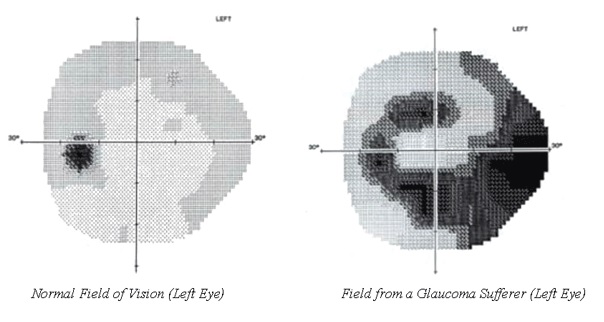
The term visual field refers to the area of a scene you can see with your eyes fixed on one location. Ophthalmologists use field tests (perimetery) to measure sight loss. Patients sit in front of the concave screen and click a buzzer as lights of different intensity are flashed onto the screen. Lights flash at different points on the screen, each of which represents a different part of the retina. The machine plots the minimum intensity of light the patient can see at each point. Darker areas correspond to more intense light.
The examples below show the field test from a normal eye (left) and the field from a glaucoma suffer who has lost most vision from the bottom of the left eye. Patients can initially lose vision from either the top of the field or the bottom. Eventually, they lose it from both areas.
How a computer screen appears with a damaged eye
The image gives an impression of how the damage caused by glaucoma affects what you see on a computer screen (for a left eye). It is based on the field shown on the right above. The levels of damage are shown as bands with increasing opacity. Of course, in life, there is a continuous gradation rather than the banding.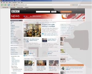
Note that in this example most damage has occurred in the bottom half of the eye. However, for many patients the damage will initially be greater in the top half. If left untreated, eventually, all vision is lost.
Important design issues
There are small areas of the screen that are very clear and other areas where it isn’t possible to see any text at all. Layout can make a big difference when navigating around a page.
Headings help you to locate the text of interest on a page.
Columns. Using a layout with columns is very helpful, as it increases the chance of seeing several complete lines of text. If you have to track across complete lines that contain gaps, you are likely to lose your place.
White Space. Adding white space helps to make different areas of the screen stand out so making it easier to locate the required text.
Bullets. Bullets help to break up text into small chunks that are easy to locate.
Fonts. I personally find sans serif fonts easier to manage than serif fonts. Plain fonts such as Arial and Verdana are good.
Issues to avoid
In pages with lots of unbroken text and narrow margins, as it is difficult to track along the lines. Unfortunately, this describes the layout for the average large print book.
Design guidelines
I am only comfortable using screen resolutions up to 1152 x 864 on a 20” monitor. Screen layouts that rely on higher resolutions appear too small for comfort.
references and credits
Car scene from http://www.glaucoma-specialist.com/images/496_carscene3.gif
Young H. Kwon, John Fingert and Emily C. Greenlee, “A Patient’s Guide to Glaucoma”, Med Rounds Publications, www.medrounds.org/glaucoma-guide/2006/02/section-1-c-understanding-vision-loss.html.
Glaucoma Associates of Texas, “The Visual Field Test”, http://www.glaucomaassociates.com/visual-field.html
#designtoread