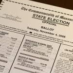
“An election is not held to test voters’ ability to follow instructions, but to receive instructions from the voters as to which candidates they will elect. No legitimate public purpose is served by designs that distort those instructions.” It’s goodContinue reading… Delivering Better Ballots
Category: Forms
People before pixels: what to think about before you start
Caroline Jarrett discusses putting users first in your forms design by choosing to keep, cut, postpone or explain the questions you are asking.
How to do ‘Contact Us’ badly (and some tips for doing it well)

Trying to report a problem with her email leads Caroline Jarrett to share some tips about how to ensure your website’s contact us function is effective for users.
Adding fun and engagement to purposeful systems using augmented reality: report from OzCHI 2007

Caroline Jarrett reports on the many uses people are finding for augmented reality in 2007, and argues for the importance of building tools that people actually want to use.
Expert review helps to improve a complex form
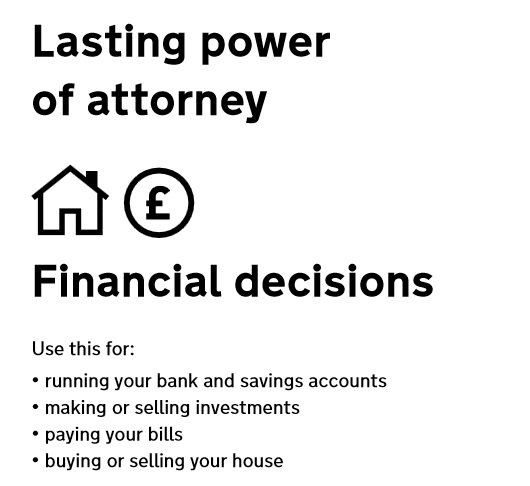
Applying for Lasting power of Attorney is often something people do at a time of challenge or stress. In this presentation to the Sixth International PLAIN Language Conference I describe a case study for the US Department of Constitutional Affairs where ourContinue reading… Expert review helps to improve a complex form
Book review: Letting go of the words: by Ginny Redish
This month, I’m enthusing about Ginny Redish’s new book Letting Go of the Words: Writing Web Content that Works (Morgan Kaufmann). If you write, or your clients write, then you’ll learn from it. If you’re working on a content-rich website:Continue reading… Book review: Letting go of the words: by Ginny Redish
How to write good FAQs (Frequently Asked Questions)

Comment in 2025: I wrote this in 2007. Since then, content designers have pointed out for at least a decade that Frequently Asked Questions (FAQs) are a bad way to meet user needs. Nevertheless, I still find plenty of FAQsContinue reading… How to write good FAQs (Frequently Asked Questions)
Label placement in forms
For ages, I’ve longed to do some eyetracking experiments on how users look at forms. And recently, I’ve been delighted to see the next best thing: excellent work by Matteo Penzo and his team. Experienced users look for the searchContinue reading… Label placement in forms
Why people persist with using paper forms

Have you ever wondered why your shiny new online form isn’t getting the use it deserves, and the boring old paper still keeps pouring in? This month, I’ve been mostly thinking about tax forms – and tax forms on paper.Continue reading… Why people persist with using paper forms
Forms design: Gerry Gaffney interviews me

Gerry Gaffney gave me an opportunity to talk about forms in a podcast for UXpod. You can find the original on Uxpod. Transcript Caroline Jarrett: And you’ve got my permission to play this to whoever you like under whatever circumstances you like.Continue reading… Forms design: Gerry Gaffney interviews me