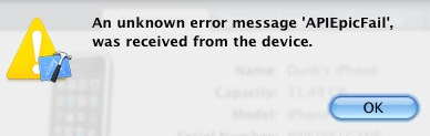
 An error message made it to Top Tweet status on Twitter in 2010. ““An unknown error message ‘APIEpicFAIL’ was received from the device”.
The only user option: click on OK.
When Duncan Campbell tweeted about this message, he commented sarcastically: “Could this be the best Apple error message ever?”
Turn the error message into plain language
If you understood what that error message was trying to say, please skip the next bit.
For everyone else, here’s what I think it means. (Years ago, I was a software engineer working on communications protocols, so I’m going to have a crack at dissecting this one, at the risk of exposing how little I know about it today.)
The computer that displayed the error message, which I’ll call the first computer, was trying to talk to some other device with a computer in it – most likely an iPhone. That is the device to which the message refers. A programmer anticipated that the device might not always work as expected and listed anticipated problems. Unfortunately, the device has itself sent an error message back to the first computer, but it’s not on that list of anticipated problems, so the programmer hasn’t written any code to handle the problem, apart from showing the poor user this useless error message.
Putting the message in plain language: “Something has happened that I didn’t program an error message for. Sorry.”
Make sure that your error messages cover unexpected problems
The real world is always messier than we expect it to be. When you offer users a list of predefined answers they can select, I urge you to include ‘Other’ as a possible option – with a text box that lets users explain what ‘Other’ means. If your list of anticipated options is perfect, no harm is done and nobody selects Other. But if your list of anticipated options happens to miss out a bit of messy reality, you’ll rapidly discover what you’ve missed from the way people fill out the Other box.
The same goes for computing devices – or indeed, anything else with lists that have even the slimmest possibility of not being comprehensive. Assign a unique error code to each can’t-ever-happen error case. Then include a last-gasp error message – for something that should never happen, but just might.
Its wording could be along these lines: “Unexpected error. We didn’t think you’d ever see this message, but you have. Please contact us and give us this error code: [Error Code].”
Give users some hint about what to do next
If you believe your can’t-ever-happen error message would appear rarely enough, why not put your direct phone number into it? Does doing that make you feel too uncomfortable? How about your email address? Or maybe the contact details for your help desk?
I realise all of these suggestions might seem ridiculously Utopian, but this error message was never supposed to appear, so the traffic it generates shouldn’t be all that bad, should it?
If these arguments fail to convince you, at least try to give users some hint about what to do next, such as: please try again, switch everything off and on again, jiggle the plug, uninstall the software, or whatever.
Not sure if this will work in practice? Here’s an example of where it did work.
“We recently changed how we handled error messages, and the changes received a lot of positive feedback. Instead of telling users what is wrong, we told them how to fix it. For example, we used to display the error message ‘Low Voltage Error.’ Now we display ‘Check Power Cable.’ We had character limits, but you get the idea. This approach reduced support calls and certainly improved user confidence.”
James Dyson contributed this advice to a discussion on the STC UUX list
Step away from ‘OK’ and ‘Cancel’
I do a lot of presentations about how to design forms. When I discuss buttons in error message boxes, I put up a slide that says: ‘It’s not OK, and I don’t want to Cancel’.
“Most times I come across the OK button, something not-OK has happened. It’s like my cat coming into our kitchen and saying. ‘Hello Gerry. Just wanted to let you know I did a pee in the sitting room. OK.’ Well, sorry, it’s not OK.”
Gerry McGovern
If all a user can do at this point is close the error message box, label the button with what it does: ‘Close this message’.
If there is anything a user can do that will improve the situation, offer a clearly labelled button or buttons that will send them on their way to that work.
Write your messages like a human talking to another human
You’re going to display your error message to a person, so write it in the tone of voice you would use if you were telling the error message to the person directly. What is appropriate to your brand and the users you expect to be working with?
Avoid jargon like invalid code, unrecognised field, mandatory, and device. If you are not clear on what people might see as jargon, try out the text on a person who doesn’t design or develop technology.
Or, if that is impossible, you can get a sense of what words might be familiar to non-technical people from a vocabulary tool – not to be confused with a grammar checker. Vocabulary checkers typically tell you whether your text is among the most common 1,000 words in English, the next most common 1,000 words, from academic language, or is unfamiliar to most people.
For example, one of the oldest out there that still works is Vocabulary Profiler. It strikes me as ugly – and, ironically, its user interface is full of jargon – but it’s also quick, effective, and free. Vocabulary Profiler.
Think about error messages as part of a conversation with users
In her book Letting Go of the Words, Ginny Redish says, “Think of the web as a conversation started by a busy web user.” Underlying all of this advice: the concept of error messages being part of a conversation with your users.
Do you want your error messages to be part of a productive, continuing conversation between your organisation and your users? Or do you want your error messages to be the subject of a mocking conversation on social media, with your users sharing them with their friends and followers? That’s the choice.
Updated in 2025. I no longer link to Twitter, but have kept the mentions of Twitter in this article. The STC UUX list went long ago. STC is the Society for Technical Communication and that closed down in 2025. The Vocabulary Profiler still exists and still works. The Oxford Dictionaries have a similar tool that is easier to use Text Checker | Oxford Learner’s Dictionaries