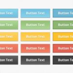
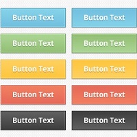
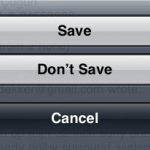
Buttons on websites? Nothing special: just an ordinary everyday element of interaction design. Despite this, it’s rather too easy to find buttons that don’t conform to some basic best practices. Here are my basic best practices for buttons: Make buttons look likeContinue reading… Basic best practices for buttons
Tag: buttons
Buttons on forms and surveys: a look at some research
Where to put the buttons on forms? There seem to be endless discussions: Does ‘submit’ or ‘send’ or ‘OK’ go to the left or right of ‘cancel’? Does ‘next’ go to the left or right of ‘previous’? My views are:Continue reading… Buttons on forms and surveys: a look at some research
Labels and buttons on forms – and other time-consuming controversies
Labels and buttons on forms are a topic that provoke a lot of discussion. At the 2011 AC CHI Conference on Human Factors in Computing Systems I ran a course addressing some of these controversies and sharing best practice. Continue reading… Labels and buttons on forms – and other time-consuming controversies
UXLX: Label placement in forms – and other time-consuming controversies

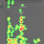
Here’s a look at current research into where to place labels – the text that stands for a question – if you want your forms to be usable. This presentation to the 2010 User Experience Conference in Lisbon also examines someContinue reading… UXLX: Label placement in forms – and other time-consuming controversies
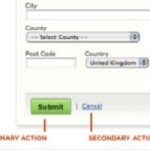
Buttons on forms – where to put them, and what to call them
Here’s a question that I get asked quite often: “Should we put ‘OK’ button to the left or the right of the ‘Cancel’ button?” A common variant is to ask the same question with ‘Back’ or ‘Previous’ instead of ‘Cancel’,Continue reading… Buttons on forms – where to put them, and what to call them
Rules for labelling buttons
It was one of those really conscientious discussions that seemed to have no end. First UI designer: ‘Right. Now here we have a tabbed dialogue box. When you press ‘Cancel’, it should remove all the changes the user has doneContinue reading… Rules for labelling buttons