Here’s a topic that divides UX professionals from ordinary people: label placement in forms. UX professionals get all excited about it, and I plead guilty to joining the discussion. I’ve written about it, included it in my book Forms That Work: Designing Web Forms for Usability, and given many talks on label placement. But conversations with my non-UX friends – maybe the retired teacher, the bookseller, or the waitress – that touch on this topic, go something like this:
Friend: “What are you talking about at the next conference?”
Me: “Label placement in forms.”
Friend: “People care about that? Really?”
Truthfully, I’d resolved to avoid the whole subject for a while. Then an intriguing email message turned up, from Roland Feichtinger. Here’s an extract:
“A new UI designer asked me why we’re aligning the labels to the left of the entry fields. From paper forms, people are familiar with labels above or below the input field. … I always have problems filling out paper forms that have the labels above. Is this my special problem, or have you heard from people who have the same experience?” Roland Feichtinger
Paper forms sometimes have labels below the fields
I was intrigued. Roland prefers filling out paper forms when the labels are below the fields? My observations in usability tests have been exactly the opposite: labels work best above or to the left of fields; labels below fields can be difficult. We exchanged a couple of email messages, and Roland explained that he was writing from Austria, and he sent me some examples of typical Austrian forms such as that shown below. It’s a form for joining a political party, but the first part is asking about personal details like name, address, date of birth, and citizenship.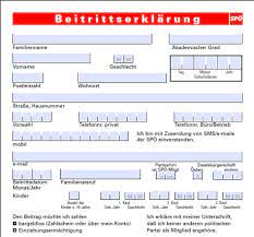
The alert forms-geeks among us will have immediately noticed that the form isn’t completely consistent: on the line after e-mail, it has some fields with labels below the fields and others with labels above. As this shows, label placement isn’t necessarily an exact science. But mostly, the labels are below the fields, and the form doesn’t appear to be especially hard to fill in.
All of Roland’s examples of Austrian paper forms were quite similar to this. I can read a little German, but not enough to know whether the questions in this form were clearly expressed. However, assessing them mostly visually, it looked like their usability would be no better or worse than you would typically expect for paper forms. That is to say, UX professionals could probably easily identify some usability issues in them, but ordinary people would somehow manage to struggle through them. Still, as Roland pointed out, the Austrian paper forms were much more likely to have the labels below the fields.
Paper forms vary by country and era
I don’t want to take the simplistic view that culture aligns with language or country, but I have observed some cultural differences in forms.
Citizens of different countries get somewhat accustomed – or perhaps inured is the better word – to the styles of forms that are typical of their government. The forms of large organisations also tend to have a style with which their employees become familiar.
For example, I once had the honour of doing some workshops on forms design at the Mayo Clinic in the USA, an organisation that is a beacon of excellence in forms design and management, as in so much else. To my British eyes, some of their forms used far more boxes and rules – lines dividing up the page – than looked good to me, but they were all in the style Mayo Clinic staff and patients were used to, and the forms looked appropriately well organised and professional to them.
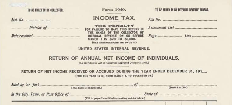 The styles of forms that are familiar to people also vary as time passes. For example, the Tax History Project
![]() has a collection of US tax return forms dating from 1913, showing how they have evolved over time. The visual style of the 1913 example below is very different from today’s US tax return – and it has some labels below the fields.
has a collection of US tax return forms dating from 1913, showing how they have evolved over time. The visual style of the 1913 example below is very different from today’s US tax return – and it has some labels below the fields.
What’s familiar may differ on the web and on paper
Roland’s investigation confirmed this. While he found that Austrian paper forms often have labels under the fields, he also found that almost all Austrian digital forms have labels to the left of their fields. As Roland pointed out, technologists usually design digital forms, and their designs reflect the experience they’ve already had with digital forms.
Users’ success with forms can vary according to circumstances
Roland and I agreed that the best way to move our discussion forward was to test some forms with real users, so that’s exactly what Roland did next. Here’s a brief description of his study and its results:
“For one group of participants, we placed the labels above the input fields and, for a second group, we placed them below. When test participants were able to concentrate on their work, there weren’t any differences between the two groups – everybody filled out the form correctly. But when we interrupted them and asked them to fill out the form in a reduced amount of time, the group with the labels below made fewer mistakes than the others.” Roland Feichtinger
Wow! I was really intrigued now. Contrary to many of my usual forms design recommendations, here was some actual data that labels below their fields might actually work better than labels above or to the left of fields! But would that result depend on the type of form or whether the users were Austrian or from some other county? Or on something else?
What matters most is whether a label is close enough to its field
Luckily, Roland was able to continue with his experiments on where to put the labels in forms and what effect their placement has on users. He later told me:
“In our latest tests, I’ve found out that it seems it’s not so important – here in Austria – whether a label is above or below its input field. The more important thing was the distance between the label and the input field. … I’d never really cared about this until one of our developers changed this distance. Suddenly nobody understood what fields the labels belonged to and, in this case, everybody expected them to be above the input field.” Roland Feichtinger
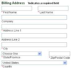 I was reminded of my own experience on Magellan’s, a site that sells travel goods. Looking at a section of their checkout form, shown below, you’ll immediately see that the labels are below the fields. When I bought something from the site, I never noticed this. I didn’t even notice this when I took a screenshot of the form – as I do of every form I fill in. I realised that the label placement was a bit unusual only when I was later browsing through my screenshot library. As an actual purchaser, I’d been able to associate each label with its appropriate field without any difficulty.
Choose any harmonious arrangement of labels, then test
Overall, I’m greatly relieved by Roland’s findings, because they support my usual recommendation:
- Arrange the labels and the fields in any way that seems harmonious to you.
- Test with your actual users.
- Make changes according to what you find.
- Repeat until it works.
Acknowledgments
I’d like to thank Roland Feichtinger of Systema.info and his colleagues for permission to include their work and for translating their forms into English for the examples.
This article first appeared in UX Matters, October 4, 2010
#forms #formsthatwork