In the chapter on Goals, I talk about why you are doing a survey. It’s focused on “The reason you’re doing it”, the first tentacle of the Survey Octopus.
The topics in the chapter are:
- Write down all your questions
- Choose the Most Crucial Question (MCQ)
- Check that a survey is the right thing to do
- Determine the time you have and the help you need
The error associated with this chapter is Lack of validity, which happens when the questions you ask do not match the reason why you are doing the survey and what you want to ask about.
I couldn’t give all the appropriate origins and suggestions for further reading in the chapter, so here they are.
The matrix was inspired by Christian Rohrer
I’ve used a four-way matrix in the section about “Check that a survey is the right thing to do”. My matrix compares “Observe” and “Ask” with “Why” and “How many?”, and I have chosen a limited range of methods to compare: Interview and Survey for “Ask”, and Usability test and Field study, and Analytics and A/B tests, for “Observe”.
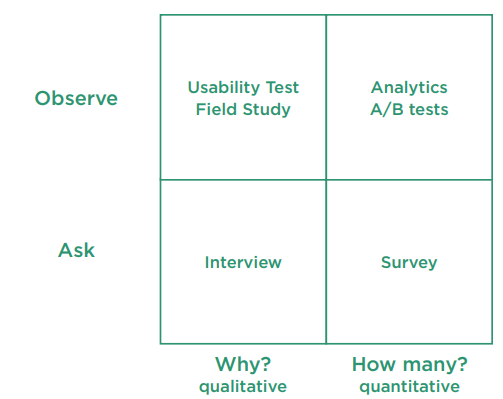
If you’d like a bigger matrix with a richer choice of methods, have a look at:
- Christian Rohrer’s article When to Use Which User-Experience Research Methods, or
- His printable version When to Use Which User-Experience Research Method (.pdf)
Wendy Gordon’s, Goodthinking: A Guide to Qualitative Research (Admap 1999), is also useful. Twenty years ago she was one of the few people in market research who looked at doing observational research as part of the user research mix. At the time her book was a classic, setting out state of the art thinking and practice in focus group research- a reminder again that surveys are not your only choice.
Quantitative methods are part of Big Honkin’ Surveys
In the book, you’ll find a “Route around the matrix” for a survey that starts with interviews, moves to usability tests, and finishes at a survey. I didn’t include any quantitative methods because for a Light Touch Survey, I find that I get better results if I focus more on iteration, using the mixture of methods in that route.
If it’s a Big Honkin’ Survey that you’ll use to make a big variety of different decisions, then definitely you’ll want to test it with plenty of A/B tests and other types of experiments. For some ideas about how to do it, have a look at the work of the US Bureau of Census. They do constant experiments because of the size and importance of the surveys that they run. Their papers are in a huge library:
That’s typical of survey methodology as a profession.
If you’d like to keep up with the sorts of experiments being done by survey methodologists in general, then good places to start are:
-
- the AAPOR’s open access journal Survey Practice
- the journal Public Opinion Quarterly (behind a paywall; if you do not have access to an academic subscription, then try writing to the named corresponding author of any article that you want as most authors will gladly send you a personal copy).
You need to think about ‘the number’ before starting your survey
Early in Chapter 1 I suggest you ask what ‘number’ you need in order to make a decision. It may appear too soon in the survey process to look at how we get from “the answer to a question” to “a number to make the decision”. But statisticians will tell you that you must work out your statistical strategy before you collect the data, not afterwards.
A useful resource while you are thinking about the number is John Allen Paulos’ book A Mathematician Reads the Newspaper. It’s a fairly light and accesible introduction to how numbers work.
Below, my guide to understanding descriptive statistics – for which there was no room in the book.
Work out your statistical strategy: how to understand descriptive statistics
There are a number of types of statistics that are relevant for surveys:
- Descriptive statistics: what does the data look like?
- Inferential statistics: what does this data tell us about the people we wanted to ask?
- Statistical tests: could what we’re seeing be happening because of chance variation? – that’s the topic for the spotlight on Statistical Significance.
In this spotlight, we’re going to think about some descriptive statistics.
The ones that I use the most often are the simplest:
n – the number of entries in the data set
‘n’ is an abbreviation that handily saves you from typing out ‘the number of entries in this dataset’. When we’re looking at a dataset of responses to a survey, n is the number of responses.
Minimum (min) – the smallest value
Maximum (max) – the largest value
Min and max are particularly useful for checking whether your data are plausible. Could anyone really have an answer this big? Or this small?
Range – max minus min
Range is convenient for comparing two data sets or as an abbreviation for talking about both maximum and minimum at the same time.
Mode – the most frequent value
The mode is often very useful for making decisions: for example, creating a ‘happy path’ for the most frequent type of customer.
Here’s an example from a data set about a conference. The organisers wanted to know whether to include a souvenir from their city in the conference swag bags. I took a quick look at the data, in this case the city of each participant.
| Conference city A | 59 | (mode) |
| City B | 12 | |
| City C | 5 | |
| Next door country | 3 | |
| (other) | 1 | |
| (no answer) | 15 |
Figure: Locations of people attending a conference
The mode? People from the conference city! The idea of a souvenir lost its lustre. Instead, the organisers pleased the mode by opting for donations to charities based in their city that also had activities across their whole country, which was fine by the attendees from the two other cities. The few attendees from other countries could buy their own souvenirs.
You won’t hear much about modes in statistics textbooks or college courses. That’s because despite the usefulness of modes for practical decisions, they don’t have convenient mathematical properties.
Median – if you arrange all the values from smallest to largest, the median is the one in the middle
Medians can be handy because they are not affected by a few very large or very small values – but like modes, they don’t come with many helpful mathematical properties.
Which brings us to the arithmetic mean, usually just referred to as ‘mean’.
Mean – the arithmetic average of the values (add them all together and divide by n)
I’ve chosen the ‘arithmetic mean’. For the statistical enthusiast, there are some others, too, but the arithmetic mean is the only one I’ve personally found useful, so that’s the one I’m sticking to.
A mean is sensitive to outliers
Unfortunately, means do have quite a big problem: they are easily distorted by an outlandishly extreme value.
Outlandishly extreme?
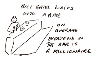 There’s a popular statistical story: “Bill Gates walks into a bar, and on average everyone in the bar becomes a millionaire”. Bill Gate’s wealth is so great that if you add it into any calculation of mean wealth, it will send that mean soaring.
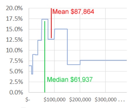
If you design for a mean, you may design for something that’s not very relevant to most people. Here’s a table comparing some actual data – US household income collected by the United States Census Bureau in 2018.
| Household income | % of households | Cumulative % |
| Less than $10,000 | 6.3% | 6% |
| $10,000 to $14,999 | 4.3% | 11% |
| $15,000 to $24,999 | 9.0% | 20% |
| $25,000 to $34,999 | 8.9% | 29% |
| $35,000 to $49,999 | 12.4% | 41% |
| $50,000 to $74,999 | 17.4% | 58% |
| $75,000 to $99,999 | 12.6% | 71% |
| $100,000 to $149,999 | 15.0% | 86% |
| $150,000 to $199,999 | 6.6% | 93% |
| $200,000 or more | 7.6% | 100% |
| Median income | $ 61,937 | |
| Mean income | $ 87,864 |
Figure: Median and mean US household income in 2018 Source: US Census Bureau
(If you’d like to see the most recent year, have a look at the Census website).
In 2018, the median household income was $61,937. In other words, half of all US households have an income under $61,937
71% of households have an income under $100,000, but the lucky 29% with household income of $100,000 or above push up the mean to $87,864. Result: most people (at least 58%) have incomes that are “below average” – less than the mean.
Modes are sensitive to banding
Modes have their problems, too.
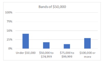
If we look solely at the table, the mode (most common band) is $50,000 to $74,999. When I put that table into a chart, the first thing I notice is that the reporting bands are not at all even. Based solely on the table, I could group the bands in two ways: as bands of $100,000, or as bands of $50,000.
Bands of $100,000 gives us a mode “Under $100,000” for household income.
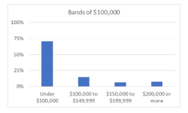
Bands of $50,000 gives us a mode “Under $50,000” for household income. Of course, strictly speaking an income under $50,000 is indeed under $100,000, but in terms of actual spending power that’s quite a difference.
This is not a criticism of the Census Bureau, as I know that they publish vast quantities of data that you can choose to use in all sorts of ways. It’s an illustration of how modes can change, to point out that if you want to use a mode in order to make any decision, you need to think through exactly how you’re going to collect and display the data that creates the mode. As so often, we have to grapple with all the tentacles of the Survey Octopus at once.
Some statistics tell us about how spread out the data is
Mean, median and mode are all “measures of central tendency” – they tell you what’s happening in the middle of your data. Our next measures are about how spread out it is.
Variance – a measurement of how spread out the values are compared to their mean
Variance is calculated by subtracting the mean from each value, squaring the result, and getting the mean of all the results.
If you subtract the mean from all the values and then add up what you’ve got left, you always end up with zero. (Try it in a spreadsheet). That’s why the variance squares the differences before adding them. But squares are a bit more difficult to work with so it’s more usual to use:
Standard deviation (s.d.) – the square root of the variance
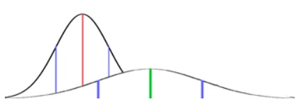
You may have met the Normal distribution before: it’s that bell-shaped curve that crops up in many types of measurement. Normal distributions have the special property that their mean, median and mode are all the same. When you know the mean and the standard deviation of a Normal distribution, you know everything about it.
The special mathematical properties of means and Normal distributions will come in handy when we are looking at Statistical Significance in another spotlight.
Think about the sort of number you need
For now, when working out what decision you’ll make based on your survey: think about what sort of number you need.
Is it the actual number of people who answer a question in a particular way? For example, if your survey is about planning an office move then you might want to know how many people say that their commute to the suggested new location will become excessively long.
Is it the proportion who answer one way rather than another? For example, will you go ahead with a new feature if more than 75% of customers say they need it?
Are you looking for a mean? For example, if the office move increases the mean commute by more than an hour, will that kill the idea?
Are you looking for a median? Many surveys by National Statistical Institutes, such as the household income one we looked at earlier, report means and medians because of the differences between the two concepts.
And for design, I’m often looking at modes: I need to know which answer is the most frequent. So I have to think very carefully about whether to offer a question that has response options in bands (usually not for modes), and how to group my answers.
Or something else? I’ve lightly touched on the basic descriptive statistics. You may be doing a modelling survey where you’ll do all sorts of advanced statistical manipulations, or something quite different.
Whatever you’re planning to do with the answers to your survey, some thought at this stage about those statistics will be well worth the time you put into it – and may send you back to have another review of your Most Crucial Question and how you plan to use it.
Further reading on goals
If you want to read a different angle on goals then David F Harris starts his book, The Complete Guide to Writing Questionnaires: How to get better information for better decisions with some relevant thoughts on planning research to support your decision-making. It’s published by I & M Press, 2014.