The spotlight on Statistical Significance was much edited and revised for the book. One of the sections which we cut was a fully-worked example – the Brewer’s Dilemma – to illustrate all the ideas I discuss. This, and other material cut from the book, is reproduced below.
Statistical significance is different from significance in practice
Statistical significance is closely related to sampling error: the choice to ask a sample rather than everyone in your defined group of people. There are many different ways of doing the calculations and they are called ‘statistical tests’.
A statistical test for significance is a calculation based on the data you collect, sampling theory, and assumptions about the structure of that data and of where it comes from.
For example, there are different tests for data that is continuous or discrete, and for paired observations or single observations. There are tools online to help you choose the right test, such as: Choosing the Right Test.
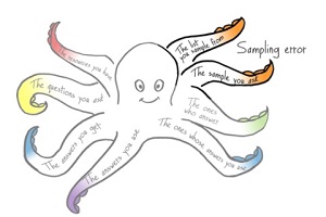
In contrast, the whole Survey Octopus is about all the choices that you make to achieve a result that is significant in practice. One thing that makes a result useful is considering the effect:
An effect is something happening that is not the result of chance.
Statistical significance relies on a p-value
Somewhat arbitrarily, the definition of ‘unlikely to be the result of chance’ is usually given as “p < 0.05”, so we get:
- A statistically significant result is one where p < 0.05
p is the usual abbreviation for the p-value:
- The p-value is the probability that the data would be at least as extreme as those observed, if the null hypothesis was true (Andrew J Vickers, What is a p-value anyway? 34 Stories to Help you Actually Understand Statistics, Pearson 2010)
When we choose to define “unlikely” as “p < 0.05”, we are accepting a risk of seeing an effect that is not there at the rate of 0.05 in 1, or 5%. The value 0.05 is the α.
The smaller the probability that you choose for α, the less risk of a false positive. The professor’s objection to the paper was that the authors rejected a treatment on the basis of a result that would be “unlikely to be the result of chance” if you allowed the risk of seeing something that is not there to be 6%, but not if it had to be better than 5%.
Another concept that is closely related to α is ‘confidence level’.
- The confidence level is 1- α expressed as a percentage.
If you choose α as 0.05, that’s the same as a confidence level of 95% or a 1-in-20 chance that you may get a false positive. To make it less likely that you will get a false positive, you need a smaller α – typically, sample size calculators will offer 0.01, equivalent to a confidence level of 99% or a 1-in-100 chance that you may get a false positive.
We will think about the Brewer’s Dilemma
To help us to grapple with all these ideas, I’ve made up an example. A brewer wants to measure some property of a batch of barley – a key ingredient in beer – to work out whether it is good enough quality. The brewer knows that farming is variable and that even the best farmer will harvest a little poor barley.
It’s possible to test handfuls of barley. By “handful”, I mean “a little bit of the batch that can be tested for quality”. Technically, statisticians would call these ‘samples’ but I find it confusing when I read sentences like “how many samples do we need to get a good sample”.
Up to now, the brewer has used barley from farmer Good, whose handfuls score about 95% on the property that the brewer measures.
The brewer is now thinking of getting barley from farmers Marginal and Careless. You’ll guess from the farmers’ names that their batches aren’t likely to be quite up to Good’s quality, so the brewer decides to accept a batch if it can score 90% or higher.
| Batch quality | Decision |
| 90% or higher | Accept |
| Otherwise | Reject |
A decision table for an incoming batch of barley
What does all this talk about barley have do with surveys? The answer is: barley, very little. The example honors William Gosset, who created many statistical ideas when he worked at the Guinness Brewery.

But the need to make decisions based on “handfuls” is an approximation of a familiar challenge. We also have an incoming “batch” for our survey – that’s our defined group of people. We also need to know how many of them to ask so that our chance of getting an accurate overall answer is good.
For the moment, let’s put aside the surveys and get back statistical significance, starting with “probability”.
A probability is a numerical statement of likelihood
A probability is a quantified statement about possible events. Conventionally, probabilities start at zero (cannot happen), and go up to one (definitely will happen).
The classic example is flipping a coin. The possible events are “heads” or “tails” depending on which side the coin lands. With two events and an unbiased coin, the probability of “heads” is 1 event out of 2 possibilities = ½. You may well argue that this ignores the possibilities of the coin landing on its edge, or of a passing seagull snatching it when tossed so it never lands at all. At least part of the fun of probabilities is defining the events that you consider.
I find it easier to convert probabilities to percentages, going from 0% to 100%. That gives my chance of “heads” as 50%.
A probability less than 0.05 is a small one
Saying “< 0.05” is a way of putting a number on “unlikely to be the result of chance”. It’s a small probability that is close to the “cannot happen” end of the scale.
| Cannot happen |
p < 0.05 | Chance of heads | Definitely will happen | |
| Probability | 0 | Less than 0.05 | 0.5 | 1 |
| As a percentage | 0% | Between 0% and 5% | 50% | 100% |
Probabilities from “Cannot happen” to “Definitely will happen”
The opposite of chance is an effect
The next step is to contrast “unlikely to be the result of chance” with its implied opposite: something other than chance is happening.
An effect is something happening that is not the result of chance.
Remember that our brewer accepts that there is always some natural variation in the quality of barley? That’s the “result of chance” part. And remember also that the brewer rejects a batch that has too many bad handfuls in it? That’s the effect part.
“The data observed” is the data that you have
When you measure something, each individual measurement that you take is a piece of data.
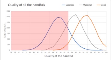
Each of our farmers, ‘Good’, ‘Marginal’ and ‘Careless’, has sent a batch of 10,000 handfuls. The “population size” for the batch is 10,000.
Magically, we can see what the batches look like, with each handful represented as a dot (there are 10,000 dots in each square). Red handfuls are problem ones. Farmer Good has a high quality batch with a sprinkling of bad handfuls. Marginal isn’t up to Good’s quality but may get away with it. Careless has had a bad year – that batch really ought to be rejected, there’s red everywhere.

The brewer first takes a handful of barley from the batch submitted by farmer Marginal and measures it, getting the value “85”. The brewer now has observed data: one handful of the barley scored 85.
Our brewer wants to reject batches that score under 90, and this first handful looks like it might be bad news for Marginal. But do we have chance or an effect?
“The null hypothesis” says what varies by chance
When the brewer points out to farmer Marginal that the first handful only scored 85, Marginal might exclaim “But I measured that batch at 92! You know that barley is variable – you’ve picked a handful that’s poor by chance”.
In statistical significance terms, Marginal is proposing the ‘null hypothesis’ that the batch is acceptable and the result comes from chance variation. The brewer is exploring the ‘alternative hypothesis’ of the effect that the batch is below acceptable standard.
“At least as extreme” says how unusual this observed data might be
The phrase “at least as extreme” recognizes that the measurement itself may not be exact. This measurement happened to come out at exactly 85, but it would be more usual for there to be a little variation such as 84.95 or 85.05 – so we are viewing the handful scoring 85 as being ’85 or worse’ by adding ‘at least as extreme’.
“The probability that” is the about chances

We’ve finally got to the first part of the definition of the p-value; the probability bit. When we looked at all 10,000 handfuls in Marginal’s batch (yes, there are 10,000 dots), we saw quite a lot of red.
Although red/gray color-coding provides a quick view of the batch, in fact a handful might measure anything from 0 (a handful of dirt got added by mistake) to 100 (every grain is perfect). If we look at an enlargement of a corner of Marginal’s batch we can see handfuls as low as 87 or as high as 96.

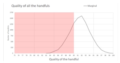
Let’s try a different – and possibly more familiar – visualisation, this time plotting the quality of the handfuls against the number of handfuls with that quality. The area under the curve is the total number of handfuls. For Marginal, the white area under the curve – over 90 – is bigger than the pink area – under 90, so Marginal’s batch probably is somewhere close to the 92 claimed. In fact, the mean quality of the batch is 91.45 – a shade under Marginal’s 92 figure, but definitely acceptable.
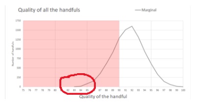
If we look closer, just at the part of graph with handfuls that measure 85 and under, we can see that Marginal is correct. In fact, there are only 105 handfuls out of 10,000 that score at 85 or worse, so the brewer has by chance picked an unusual handful.
For the next bit of this discussion, bear in mind that although we were magically able to look at the whole batch and can therefore support Marginal, our brewer doesn’t have that magic available and instead will be relying on the test of statistical significance – and that could give a correct or incorrect result. Let’s see.
With 105 handfuls out of 10,000 that score at 85 or worse, the p-value is 105/10,000 which is 0.0105 so p < 0.05. Back to the full definitions:
A statistically significant result is one where p < 0.05
The p-value is the probability that the data would be at least as extreme as those observed, if the null hypothesis was true.(Vickers, 2010)
We’ve been able to see exactly what is happening in Marginal’s batch, but the brewer doesn’t have that benefit. Let’s look at three possibilities for batches that a handful measuring 85 could have come from, as in the chart below. I’ve drawn a line for a handful at 85, and then created some possible batches and added them to the chart:
- A batch with a mean of 85
- A batch with a mean of 88
- A batch with a mean of 93
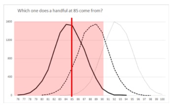
The batch with a mean of 85 has a lot of handfuls that measure about 85. As we move to the batch with mean of 88, there are a lot fewer handfuls in the batch that measure about 85. And that batch on the right, with a mean of 93, only has tiny number of handfuls that measure 85.
It’s most likely that this handful at 85 came from a batch with mean of 85. It might have come from one with a mean around 88, and it’s possible (but very unlikely) that it came from one with a mean around 93. The related p-values for a handful of 85 for worse those three batches are:
Mean of 85, p = 0.65 (quite likely that a handful of 85 came from a batch like this)
Mean of 88, p = 0.12 (less likely, but still possible, that a handful of 85 came from a batch like this).
Mean of 93, p = 0.02 (extremely unlikely, but just about possible, that a handful of 85 came from a batch like this)
Our brewer has to take a view about Marginal’s batch based on this handful. Armed with a p-value of 0.0105, the brewer turns to Marginal and says: “Sorry, this result is extremely unlikely to have happened by chance. The result I have is statistically significant, and I’m accepting my hypothesis that your batch isn’t good enough”.
Statistical significance does not guarantee good decisions
Seems harsh, doesn’t it? We saw that the batch has its weak points but overall it is acceptable. Although Marginal was a little optimistic in the measurement – in fact, the mean quality of the batch is 91.45 – Marginal was unlucky that the brewer happened to grab an unusual handful.
“Statistical significance” looks only at probabilities
When we choose to define “unlikely” as “p < 0.05”, we are accepting a risk of seeing an effect that is not there at the rate of 0.05 in 1, or 5%. In this case: the brewer has accepted a 5% risk of deciding to reject a batch (the brewer’s alternative hypothesis) which is actually acceptable (Marginal’s null hypothesis).
The worry about seeing an effect that is not there dominates statistical significance testing.
A false positive result is one that detects an effect that is only due to chance. Also known as: “seeing something that is not there” or Type 1 error.
The α (alpha – a Greek letter) is the probability level that you set as your definition of “unlikely”. If you are extra-worried about false positives, you can set a stricter α.
α is the risk of seeing an effect that is not there. The smaller the probability that you choose for α, the less risk of a false positive.
In our example, our brewer has hit the 5% chance of a false positive. Hard luck! That’s the way statistical testing works.
Are you thinking: maybe we could recommend a different α? Of course we could. Another concept that is closely related to α is ‘confidence level’.
The confidence level is 1- α expressed as a percentage.
If you choose α as 0.05, that’s the same as a confidence level of 95% or a 1-in-20 chance that you may get a false positive. To make it less likely that we get a false positive, we need a smaller α – let’s say 0.01, equivalent to a confidence level of 99% or a 1-in-100 chance that you may get a false positive.
Bonus: we’ve ticked off the second item in the to-do list.
- population size
- confidence level
- margin of error
“Statistical significance” says nothing about the quality of the decision
From the point of view of the brewer, do we think that the decision to reject Marginal’s batch is a good one or a bad one? If the brewery is now short of barley then maybe it was a bad decision. If poor quality barley might create nasty beer then maybe it was a good decision.
Statistical significance is about the mathematics of the decision process, not the quality of the decision. For “quality of decision” we need significance in practice, which comes mostly from the other topics in our Survey Octopus
Statistical significance says nothing about the choice of test
In our discussion so far, the brewer chose to test only a single handful from the batch.
The concept of statistical significance itself says nothing about the choice of test. It looks solely at the outcome of the test. It’s up to us to decide – and in this case, to advise the brewer – about what test is appropriate given the circumstances.
A successful test of statistical significance comes in three parts:
- The mathematical manipulation – the statistical test – that you do on the data
- The assumptions that you make about the data and whether those assumptions match the underlying mathematics.
- The amount of data that you give to the mathematics
In the case of our brewer, so far we only did a very simple mathematical manipulation: we looked at the result of one handful and used the decision table. We’ll return to the assumptions in while.
For the moment, let’s focus on the amount of data that we gave to the mathematics: in this case, one handful.
Let’s think about surveys again, briefly. We started all of this with the question: “How many people do I need to ask to achieve statistical significance?”. I think we agree that one is better than none, but almost certainly not enough to convince ourselves – let alone our colleagues and stakeholders.
Back to the barley. It seems like one handful didn’t give a fair result, so how many handfuls might we need to test to help our brewer decide appropriately in the case of our three farmers?
The amount of data you collect makes a difference
Statisticians refer to the shape of a dataset as “the distribution”. You may have recognized that the distributions of all six sets of test results, three handfuls and 33 handfuls for each farmer, are looking somewhat like the bell-shaped curve of the Normal distribution.
I didn’t make that happen by the way I made up the examples. It’s the way that means work: when you take a random sample:
- you’re more likely to get frequent values than infrequent ones
- the frequent values have the biggest influence on the mean of the entire data set
- the bigger your sample, the more likely that the mean of your sample is pretty close to the actual mean of the entire data set.
And you can prove it, too: the Central Limit Theorem tells us that, conveniently, as you take more samples and average them, the distribution of those means gets closer to a Normal distribution.
A distribution says how many you have of a value
To pick a test, we need to understand the distribution we are working with. Here’s a definition:
- A distribution describes how many there are of each possible value in a dataset.
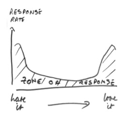
Distributions come in all sorts of different shapes. We met one when we looked at how the zone of response might be affected by people with strong feelings:
The Normal distribution is a common one and there are many more.
Let’s have a look at the distributions for the three batches of barley that we considered for our brewer. They are all pretty close to Normal distributions, with just about the same widthways spread (standard deviation) but with the peak (which for a Normal distribution is always the same as the mean) in different places.
Statistical tests do not protect you from wrong assumptions
Before we discussed variances and standard deviations, I mentioned that a successful test of statistical significance has three parts:
- The mathematical manipulation – the statistical test – that you do on the data.
- The assumptions that you make about the data and whether those assumptions match the underlying mathematics.
- The amount of data that you give to the mathematics.
If your stakeholders are genuinely interested in statistical significance, it’s important to have a discussion with them about what tests they consider to be appropriate for the sort of data that you are collecting, and the decisions that you are making. If you want some advice of your own, many universities have helpful pages for their students about choosing tests, such as https://www.sheffield.ac.uk/mash/statistics/what_test .
Most of all, statistical tests generally assume that you have a random sample. If you don’t – for example, if you chose to sample by ‘snowball up’ – then the tests will also deliver something that looks like a result even though they have not worked.
The probability of the data given the hypothesis says nothing about the hypothesis
Let’s have another quick look at those definitions.
- A statistically significant result is one that is unlikely to be the result of chance.
- A statistically significant result is one where p < 0.05.
- The p-value is the probability that the data would be at least as extreme as those observed, if the null hypothesis was true (Vickers 2010).
We are aiming to reject the null hypothesis by looking at the probability of the data given that the null hypothesis is true.
It’s crucial not to confuse “the probability of the data given the hypothesis” and “the probability of the hypothesis given the data”.
Personally, I find it easier to sort out conundrums like ‘probability of x given y’ compared to ‘probability of y given x’ by thinking: am I given the Popes or the Catholics?
As I write, there are around 1.3 billion Catholics and two of them are Popes: Pope Francis (current) and Pope Benedict (retired). Try this:
A. “The probability that we’re looking at a Pope, given that we sampled from Catholics.”
B. “The probability that we’re looking at a Catholic, given that we sampled from Popes.”
Answers:
A is: 2 chances in 1.3 billion
B is: 2 chances in 2
Whatever you think about Popes or Catholics, I hope you can see that the two probabilities are dramatically different.
The bottom line for us on statistical significance is that we can’t prove that the null hypothesis is true from our data. We can only look at the data we have and decide whether or not that data is probable if the null hypothesis was true.
Before you claim statistical significance, use this checklist
Let’s recap what we needed previously to know whether something is statistically significant, which was that you must first decide:
- What the effect is
- What the null hypothesis is
- Your α, your view of the amount of risk you can tolerate of “seeing something that is not there” (a false positive or type 1 error).
And now we’ve added on:
- What the distribution looks like
- The assumptions you’ve made about what you are testing relative to the distribution
- Whether the statistical test that is appropriate for the data you have collected does in fact work correctly given the distribution that you have and your assumptions.
Finally, we also always need to be clear on these related questions before we collect any data:
- Does this help me to answer the Most Crucial Question?
- How big an effect do we need for the result to be useful?
- What statistical power do we need? Or in everyday terms, how are we going to set our power, 1 – β, the probability that we will not miss the effect if it is big enough.
- Can we afford the cost of getting the number of people that our effect size and β require us to find to respond to our survey?
Further reading in statistical significance
Below are a few of the introductory titles on statistics that I read while I was researching my book. All have strengths and weaknesses and some are a challenging read. So if you are digging into this topic you may want to try two or three in order to find one that appeals to you. Of course if you are studying and your instructor has recommended one then that’s the one to start with.
How to Think About Statistics by John L. Phillips is a good book to read if you are just getting started in statistics. I found the section and illustrations on reliability (in Chapter 6, Correlation) particularly helpful.
Another book that aims to teach you about basic statistics is Derek Rowntree’s Statistics Without Tears: an introduction for non-mathematicians (Penguin 2000, 3rd ed.)
The Tiger That Isn’t: Seeing through a world of numbers is another good introduction to statistics for non-specialists, explaining how to make sense of numbers. It’s by Michael Blastland and Andrew Dilnot, part of the Radio 4 team who produced the popular More or Less series, and I read the second edition published by Profile Books in 2008.
Simple Statistics: A course book for the social sciences by Frances Clegg (Cambridge 1982) will have appeared on many course reading lists and is aimed at entry-level readers. Its main advantage is its use of cartoons to break up the complicated theory. While the main advantage of Uri Bram’s introduction, Thinking Statistically, (Kuri Books 2012) is that it’s only 72 pages long.
Statistics For The Terrified by John H Kranzler (Rowman & Littlefield 2018) starts in a helpful fashion with a chapter on ‘Overcoming Math Anxiety’ but thereafter becomes a rather tough read.