Skip to content
Effortmark: Better forms and surveys (logo)

Effortmark

Better forms and surveys

Main Navigation

  • Home
  • Training
  • Speaking
  • Forms
  • Surveys
  • Design
  • Publications
  • Blog
  • About
  • Contact me

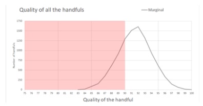
quality of the handful graph

graph showing a steep curve rising out of what is acceptable quality, peaking in the poor quality area

Marginal’s batch does look as if it might hit 92 on average

Primary Sidebar

Latest Blog Posts

  • Error rates and data quality – my 2025 topic28 October 2025
    In 2025, I’m focusing on error rates and data quality. My plan is to update this postContinue reading... Error rates and data quality – my 2025 topic
  • Garbage in, garbage out: Workshop at SDinGOV 202521 October 2025
    My topic for 2025 is ‘error rates and data quality’, and it was a pleasure to haveContinue reading... Garbage in, garbage out: Workshop at SDinGOV 2025
  • How to allocate time effectively in a training course8 October 2025
    In this blog post we will help you to decide how to use the time you haveContinue reading... How to allocate time effectively in a training course

RSS Feed

Footer Menu

  • Home
  • Training
  • Speaking
  • Forms
  • Surveys
  • Design
  • Publications
  • Blog
  • About
  • Contact me

@ Creative Commons Attribution 4.0 International Public License

Theme by Suri