The chapter on Questionnaires is mostly concerned with the last of the four steps to answering questions – respond. Once you’ve got your questions you need to turn them into a questionnaire that people can use.
The topics in the chapter are:
- What could possibly go wrong with your questionnaire
- Good questions are easy to respond to
- Choose your images carefully
- Consider the order of your questions
- Test your questionnaire.
There are no new errors associated with creating your questionnaire, but the risk of measurement error remains if the way you construct your questionnaire means people’s answers do not align with the questions you ask.
I couldn’t give all the appropriate origins and suggestions for further reading in the chapter, so here they are.
Be very careful if you’re using grids in your questionnaire
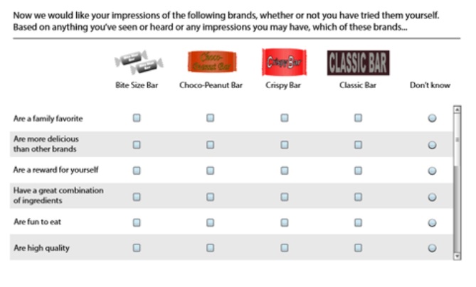
In the chapter I’ve written about why grids in questionnaires may be a problem. It’s a topic I studied for the organisation Kantar, who were concerned about the 15% of respondents who break off from questionnaires because of large grids. Clearly one way of solving the problem is: don’t use grids. But for various excellent operational reasons, many Kantar questionnaires must deal with a set of questions that are a series of rating responses – usually provided as a grid, such as the example below from (Conrad, McCullough et al. 2014).
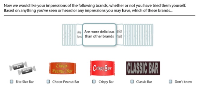
We worked to create a new response format, the ‘dynamic grid’. I remember the initial workshop where someone – I wish it had been me! – said ‘why not try something like iTunes Cover Flow?’
A few sketches later and we had the core of our new format – called a ‘dynamic grid’ by Kantar because of the way each new topic appears on a card when the person who answers chooses their response to the previous card.
Test every aspect of your questionnaire
The workshop part was quick and fun. It then took a long, long time to get through the necessary tests including:
- usability tests with respondents
- expert reviews with questionnaire professionals
- pilot tests in the field
- a/b experiments conducted by survey methodologists, such as the one reported in (Conrad, McCullough et al. 2014).
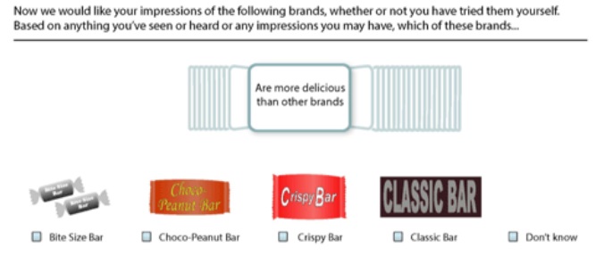
Here’s one example of the details to investigate: is it better to show hints of text on the previous and next tile (“context”), as above, or might they be distracting? And is the dynamic grid better than the ordinary type?
The a/b experiment that those images came from compared the two types of dynamic grid with the conventional grid on short (6 statements), medium (14 statements) and long (28 statements) tasks. Remember that the whole idea was about reducing break-offs from that nasty 15%?
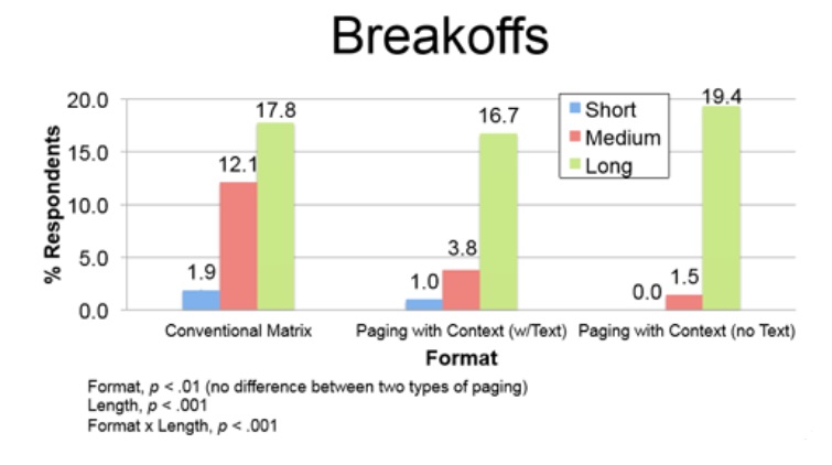
The results of the a/b test are mixed: our new format could help with a medium length task but didn’t make any difference for short or long tasks. It was a lot of work for a modest gain for a highly specific length task.
The morals of that story are:
- Don’t assume that your fun, fancy interaction method will work once it gets stuck into a questionnaire. It may be great, or it might simply increase your breakoff rate. Or it may not make enough of a difference to justify the effort you put in.
- You’ve got to test, test, and test again.
Should you use sliders in place of standard numeric scales?
Here are two useful articles to read before deciding to replace a standard numeric-type scale with a slider in your questionnaire:
- Are sliders better than numbered scales?
- User experience rating scales with 7, 11 or 101 points: does it matter?
Further reading on questionnaires
The Complete Guide to Writing Questionnaires: How to get better information for better decisions has some pretty good material on questions and questionnaire design that you might like to look at. The book, by David F Harris, includes a useful questionnaire. It also covers seven types of rating scale you might want to consider and some hints on cognitive interviewing. It’s published by I & M Press, 2014.