Buttons on websites? Nothing special: just an ordinary everyday element of interaction design.
Despite this, it’s rather too easy to find buttons that don’t conform to some basic best practices. Here are my basic best practices for buttons:
- Make buttons look like buttons.
- Put buttons where users can find them.
- Make the most important button look like it’s the most important one.
- Put buttons in a sensible order.
- Label buttons with what they do.
- If users don’t want to do something, don’t have a button for it.
- Make it harder to find destructive buttons.
Nothing particularly revolutionary there, right? Ever since the <button> tag arrived in HTML4, buttons haven’t been especially difficult to create. Despite this, it’s rather easy to find buttons that don’t comply with these basic best practices, so I’m going to dig into them a little deeper.
1. Make buttons look like buttons
The main point with buttons is that they need to look buttony – with a bit of shading on their surface or around their edges to make them stand out from the background and look clickable.
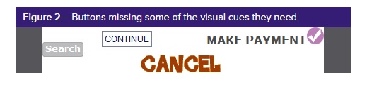
A shape around a word without any shading isn’t enough to make it clearly look buttony, and a simple word on its own definitely doesn’t provide enough visual cues, as in Figure 2.
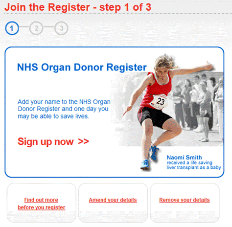
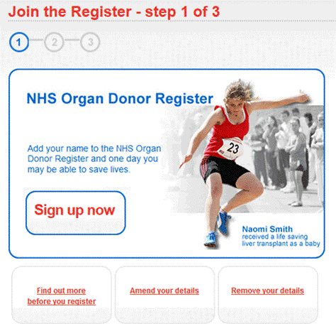
 If you make a button too big, it may no longer look buttony. Figure 3 shows a section from the UK website for registering to be an organ donor. It has four buttons – one main action and three subsidiary actions – but the primary action button is so large that it no longer looks like a button.
The solution for a button that is too big? Make it smaller. Figure 4 also has four buttons, but it’s now a lot easier to see which one is the primary action.
Although it seems obvious to me that buttons need to look like buttons, many website designers appear to worry that a messy old button would spoil the lovely lines of their design. And, of course, they may be right: we want that primary action button to look great, as well as to look like a button. It’s the one single most important place for your users to look, so it needs to be a visual pleasure. Just make sure it’s a buttony pleasure.
2. Put buttons where users can find them
On a web page, it’s all about knowing what catches your users’ attention and inspires them to action.
One of the most hotly debated questions in user experience is: “Does the OK button go to the left or the right of the Cancel button?” And there are equally impassioned debates about other combinations of buttons: for example, the vexing question of Next and Previous buttons in survey research. You can find opinions everywhere – and they’re often backed up by references to various style guides, articles, and even actual research.
My experience is that I have never designed a dialog box or form that consisted solely of the two buttons OK and Cancel. Nor have I seen a survey page that consisted solely of the two buttons Next and Previous. I can’t remember ever seeing one, and my library of screenshots doesn’t include any. Why? Because there’s always something else: some text, an image, or of course, one or more questions.
What were users looking at immediately before they started to hunt for that crucial primary action button? What made them choose Cancel or Back?
Generally, on a web page, it’s all about knowing what catches your users’ attention and inspires them to action. You have to decide on the text or image that inspires the call to action and put the corresponding button right there.
In the world of forms and surveys, users have just tabbed to or clicked a field – so put the primary action button, Next or OK or Send, as close as possible to the left-hand end of the last field on the form.
For a longer explanation of this advice, see my presentation “Buttons on Forms and Surveys: A Look at Some Research.”
Figure 5—My presentation “Buttons on Forms and Surveys”
Why, then, do I see buttons that are hidden in all sorts of strange places? For example, in Figure 6, the Next button is hidden in a footer. There’s one hiding in the page’s banner as well, above the logo.
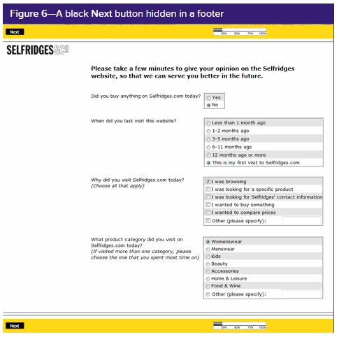 Figure 6—A black Next button hidden in a footer
3. Make the most important button look like it’s the most important one
Another common way of making it difficult for users to play hunt-for-the-button-I-want is to offer them lots of buttons in a neat row, all of them looking very similar.
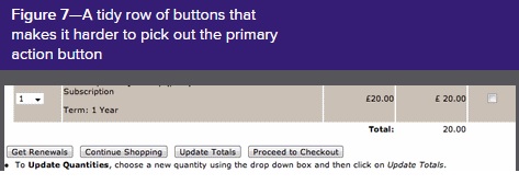
Figure 7 – A tidy row of buttons that makes it harder to pick out the primary action button
Why not give users a bit of help and make the primary action button more prominent? Making it a bit bigger makes it look more important. It also creates a larger target for users to click. Or try the more conventional approach: use a brighter color for the primary action button—just don’t be too subtle. We’re aiming for obvious.
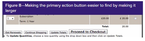 Figure 8—Making the primary action button easier to find by making it larger
4. Put buttons in a sensible order
If the primary action button needs to be where users look next, where should the other buttons go?
Clearly, you should tuck the other buttons away somewhere users won’t stumble upon them too easily. This is fine advice, but if you follow it without taking other design considerations into account, it could lead to improper layouts like the one in Figure 9.
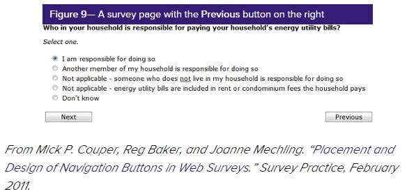
Figure 9— A survey page with the Previous button on the right
For languages that read left to right, a Previous button should always be to the left of a Next button, so the answer here is to rearrange the fields and buttons, possibly as in Figure 10. Another option would be to increase the left margin of the page and put the Previous button into it.
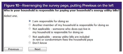 Figure 10—Rearranging the survey page, putting Previous on the left
5. Label buttons with what they do
Some users do read those labels, so help them by writing button labels that clearly explain what each button does.
The other day, I was anxiously trying to upload a presentation to a Dropbox account. Up popped the message shown in Figure 11. It offered me a single button labelled Awesome! What was that supposed to mean? What did the button do? How could I fulfil my goal of getting that presentation to where it needed to be?
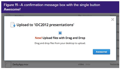 Figure 11—A confirmation message box with the single button Awesome!
This illustrates a violation of the best practice: label buttons with what they do.
Most of us have experienced wholly unwelcome message boxes that tell us about some drastic and horrible error – and expect us to click OK. It’s not OK, and I don’t want to click OK after receiving such bad news.
We certainly can’t guarantee that users will read the labels on buttons. In my presentation, I referred to three studies that showed if you put the wrong button in the line of fire some users won’t read the button’s label and will click the button. But the two survey studies also showed that some users do read those labels, so help them by writing button labels that clearly explain what each button does.
And if you find yourself in one of those arguments about what exactly the action of, say, Cancel should be on a dialog box – remember that you ought to be labeling the button with what it does, not trying to build an action that corresponds with the label that a button happens to have.
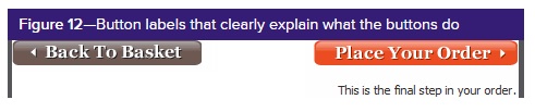 Figure 12—Button labels that clearly explain what the buttons do
6. If users don’t want to do something, don’t have a button for it
A lot of buttons … simply repeat the same action, so users get the feeling that they aren’t making any progress.
I constantly browse for forms to use as examples. To find out whether they work well, I fill them in as honestly as I can, but I don’t really want to register for a site or apply for a loan or do whatever else the purpose of a form might be, so I find a Reset or Cancel button rather convenient. I once wrote an article titled “Reset: The Piece of HTML Invented Just for Me, in which I said, “If you’re designing for consultants who specialise in forms design, make sure you include that Reset button. If you’re designing for anyone else, ask yourself whether they really will want to throw away all their work.”
Writing this, I just realised that it’s been a long time since I’ve seen a Reset button on a form – in fact, I haven’t seen one this year – and even Cancel buttons are becoming rarer. I capture screenshots of nearly every form and survey I see, and my 2012 example library, so far, has not got a single Reset button and only about 10% of forms have a Cancel button – and about half of those were forms for which it seemed plausible to me that a user might actually want to cancel.
I continue to see a lot of buttons that simply repeat the same action, so users get the feeling that they aren’t making any progress. For example, I recently started to apply for a credit card. Figure 13 shows the primary action buttons from the first three steps – none of which offered me a form, so I was feeling impatient before I had even answered a single question and quickly abandoned that process.
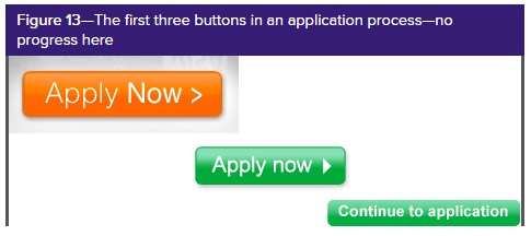 Figure 13—The first three buttons in an application process—no progress here
Lest you think this problem is a bit trivial, remember the “$300 million button.” Part-way into a process, users encountered a form with a choice of buttons: Log In or Register.
But users either didn’t remember their log-in credentials or didn’t want to register, so both choices were things that they didn’t want to do. Changing Register to Continue, something they did want to do, achieved a dramatic increase in sales.
7. Make it harder to find destructive buttons
Despite my arguments against buttons for things that users don’t want to do, we sometimes do need to offer destructive buttons such as Cancel This Order. This was one of the plausible Cancel buttons that I found in my library, from a website that is aimed at non-savvy users who were about to commit to a rather large purchase, with long-term monthly payments, and who might not realise that the Close the Window option would let them escape.
If you do need to include destructive buttons, you should definitely find a way to make them harder to find than the primary action button – for example, by making them look less buttony, smaller, or even turning them into links. Users who want to cancel – or perform some similarly destructive action – will break off and go hunting for them. But users who are happily proceeding with their tasks don’t get snagged into a horrible error.
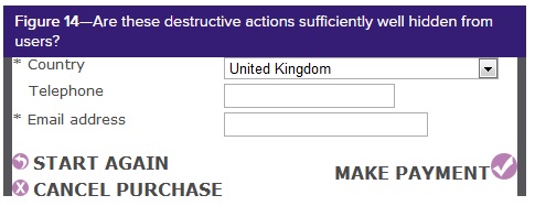 Figure 14—Are these destructive actions sufficiently well hidden from users?
Buttons have a role in the conversation
In our book Forms That Work: Designing Web Forms for Usability, Gerry Gaffney and I talk about forms as having three layers: relationship, conversation, and appearance. In her book Letting Go of the Words: Web Content That Works, Ginny Redish recommends that we “Think of the Web as a conversation started by a busy user.”
The humble button plays a crucial role in these conversations. When users first navigate to a page that contains a form, an appropriately easy-to-spot primary action button helps to show the extent of their task—a short form with a button that’s immediately visible is good; a long form with no button above the fold might not be so good. Of course, this depends on the relationship—that is, on the combination of the user’s goals and the assessment of the organisation asking the questions.
Clicking a button signals the end of my turn, a crucial element in any successful conversation. A smooth handover keeps the conversation flowing along; glitches such as an unsatisfactory game of hunt-the-button serve, at best, as interruptions and, at worst, as breakdowns.
From the conversational point of view, does it matter whether the primary action button’s label is Submit? Possibly. Both Send and Submit label the button with what it does—but only if you are a tech-savvy person with a clear concept of data being whizzed off to a processor that will deal with it. For others, either label simply signals the button to click to move things along—just as the Esc button on a keyboard sometimes helps you to jump out of what you’re doing. From these neutral viewpoints, the two labels are equivalent. But there is a minority who have read and thought about these terms, for whom Submit seems to create an unpleasant tone within the conversation, to the point where some especially sensitive people may break off entirely.
Summary: the Basics About Buttons
Because buttons are a vital element in creating a smooth conversational flow in Web, form, and survey experiences, it’s worth paying attention to these basic best practices for buttons.
Buttons are hardly newfangled or glamorous; they’re just an ordinary, every-day element of interaction design. Despite this, because buttons are a vital element in creating a smooth conversational flow in Web, form, and survey experiences, it’s worth paying attention to these basic best practices for buttons:
- Make buttons look like buttons.
- Put buttons where users can find them.
- Make the most important button look like it’s the most important one.
- Put buttons in a sensible order.
- Label buttons with what they do.
- If users don’t want to do something, don’t have a button for it.
- Make it harder to find destructive buttons
#forms ‘formsthatwork #surveys #surveysthatwork