Anyone who has heard or read more than one of my presentations will be familiar with my mantra: ‘test, test and test again’. It’s the only way to find our whether something really is usable, and yet we’re sometimes put in a position where we have to give judgments (sometimes known as ‘expert opinions’) on the usability of a product without doing a usability test. For example, when deciding whether the product is ‘fit for test’, which of a number of versions should go forward for testing – or because there’s neither time or budget.
How to look at a form – in a hurry was initially written and delivered by Whitney Quesenbery and I for the Usability Professionals’ Association Conference in Denver, Colorado in 2006, using a personas-based approach to reduce the risks inherent in being asked to make snap judgments.
Introduction
We still believe usability testing to be the ‘gold standard’ of finding out whether something is usable, but we are also often placed in a position where we have to give judgments (sometimes known as ‘expert opinions’ on the usability of a product without doing a usability test. These circumstances include:
- deciding whether the product is ‘fit for test’
- choosing between different versions to go forward to test
- or, of course, a simple lack of time or budget to do a test.
This paper describes a personas-based approach that reduces the risks of providing a snap judgment, and uses the example of looking at forms to set it in context.
Don’t look at it! Why you need to keep away from the form until you are ready
You only get one chance to have a completely fresh eye on a product, and only one chance to use it “as new”. This is especially important for forms, because few people (aside from forms designers) look at forms for pleasure. They only visit them because they are going to use them. But the interaction pattern for looking at a form is very different to the interaction pattern for using it.
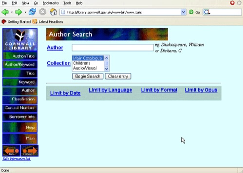
For example, we tested the library search form (left). Participants could choose which author to search on. They typically chose a best-selling author such as Dan Brown (‘The Da Vinci Code’ was in the bestseller lists at the time). Without exception, participants typed the author’s name with the first name first: “Dan Brown”.
The search returned nothing. Sometimes they tried again, perhaps with a different author: first name first. Participants behaved as if the form looked like the screenshot below.
When you looked at the form on the previous page, did you notice the hint on the right-hand side? It is supposed to tell users that the correct behavior is to type the last name before the first name: “Brown, Dan”.
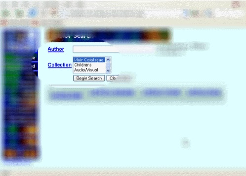 If you noticed the hint, then you were looking at the form differently to the way people looked at it when they used it.
Looking at a form in 30 minutes
Let’s say you have to get some response on a form in 30 minutes. Within that time, we want to:
- use it like a user,
- review what we find in our role of usability experts,
- report on it.
We use an approach that is similar to ‘persona-led heuristic inspection’, the technique described by Chisnell and Redish (2005).
The first minute: explaining the approach
We find that we usually have to devote the first minute to explaining that we don’t want to look at the form until we have thought about who will use it.
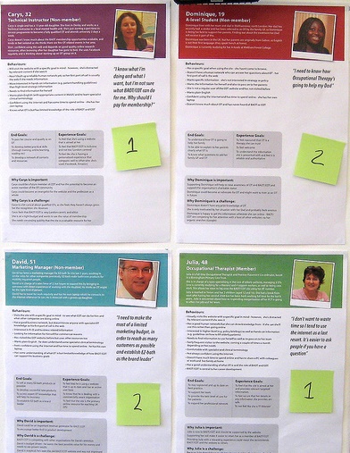
The three-minute persona
If the client has already established personas, then we spend the next three minutes choosing one to use and reading it carefully. More often, we have to create a persona for ourselves. In three minutes, we’re not going to get anything like the detail that would go into a complete persona.
But we can answer these questions:
1. Who is filling in the form?
2. Why are they doing it?
3. How do they feel about it?
4. What do they expect to happen once they have filled in the form?
Now try it: 11 minutes to fill in the form ‘in persona’
Once you have a persona in mind, it is much easier to stick with the discipline of trying to use the form rather than simply looking at it.
We fill in the form from the point of view of the persona, as honestly as we can. We use real, personal data. We look things up if they need to be looked up. If we would have to ask someone else for an answer then we think about whether a real user would do that.
We have found that it is crucial to avoid looking back over the form until we have made it right to the end. People using forms don’t look back – they just plow ahead until finished (or they bail out). If it is an electronic form, we aim to complete the transaction and note whether we expect to get a confirmation onscreen or separately, for example by email.
10 minutes to gather observations
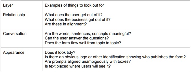
After filling it in, then it’s OK to look at it. We use the ‘three layer model’ (Jarrett, 2000) and look for problems in three categories: relationship, conversation and appearance.
Five minutes to report
Our last five minutes are devoted to delivering the report. The overall aim is to buy some more time: to get the client to agree that it is worth investing in a more thorough approach.
We are therefore trying to illustrate the types of things that need to be looked at more thoroughly. We usually do this by including at least one of each of the different types of problems: relationship, conversation and appearance. We also try to make sure that we have balanced the problems that we report with some encouragement and praise. Even the worst form can be described as ‘offering opportunities for improvement’.
Total: 30 minutes
What to do if you have two days
Not everything is done in a big rush. Sometimes we have the luxury of more time. If you can, try one or more of these further ideas:
- getting a second opinion
- setting up a quick ‘hey, you’ usability test
- finding out more about the users
- create a richer persona
- getting consensus about the business goals
Getting a second opinion
Although heuristic or expert reviews are an attractive idea from the point of view of a speedy turnaround, it is also well-known that they are a rather poor predictor of the actual usability of a product. Experts tend to over-report some errors and miss others entirely.
For example, Rolf Molich (who worked with Jakob Nielsen to develop their original list of heuristics) expressed this view in an interview with Christine Perfetti:
“Heuristic inspections are cheap, simple to explain, and deceptively simple to execute. However, I don’t use this method very often and I don’t recommend it to my clients. In my opinion, the idea that anyone can conduct a useful heuristic inspection after a crash course is rubbish. The results from my studies showed that inexperienced inspectors working on their own often produce disastrous amounts of “false alarms.
“Another problem is that heuristic inspection is based solely on opinions. No one has given me a good answer to the question that I’ve heard several times from disbelieving designers: “Why are your opinions better than mine?” I think that’s an excellent question, particularly knowing that users often prove me wrong henever my heuristic predictions are put to a real usability test.” Perfetti, 2003
One way of improving your results and guarding against the problems is to bring in a second opinion, ideally from someone with expertise either in the domain of the form or in forms design.
Setting up a quick ‘hey, you’ usability test
In two days, you probably do not have time for the usability test that you know would be the best way to find out whether the form works. But you should be able to fit in a quick test with the nearest match you can find to your user group.
Just think about the differences between the person that you caught with your ‘hey, you’ and the real users. Is there a difference in domain knowledge? Are there cultural differences that might be important?
Finding out more about the users
Thinking about the results of a ‘hey, you’ usability test often reveals that we do not know as much about our users as we would like. What do the real users know about the domain of the form? What is their attitude to it? Are there contrasting groups of users? For example, think about a travel booking form. A retired couple booking the ‘trip of a lifetime’ might have a very different set of attitudes and expectations about the form compared to a harried frequent flyer on the fourth business trip of the month.
Create a richer persona
As Quesenbery, 2006 points out, storytelling is a powerful communication tool. Try investing some of your extra time in creating a story for your persona. It will help you to enter into their world, and to take a more user-centered view of the form.
Getting consensus about the business goals
Many times, we have been offered forms to review where there is not yet a consensus about the business goals. Us: “what is the purpose of the form?” Client: “to collect information”.
Collecting information is not a purpose. It is a mechanical description of what forms do. It’s worth investing some of your extra time in talking to the form’s owners and stakeholders. Try to find out who uses the data gathered on the form and for what purpose. We find that asking: “what happens if you get no answer or the wrong answer to this question?” is often quite revealing.
If you get the answer “I don’t know” then it is an opportunity to ask to talk to the person who does know.
If you get the answer “that’s a required field, you can’t put the wrong answer into it” then it is an opportunity to talk about the possibility of the real world offering more complexity than the designers envisaged. For example, USA web sites that force foreign visitors to choose a state as part of their address – or UK web sites that force foreign visitors to give a UK-formatted postcode.
A case study
Caroline was asked to do an expert inspection of a form for the Oxfordshire Gateway, a consortium of local government organisations in Oxfordshire, UK. She persuaded the client to let her have two days.
She followed the basic 30-minute process, investing the extra time in:
- a deeper discussion of business goals,
- creating richer personas,
- producing a written rather than a verbal report,
- and most important of all, getting a second opinion from Whitney.
The client was pleased with the report and published it on the web (http://www.oxfordshiregateway.co.uk/oxdownloads/Expert_inspection_Oxfordshire_Gateway_2.pdf).
More importantly, they made the recommended changes.
Caveats: what you are risking if you do quick turnaround opinions
If you try to do something very quickly, there are obvious risks:
- Anything that does not involve real users from the target population is a risk. Users delight us,and frustrate us, by behaving in ways we did not expect and could not predict.
- Speedy turnaround can ‘train’ a client into believing that 30 minutes, or two days, is enough for investigating any problem.
- If you do get it wrong, and the client acts on your recommendation, you could damage your credibility with that client.
Summary
If you are forced into providing an expert opinion in a very short time, then we recommend taking a small part of that time to think about your users and create a mini-persona. Then dive in to your review.
REFERENCES
Chisnell, D and Redish, J. C. (2005) Designing Web Sites for Older Adults: Expert Review of Usability for Older Adults at 50 Web Sites http://assets.aarp.org/www.aarp.org_/articles/research/oww/AARP-50Sites.pdf
Jarrett, C. (2000) Designing usable forms: The three-layer model of the form Proceedings of the Society for Technical Communication’s 47th Annual Conference
Jarrett, C. (2005) Caroline’s Corner: Persona-led Heuristic Inspection is Here http://www.usabilitynews.com/news/article2477.asp
Perfetti, C (2003) Usability Testing Best Practices: An Interview With Rolf Molich http://www.webpronews.com/webdevelopment/sitedesign/wpn-26-
20030730UsabilityTestingBestPracticesAnInterviewwithRolfMolich.html
Quesenbery, W (2006) “Storytelling and Narrative” in Pruitt, J. and Adlin, T (2006) The Persona Lifecycle: Keeping People in Mind Throughout Product Design Morgan Kaufmann
Download How to look at a form – in a hurry by Caroline Jarrett and Whitney Quesenbery.
#forms #formsthatwork