“Whose work should you be checking out if you’re interested in better forms?”
For me, that’s the most interesting question I was asked in a new interview on forms design and usability for theUXreview because it gave me the opportunity to share a host of links to people and articles that have impressed me.
Editor Chris Mears also asked me who inspires me on forms. I had to say it is those who fill them in. Watching them always motivates me to want to make better forms and encourage others to do the same…starting with the advice I share in the interview.
What is the most common usability problem you see on the forms you look at?
Poor wording of the questions and poor choices for the response options. Sometimes it’s obvious that the organisation publishing the form has never tried to watch someone fill it in, or thought about what the questions might mean to the person filling in the form.
What are the main differences between usability on a paper vs. electronic form?
Fewer than you might think. Paper forms have some advantages: if you’re filling in a paper form and get stuck, you can write an extra explanation or find some other workaround. On an electronic form, you may be forced to lie or to give up entirely. So electronic forms can be a massive barrier.
But electronic forms have their advantages too. If they’re thoughtfully designed with good error messages, they can help guide people to fill them in correctly. And for some people, they are a lot more accessible. You can enlarge them more easily and you can access them using a screen reader.
How does people’s behaviour and interaction with forms differ between mobile and desktop?
Also less than you might think. It’s still all about the questions: questions don’t change their meaning all that much when transferred between paper, mobile, desktop, or when asked by a person face-to-face or in a telephone interview. (There are few little changes but not that many).
The biggest differences are that the smaller form-factor of most, but not all, mobile devices means that you’ve got less space to deal with and also typing can be harder on the smaller mobile keyboards. Watching someone pinch, scroll, enlarge and shrink to get around a form designed for a desktop when they have to access it on a smallish smartphone – well, it’s a horrible experience even watching and worse for the person.
Another very important consideration is that not that many people have desktops any more. I’ve seen lots of forms that have been designed with lovely responsive layouts, but that expect that all non-mobile users have massive screens. They don’t: many of them have laptops where there’s quite a lot of spare horizontal real-estate but only a tiny amount of vertical real-estate. Yes, many people know enough to scroll down, but is your logo and top-of-the-page whitespace so vital on every page that they have to scroll down every single time? That’s also not a lot of fun to watch.
(By the way, two-column forms are not the answer; they’re an even worse nightmare. But that’s another story).
What are the future trends for form design?
Greater simplicity and greater focus on asking good questions that mean that you gather the right amount of information at the right time. Well, I hope so: I think that organisations that continue to force people to fill out poor forms will find that their customers move elsewhere, to competitors who do a better job.
Is there anything you don’t like about forms?
There are so many hideous ones about. I spend my life trying to restrain myself from thinking ‘if only they’d worked a bit harder on this form’. I don’t like bad forms, at all.
But another thing that I don’t like: designers and developers who think that forms are both easy and boring. So they try to do fancy things on the forms, or they don’t pay them enough attention. It’s pointless to spend loads of time on a fantastic home page or a beautiful logo if the only non-optional part of the experience – filling in the form – is horrible.
And it’s inexplicable to me that people aren’t fascinated by the challenge of making great forms. That’s weird.
What considerations are there when designing a form for multiple devices?
We’ve sort of looked at that in the differences between paper and electronic forms, above. These days I’m in favour of starting your design for a small form-factor – for limited space, both vertically and horizontally – and then testing it on the other types of device. I was impressed by the way that you and Christina Li @chrissy0118 are doing that on the complex form you’re designing. I’m finding more and more that simplicity helps everyone: simpler questions, fewer fancy interaction features, fewer questions on each page. Focus on what you have to ask, and think hard about whether there is any way in which you can postpone asking a question until you need that data. Those are factors that work across all devices.
Who inspires you on forms?
Definitely the people who fill them in. Watching people fill in the forms recharges my batteries and inspires me to want to make better forms, and to encourage other people to create better forms.
You are one of the prominent figures in form design – is there anyone else we should be checking out?
I was chatting to Joe Leech @mrjoe at the recent UXPA conference and we were celebrating having 50% of the true forms people in the room at the same time. The other two are his colleague Chui Chui Tan @ChuiSquared and our friend Jessica Enders @formulate. Jessica lives in Australia and we rarely get to see her in person. We all pay a lot of attention to each other’s work.
There are others who understand that forms are important and pay a lot of attention to forms design. They don’t quite (yet) love working with forms in the same way that Jessica, Joe, Chui Chui and I do – but they show signs of heading that way. For example, Gerry Gaffney @gerrygaffney, co-author of my forms book, always claims not to be interested in forms but maybe he just loves winding me up.
Ginny Redish @ginnyredish is my all-time UX hero; she was doing wonderful work on paper forms in the 1980s and is still very interested but these days focuses more on writing for the web. (If you don’t yet have her book ‘Letting Go of the Words’ *, buy it now and read it immediately. If you’re not sure whether to follow my advice, take Steve Krug’s word for it – he says exactly the same thing).
Of course Luke Wroblewski @lukew wrote a terrific book on interaction design of forms because although he wasn’t particularly interested in forms, he was very, very interested in great experiences and he realised how much good forms design contributes to that. I’ve been enjoying his recent short videos where he focuses on a particular aspect of design – and that’s often something relevant to forms.
I’m also delighted that several of my colleagues at Government Digital Service (GDS) and across UK government are getting into forms. For example Joe Lanman @joelanman wrote a great article recently on making choices in forms design when designing ‘Register to Vote’.
Ben Holliday @benholliday tops that – he’s been doing a wonderful series of forms experiments that are so exciting, showing us what things in forms design do and don’t make a difference in practice and how to think about the challenge. The most recent one was improving the Carer’s Allowance Guide. They’re both working closely with the team that’s creating, updating, and publishing our design patterns – most of them are about forms.
Gemma Leigh @gemmaleigh and George Sheldrake @georgesheldrake have done a lot of work on that with Tim Paul @timpaul who wrote this post on the new design patterns.
There’s also another group that we don’t hear enough from: the people who are deeply into forms management. That’s a related topic that’s about finding, improving, and managing forms across organisations. Many of us find it quite a struggle just to deal with one form at a time and make that into a good experience – but we don’t get the chance to think about every single form that our organisations publish and how to manage every single one of them. For example Kelly Halseth @kellyhalseth does that in Canada for a hospital. I wish she had the time to write and publish, but she’s too busy simply keeping on top of all their forms. Ray Killam and Margaret Tassin of Essociates, Inc. are forms management experts and I have a huge respect for their work.
Are there any resources you recommend checking out for those who would like to learn more about form design?
On the Effortmark website we have come suggestions of where to get started on forms, linking to a selection of the wealth of content on forms across the site. You can also find my forms presentations on Slideshare.
What are the top 3 form guidelines that are worth repeating?
- Test everything: watch people fill in your forms, and get them to tell you what they’re thinking as they do it.
- I’m tempted to write: stick with guideline 1, that will deal with most things. But also: Make sure you understand exactly why you’re asking the questions and what you’ll do with the answers.
- Can I repeat number 1? But also: Put most of your effort into writing the clearest, simplest questions that you can possibly write.
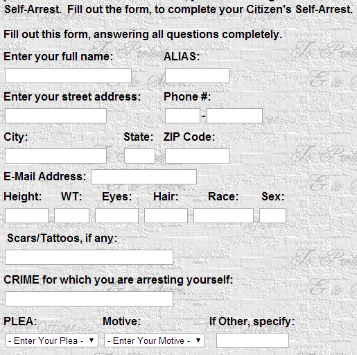
What’s the best form joke you’ve heard?
I collected a few in a post on ‘Fun with Forms’ page but my all-time favourite is the Citizen’s Self-Arrest Form.
- Image courtesy jasleen_kaur
#forms #usability #formsthatwork