For a long while now, I’ve been worrying about how to design forms for people with learning disabilities. It’s not been a pressing problem because frankly, a lot of the forms that I work with don’t even work for people with post-graduate degrees and specific training in the subject area of the form. But recently I’ve noticed a trend: sometimes I come across a form that’s really not too bad. So I’m increasingly thinking about how to make forms more accessible – and that’s restarted an interest in learning disabilities.
Easy Read makes information more accessible
In 2004, the Disability Rights Commission (DRC) published an interesting report on the state of the UK web from the point of view of accessibility: The Web: Access and Inclusion for Disabled People (.pdf). It’s an excellent report and I recommend it to you.
As you might expect, they published it in printed, PDF, Braille and audio versions. If you live outside Wales, you may be surprised to learn that they published it in Welsh. But for the purposes of this column, the most intriguing aspect was that they also published it in Easy Read.
I had a positive attitude to Easy Read from the moment that I read this definition in the Easy Read summary: “Accessible: this means easy to use”. Short, simple and accurate, in my view. So I read on, and found that the summary also includes a definition of Easy Read:
“Easy Read pages should have:
- Easy words
- Big writing
- Pictures
- Sound – so that you can listen to the words.
It must also be easy to find the page you want”.
Some questions about Easy Read
I don’t mean to criticise this short, simple definition in any way, but I found that I still have some further questions. For example:
- How can I tell whether the words I have chosen are as ‘easy’?
- How big is ‘big writing’?
- What should I put in the pictures?
An Easy Read guide to Easy Read
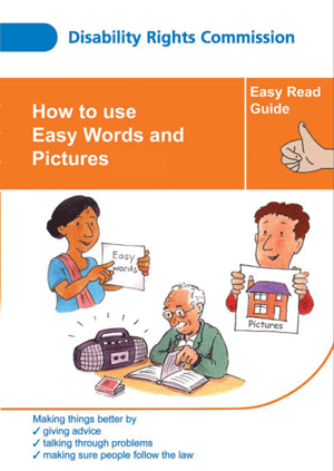
So I went looking for further advice, and found that the DRC published a guide written in Easy Read on how to write in Easy Read (.pdf). I think this is an excellent example of “practice what you preach”. I’ve chosen the .pdf option because it puts the pictures in the right place compared to the words. The other electronic versions are handy but they don’t have any pictures.
But I still had some questions
I’m still not sure about what words count as easy. ‘Big writing’ is defined in the guide to easy read as ‘like this’, so you’ll need the printed version to use as a measure. And it tells me where to place the pictures but not what to put in them. So I went hunting for some further advice.
Mencap’s guide ‘Am I making myself clear?’
Mencap, the UK’s leading learning disability charity, has a beautiful little guide called ‘Am I Making Myself Clear?’ (.pdf)
I’m brooding on it at the moment, but was pleased to see that this column does manage to follow one of the guidelines: “Having a photo of the person writing is a good idea”.
(Update in 2015: when this column was originally published on Usability News, I had no control over the images. Each column started with a picture of me and that could not be changed).
Advice from elsewhere in the UK
So far, I haven’t succeeded in finding anything else that gives me specific advice on how to write for people with learning disabilities – although I have found some fascinating examples of material written for people with learning disabilities. My favourite so far: Connects, the learning disabilities portal, held a conference on Values and Mental Capacity in March 2005. Each paper had a summary in Easy Read, creating a selection of examples of ‘how to do it’.
(Update in 2015: Connects closed in 2009. Some of its work moved over to the Foundation for People with Learning Disabilities, but it seems that the conference papers are no longer available).
Next Step
The next step for me is to broaden my search overseas. I’m off to the Society of Technical Communication conference in Seattle and will have the chance to pick the collective brains of their AccessAbility Special Interest Group.
(Update in 2015: My interest in Easy Read continues. In 2008, I co-founded the Design to Read project, which has since held some workshops and published articles and chapters).
This column was originally published in Usability News in April 2005.
#forms #formsthatwork #designtoread