A client’s web team were looking sadly at the ‘scrolling news’ feature they were forced to carry on many pages. “We hate it, we want to get rid of it, but we need evidence”. So I’ve done a bit of trawling for reasons why you can and should remove these features.
Motion helps to show change and attract attention
Motion can help to illustrate changes, for example showing how to write Greek letters. A game of fling the cow wouldn’t be the same if that cow didn’t fly. Notice that these are animations that we can control, not text that moves all by itself.
Motion also attracts attention. If you are designing a marine safety system, then a flashing light is easier to pick out than a steady one (Laxar and Benoit, 1995). A blinking cursor does improve performance in word-processing and form entry applications because it shows you where the next input should go (Coll, Callahan, Flaherty and Coll, 1993).
(Update in 2015: the original article linked to sites that are long gone.
In 2004, videos on the internet were erratic at best; these days, if you’re looking for a way to write Greek letters then YouTube offers a wide selection of tutorials that will typically show you all the letters in about 7 minutes. I preferred the old animated .gif, which took a couple of seconds for each letter and was easy to replay instantly, but maybe I’m just old fashioned.
‘Fling the cow’ was a very early flash-based precursor of the now hugely popular ‘Angry Birds’ app and associated games. You can still find ‘Fling the cow’ on the internet, but all the sites I found are so loaded with adverts and pop-ups that I’m reluctant to link to them).
The bad news: motion can undermine your message
But just because motion can be done on the web it doesn’t mean that it should be done. I’ll assume that we’re on an ordinary corporate or government website here, and its overall purpose is to offer information and provide services rather than to keep us entertained by launching bovines.
Do you want your visitors to be attracted to the motion?
Blinking, scrolling, flickering text: all designed to attract your visitors away from whatever they are currently looking at, towards the item that you are highlighting. Is that really what you want?
“Blinking text makes it nearly impossible to pay attention to anything else on the page. It reduces 87% of all surfers to a helpless state of fixated brain-lock, much like that of a rabbit caught in the headlights of an oncoming semi. This is not good. If you abuse the blink tag, you deserve to be shot. Clue: if you use the blink tag, you’re abusing it” (Raymond, 2004). He’s much less polite about scrolling marquees and gratuitous animation.
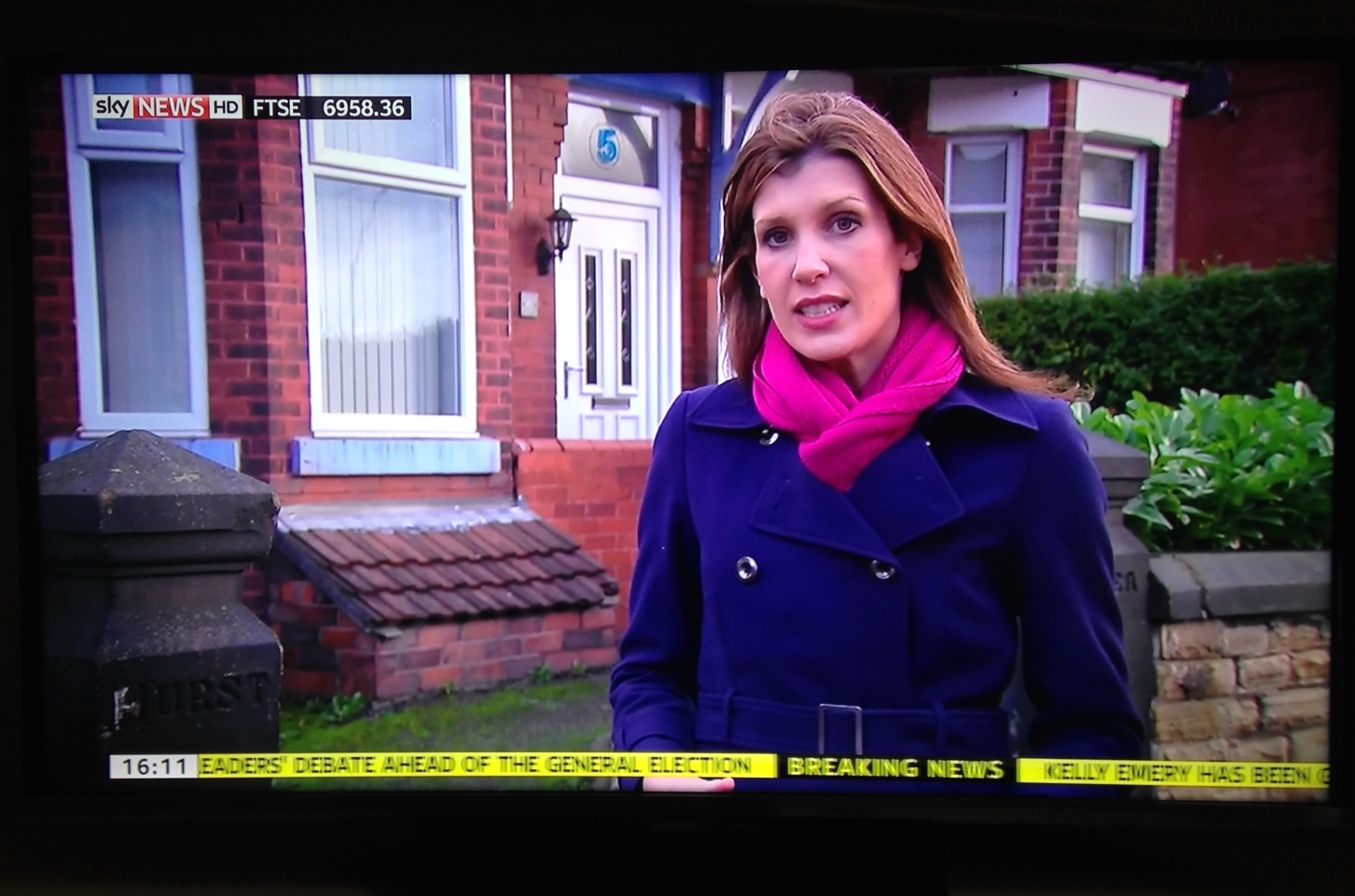
If you have done your design work properly, you will have a carefully constructed navigation scheme that rapidly guides users to the pages they want. It will be complemented by a thoughtfully maintained search, constantly updated with ‘best bets’ for topics that are hot with your users to direct them to the most useful pages. So why throw that all away by adding a ‘scrolling news’ feature?
Will your visitors really notice the motion?
“The use of scrolling text is counterproductive – many users don’t notice it at all, and those that do are frustrated by it” (Safalra (Stephen Morley), 2003).
During 2000/2001, I tested a website with a scrolling marquee during my tutorial ‘Introduction to Web Usability Testing’. It got different reactions in different countries. The North Americans simply blanked out the scrolling text. It was invisible to them. The phenomenon has become known as ‘banner blindness’ because it has been frequently observed during tests of e-commerce sites (for example Benway and Lane, 1998). Anything that looks like an advertisement is likely to be ignored: and your flashing image, designed to attract attention, may fall into that trap.
Are you excluding some visitors?
My tests during 2000/2001 included many experienced internet professionals who spoke English as a second language. They didn’t blank the scrolling text, but noticed it: and they found it insulting. Why? Because scrolling text is so much harder to read, and they were annoyed when they saw text that caused them to doubt their language skills.
Moving text is harder to read. As well as any visitor whose first language is not English, you may be excluding:
- people with dyslexia
- people with learning disabilities
- people who are visually impaired and use screen magnifiers
It can also confuse some screenreaders, used by people who are blind.
That is why the W3C Web Accessibilty Content Guidelines – 1999 say: “Ensure that moving, blinking, scrolling, or auto-updating objects or pages may be paused or stopped”. In other words, if you must use motion then make sure the user can stop it easily.
(Update in 2015: the current version, WCAG 2.0, offers similar advice: Pause, stop, hide.)
Moving text may be illegal
But even if the user can prevent the text from moving, it may still be dangerous.
“Some individuals with photosensitive epilepsy can have a seizure triggered by displays that flicker, flash, or blink, particularly if the flash has a high intensity and is within certain frequency ranges” (The Access Board, 2000).
So if the flickering display appears at a point that may prevent these people from navigating to your service, it may constitute a barrier and therefore be illegal, depending on your service and the legislation operating in your country.
I’m not a lawyer, but www.gov.uk tells us that ‘As a disabled person you have rights to protect you from discrimination. These rights cover most areas…’. And if your website gives some people seizures, then that could be described as discrimination’. I’m not at all sure how I’d prove that my moving text wasn’t a problem, so I wouldn’t take the chance.
And it’s so 1997
Even the geeks aren’t too keen on snazzy tricks like blinking, scrolling or flickering.
“Blinking text was one of the most dreaded homepage effects in the 90’s. It was easily achieved by using the <blink> tag and was viewed upon as a real newbie thing to do” (Ove Klykken, 2003).
“Not only does having a ton of animated stuff on a main page take a long time to load, but it usually looks trashy. Many people will have less respect for a website and the owner when the main page looks like the creator is clueless and has absolutely no discernment.” (Duane Alan Hahn)
“Some “features” of web pages are more annoying than they are useful. Here are some of them:
- Blinking text. One of the most annoying things you can put on a page is blinking text. Sure, it attracts attention–at first! But after a few repetitions, it is an annoying distraction. I have only seen one legitimate use of the blink function. It consisted of a single letter blinking to call attention to an error in a complex string that someone else had originally typed. Even then, bolding the character would probably have been better.
- Scrolling text. I find scrolling text, created with MSIE’s MARQUEE tag or with JavaScript particularly annoying, too. It never scrolls at my reading speed, and if it overwrites the status bar at the bottom of the browser screen, it robs me of information I expect always to be there.” (Walt Howe, 2001)
The good news, again
But don’t rule out motion altogether. If it can be controlled by the user, then it can be wonderful for showing changes over time. Just don’t overdo it, and don’t do it to ‘look cool’. You won’t.
References
The Access Board (2001) “Web-based Intranet and Internet Information and Applications (1194.22)” http://www.access-board.gov/sec508/guide/1194.22.htm#(j)
Benway, J. P. and Lane, D. M. (1998) “Banner Blindness: Web Searchers Often Miss “Obvious” Links” http://www.internettg.org/newsletter/dec98/banner_blindness.html
Coll J. H, Callahan W. C., Flaherty J. H. and Coll, R (1993) “The Blinking Cursor: A Two-Experiment Sequence Investigating Whether a Blinking Cursor Facilitates User Performance” International Journal of Man-Machine Studies v.39 n.2 p.177-185 as quoted at www.hcibib.org
www.disability.gov “Disability Discrimination Act 1995″ http://www.disability.gov.uk/dda/
Hahn, D. A. (undated) ” Animation and Scrolling Text” http://www.randomterrain.com/webdesign/animation.html
Howe, W. (2001) “Walt’s Publishing Forum on the Web. Part 4: Avoid Turnoffs” http://www.walthowe.com/pubweb/qdesign/qdesign4.html
Klykken, Ove (2003) “Blinking text with CSS” http://www.domedia.org/oveklykken/css-blinking-text.php
Laxar K. V. and Benoit S. L (1995) “The Conspicuity of Flashing Lights as Marine Aids to Navigation” Proceedings of the Human Factors and Ergonomics Society 39th Annual Meeting 1995 v.2 p.1380-138,
Raymond, E. S (2004) “You Know You’re In Design Hell When You See…” http://www.catb.org/~esr/html-hell.html
Safarla (Morley, S.) (2003) “Scrolling Text” http://www.safalra.com/internet/scrollingtext.html
www.w3.org (1999) “Web Content Accessibility Guidelines 1.0″ http://www.w3.org/TR/1999/WAI-WEBCONTENT-19990505/#tech-avoid-blinking
Hahn, D. A. (undated) ” Animation and Scrolling Text” http://www.randomterrain.com/webdesign/animation.html
Howe, W. (2001) “Walt’s Publishing Forum on the Web. Part 4: Avoid Turnoffs” http://www.walthowe.com/pubweb/qdesign/qdesign4.html
Klykken, Ove (2003) “Blinking text with CSS” http://www.domedia.org/oveklykken/css-blinking-text.php
Laxar K. V. and Benoit S. L (1995) “The Conspicuity of Flashing Lights as Marine Aids to Navigation” Proceedings of the Human Factors and Ergonomics Society 39th Annual Meeting 1995 v.2 p.1380-138, as quoted at www.hcibib.org
Raymond, E. S (2004) “You Know You’re In Design Hell When You See…” http://www.catb.org/~esr/html-hell.html
Safarla (Morley, S.) (2003) “Scrolling Text” http://www.safalra.com/internet/scrollingtext.html
www.w3.org (1999) “Web Content Accessibility Guidelines 1.0” http://www.w3.org/TR/1999/WAI-WEBCONTENT-19990505/#tech-avoid-blinking
This article first appeared in ‘Caroline’s Corner’, in the March 2004 edition of Usability News.