Most of us are familiar with what it is to read a research paper and, at times, to struggle with it. Writing an editorial for the Journal of Usability Studies, I took my own experience as a user and reader of research papers to discuss some of the obstacles to usability – and to share checklists and recommendations to help authors and their publishers to help us as readers.
Why I read research
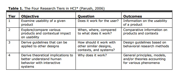
I am passionate about our field, but let me share a secret: in my leisure time, I would probably rather curl up with a good detective story than with a bad research paper. OK, I would rather read any detective story than nearly any research paper. So my research reading generally has to have a business purpose—“help me now!”, or perhaps if I am feeling more generous—“help me sometime soon!”. Meaning: ideally, I would like something for today on my current project, but I will also be pretty happy with something I might be able to call on for a typical future project. Avi Parush’s concept of “tiers of research” (Table 1) neatly summarises the types of help that research can give us.
 Why I cannot always use what I read
Eager practitioners, and plenty of researchers often ask, “why is there not a perfect match?”
Cannot Understand It
My first challenge is the actual reading process. This journal makes it easy by enforcing clarity of language, titles that reflect the contents, and offering the ‘practitioner’s takeaway’ that neatly summarises key points.
The first barrier I encounter is about reading. Many journals still have densely-formatted pages of tiny type that may have been appropriate for the days of high-quality printed distribution and does not seem necessary now, but that is hardly the fault of the researchers.
But why do we get titles like the following? “Love at first sight or sustained effect? The role of perceived affective quality on users’ cognitive reactions to information technology” (Zhang and Li, 2004)? It is hard going. The cute introduction does not help me.
I confess: I used to do cute introductions myself, until I realised how useless they are. For example, “Caroline’s Corner: Playing Piggy in the Middle” was a poor choice for a piece about the merits of a 5-point scale in questionnaires (Jarrett, 2004).
Back to Zhang and Li. I think their title means: “Is there a relationship between users’ feelings about information technology and the amount of mental effort they have to exert when using information technology?” I am not entirely sure.
Let’s contrast that with a paper that I am constantly using (and recommending to clients): “Guidelines for accessible and usable web sites: Observing users who work with screen readers” (Theofanos and Redish, 2003). Immediately we know the following:
- We’re going to get guidelines, so we’re at tier 3.
- The guidelines apply to websites.
- The guidelines came from observation, not from a synthesis of other research.
So clear, so encouraging. Even if you don’t want to read it just this second, you’d want to keep a note of it for another day, right?
I have placed a lot of focus here on titles, but the same issue applies throughout the paper.
- Cannot understand the title: I am less likely to read the abstract.
- Cannot understand the abstract: I am less likely to read the conclusions.
- Cannot understand the conclusions: I am afraid that research is lost to me until some kindly academic colleague decides it is worth translating into plain language.
Cannot Apply It
As Parush points out, the level of focus and extent of generalisation change as you move from tier to tier of his model. Usability of a given product, at tier 1, is highly focused on that product and therefore, less easy to generalise.
Sometimes It is easy enough to decide whether something is applicable to my world, the following title for example: “User Research of a Voting Machine: Preliminary Findings and Experiences” De Jong, van Hoof, and Gosselt, J. (2007).
That title is easy enough to understand. It is clearly aiming at tier 1. I was slightly worried that it would, therefore, focus solely on voting machines. I am from the United Kingdom and the only “voting machines” I encounter consist of a piece of paper and a pencil. But no, a quick scan of the paper and I have picked up some interesting tips about comparing paper and electronic methods, material on error rates, and so on. But for me, the mismatch in technologies was overcome by plentiful matches in tasks, types of users, and context of use.
Often, however, the points are rather subtle. I would like to be able to use the result, but I find that, on examination, there is some crucial difference in research assumptions that makes it impossible. One very common example—I am usually designing for the whole adult population, seniors included. So let’s look at the following title: “The Impact of Web Page Text-Background Color Combinations on Readability, Retention, Aesthetics, and Behavioral Intention” (Hall and Hanna, 2004)
That title looks to me as if this research is trying to be tier 3 (guidelines) and or possibly even tier 4 (underlying principles). So let’s look at who their participants were: “One hundred and thirty-six students enrolled in General Psychology classes at the University of Missouri – Rolla participated in this experiment as partial fulfillment of a research participation requirement for the class”.
Students? Participating for a class requirement? They have chosen a restricted audience that does not match very well to my ‘whole adult population including seniors’.
To be fair to Hall and Hanna, they mention this as one of the limitations of their research, right at the very end of their paper where they say “It is important to keep in mind that this was an initial exploratory experiment”. Why no hint of that limitation in their title? They could easily have said “An initial study of the impact …”. They would have hinted at the research assumptions, and I would be able to take a more lenient view of the paper: “OK, just starting; it is fair enough to take the easy route and use student participants”. And doing so would place the research firmly in tier 1 where it belongs.
But their abstract includes level 4 claims, for example: “Users view “professionalism” as more strongly related to readability than aesthetics”. Sorry, Hall and Hanna. I don’t think I will accept that from this paper.
Checklist for assessing whether research is applicable
So which research assumptions are essential? From my standpoint as a usability practitioner, it seemed obvious to start with the ISO 9241:11 definition of usability. At each stage, I ask myself “Do any of those things match with projects I am likely to work on?”
- Who are the users?
- What are the tasks, and were they imposed by the researchers?
- What is the context of use, and who controlled it?
- Were the examples in the tasks realistic and well designed?
An Example: A Paper On Polarity Of Text
Let’s look at a paper that seemed promising at first: “Text-background polarity affects performance irrespective[sic] of ambient illumination and colour contrast” (Buchner and Baumgartner, 2007).
I am always looking for papers that discuss effects of text-background polarity. In several usability tests, I have observed that participants fail to absorb information from reverse-polarity (white on dark) text that is interspersed with ordinary dark-on-light text. But, I have never had the opportunity to take this any further as a research project. Could Buchner and Baumgartner have some helpful findings?
I would be pleased to be able to use their result: essentially, that dark text on a light screen is easier to read than light text on a dark screen. A glance at most people’s screens will tell you that this is true for the majority of people in 2007 with no eyesight problems using screens of standard quality or better in ordinary office conditions.
Why bother researching it? Because there is much older research that claims to prove the opposite – neatly summarised in their paper. But unfortunately, their paper fails my ‘can I apply it’ checklist.
Here’s the abstract: “In a series of experiments, proofreading performance was consistently better with positive polarity (dark text on light background) than with negative polarity displays (light text on dark background). This positive polarity advantage was independent of ambient lighting (darkness vs. typical office illumination) and of chromaticity (black and white vs. blue and yellow). A final experiment showed that colour contrast (red text on green background) could not compensate for a lack of luminance contrast. Physiological measures of effort and strain (breathing rate, heart rate, heart rate variability and skin conductance level) and self-reported mood, fatigue, arousal, eyestrain, headache, muscle strain and back pain did not vary as a function of any of the independent variables, suggesting that participants worked equally hard in all experimental conditions, so that the interpretation of the primary performance measure was unlikely to be contaminated by a performance-effort trade-off”.
We do not learn much about the users in the abstract, apart from their consistency of effort. A point to remember when reading the paper (if it passes the rest of my checklist).
So, what were the tasks? The abstract clearly states that the task was proofreading: a perfectly respectable task, but highly specific. Just think for a few moments about how much time you spend proofreading each day compared to other tasks: by which I mean, proofreading someone else’s work, not just hunting for errors in your own work (a completely different matter). Proofreading is nothing like the typical reading tasks I am working with, so this paper will not help me.
But let’s carry on to the context of use and who controlled it. Good marks to Buchner and Baumgartner, who clearly state that they tested ‘ambient light’ against ‘darkness’. Well, that means I can firmly disregard this paper in all those contexts where my users will not work in the dark. I don’t even need to ask the usual questions about interruptions, screen quality, whether users were allowed to make any adjustments – all the things that might affect context of use.
And, what were the examples like?
Luckily for me, I have already decided I don’t need to bother with this paper. But sometimes (albeit very rarely in the case of legibility research) a paper will make it through the previous three questions. Then I need to see the examples. Were they designed by anyone with the teensiest bit of visual imagination or typographic sensibility?
For example, comparing negative with positive polarity. Did the designers compensate or control for the problems of text appearing to be bigger in negative polarity on screen? If not, why not? And that ‘red text on green background’: did the text oscillate in the usual way, or did they figure that one out?
What possessed them to choose a colour combination that is known to cause issues for colour blind people? And what about that blue and yellow? Pale, saturated—maybe it is all shown with illustrations in the paper. Maybe not—I lost interest when I saw ‘proofreading’ and gave up entirely at ‘darkness’.
Inapplicable Research Can Still Be Valuable
The Zhang and Li paper was inapplicable for me because I couldn’t understand it. I don’t know what tier of research they were aiming for. But the conference they submitted to must have been happy about it, so clearly it was aimed at someone other than me.
The Hall and Hanna paper was inapplicable for me because they had an apparent mismatch between their assumptions and the claims that they were making – a problem only partly solved for me by their discussion of limitations.
The Buchner and Baumgartner paper was inapplicable for me because the users, tasks, and context of use are too specialised.
So is ‘inapplicable for me’ really a problem? Well, not necessarily. I have no problem at all with researchers doing research for other reasons than being useful to practitioners: exploring ideas, establishing processes, even impressing each other. But if you want your research to be useful to practitioners, make it easy for us to understand, and try to research combinations of users, tasks, and context of use that are likely to exist in everyday life.
References
Buchner, A. and Baumgartner, N. (2007) Text-background polarity affects performance irrespective of ambient illumination and colour contrast, Ergonomics, 50(7), July 2007, 1036–1063
De Jong, M., van Hoof, J. and Gosselt, J. (2007, August) User Research of a Voting Machine: Preliminary Findings and Experiences, Journal of Usability Studies, 2(4), 180-189
Hall, R. and Hanna, P. (2004), The Impact of Web Page Text-Background Color Combinations on Readability, Retention, Aesthetics, and Behavioral Intention, Behaviour & Information Technology, 23(3), 183-195(13)
Jarrett, C. (2004) Caroline’s Corner: Playing Piggy in the Middle. Retrieved from http://www.usabilitynews.com/news/article1269.asp
Parush, A. (2006, November-December) Toward a Common Ground: Practice and Research in HCI Interactions.
Theofanos, M. F. and Redish, J. C. (2003, November-December) Guidelines for accessible and usable web sites: Observing users who work with screen readers, Interactions, X(6), 38-51
Zhang, P. and Li, N (2004) Love at First Sight or Sustained Effect? The Role of Perceived Affective Quality on Users’ Cognitive Reactions toward IT. Proceedings of the International Conference on Information Systems (ICIS) 2004, Washington D. C., December 12-15, 2004.
This article was first published as Problems and joys of reading research papers for practitioner purposes in Journal of Usability Studies, Volume 3, Issue 1, November 2007, pp. 1-6.